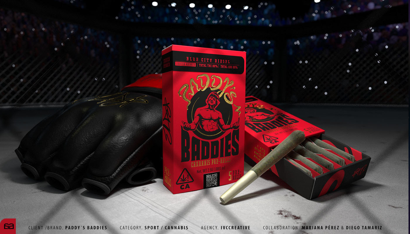
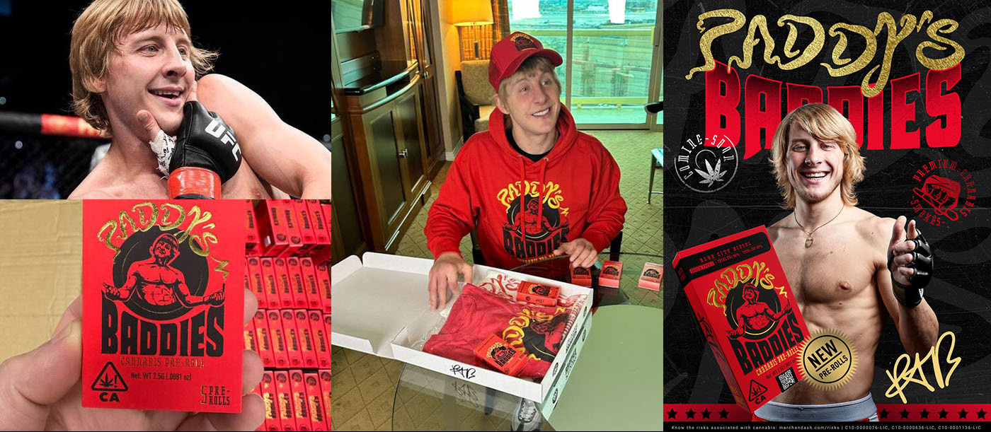
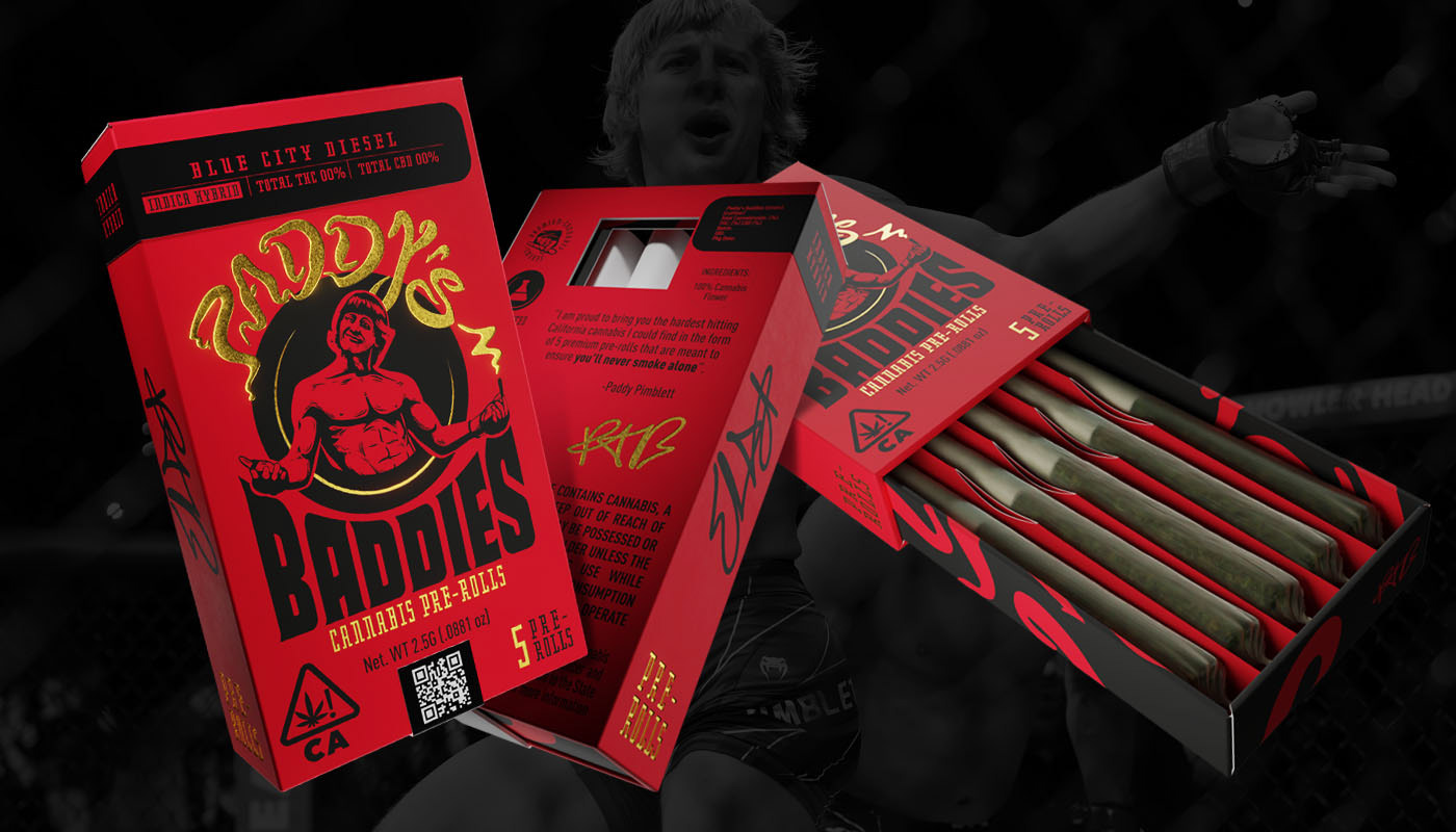
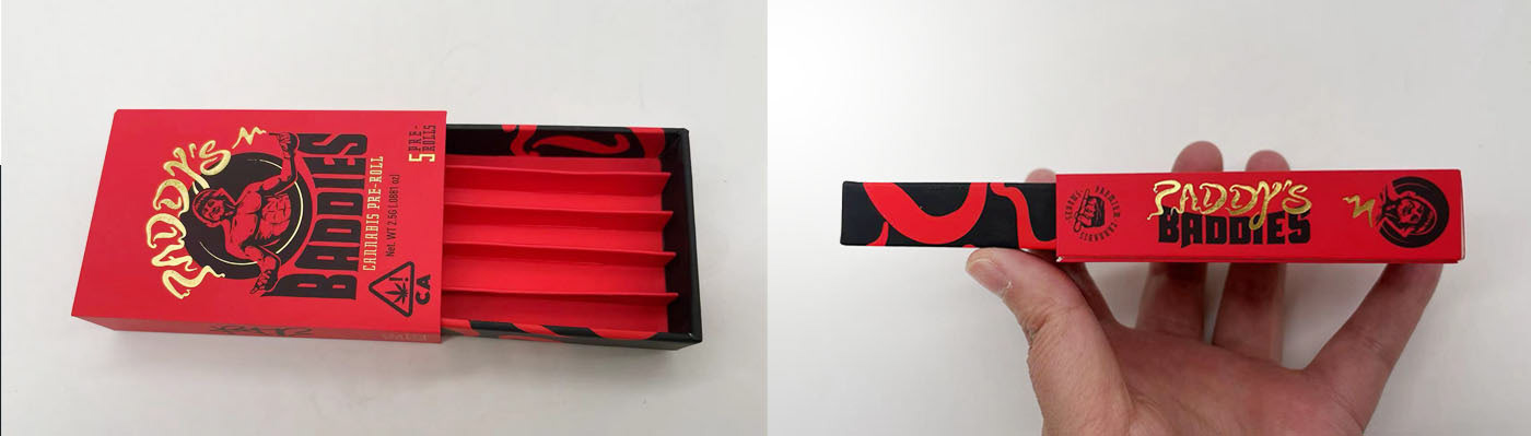
PADDY'S BADDIES ®
Built around the larger-than-life persona of UFC® standout Paddy "The Baddy" Pimblett, this product line translates a champion's charisma into a cannabis brand with an unmistakable edge. Known for his bold presence, infectious confidence, and high-octane personality, Paddy’s personal brand served as the creative North Star for every decision—from the brand’s verbal identity to its visual expression.
The packaging is designed as a full premium experience, mirroring the elite quality of the product through a meticulous selection of materials. The visual language is defined by a palette that is simultaneously elegant, aggressive, and minimalist, capturing the duality of a professional athlete: the discipline of the craft and the raw energy of the Octagon.
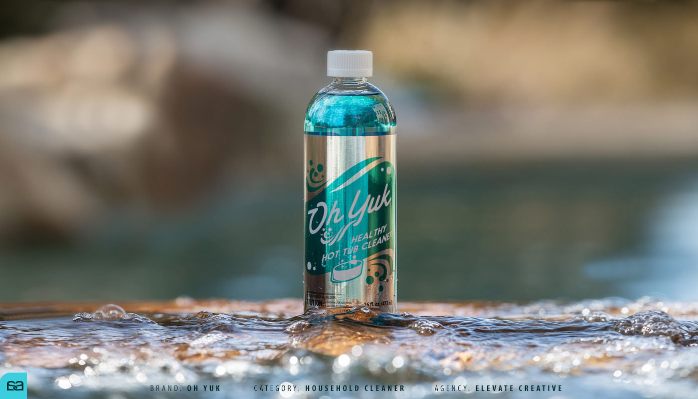
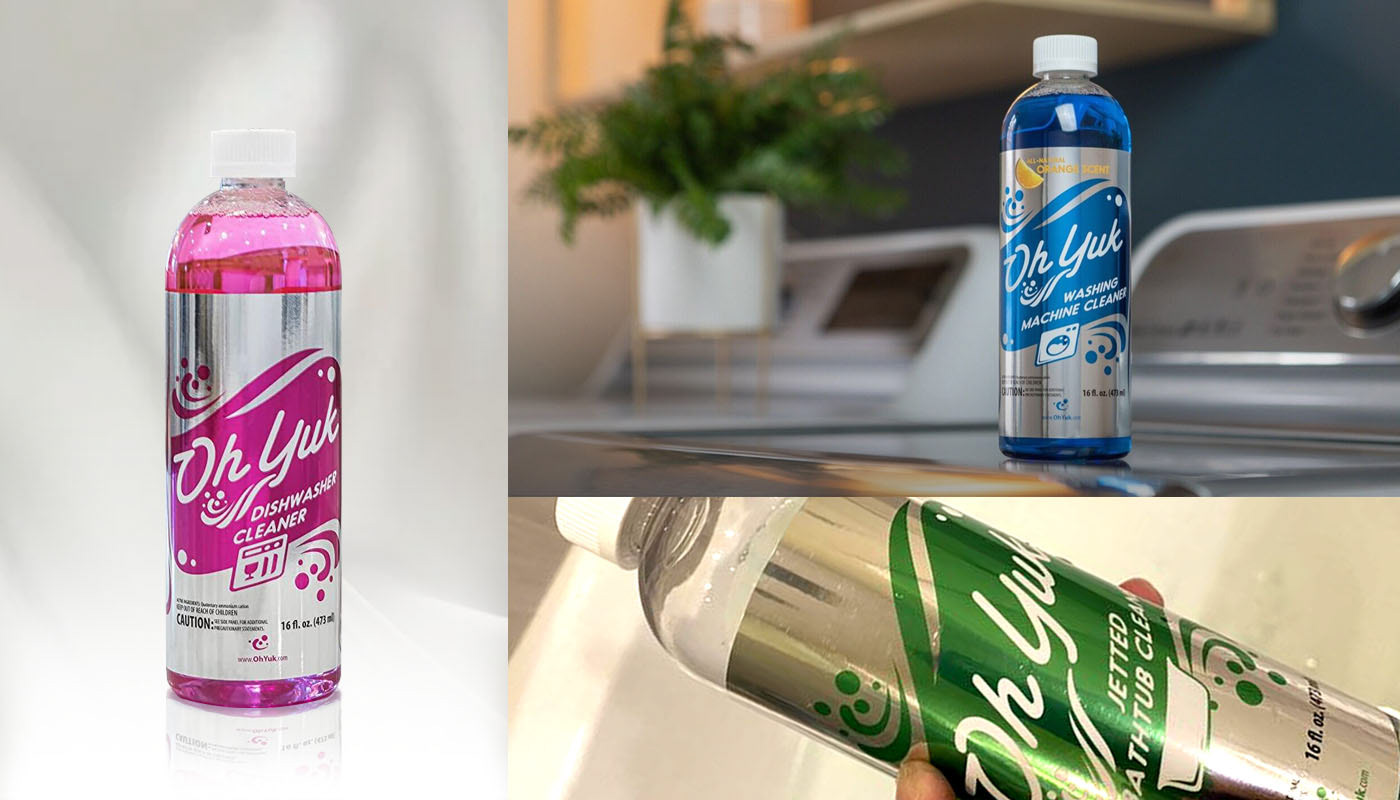
OH YUK ®
Based in Minnesota, this American brand specializing in high-performance deep cleaning solutions—engineered specifically for hot tubs, jetted baths, and household appliances—partnered with Elevate Creative®, under the creative supervision of Alex Viveros, to execute a strategic packaging redesign for their expanding product lines. The objective was to elevate the brand's shelf presence while maintaining its reputation for industrial-grade efficacy.
We developed a revitalized visual identity that aligns perfectly with the brand’s core promise: cleanliness and restoration. The creative direction focuses on fluidity and freshness, utilizing a dynamic art style that emphasizes "flow" and directional movement. This transformation shifts the brand from a purely utilitarian look to a premium, modern aesthetic that resonates with contemporary homeowners.
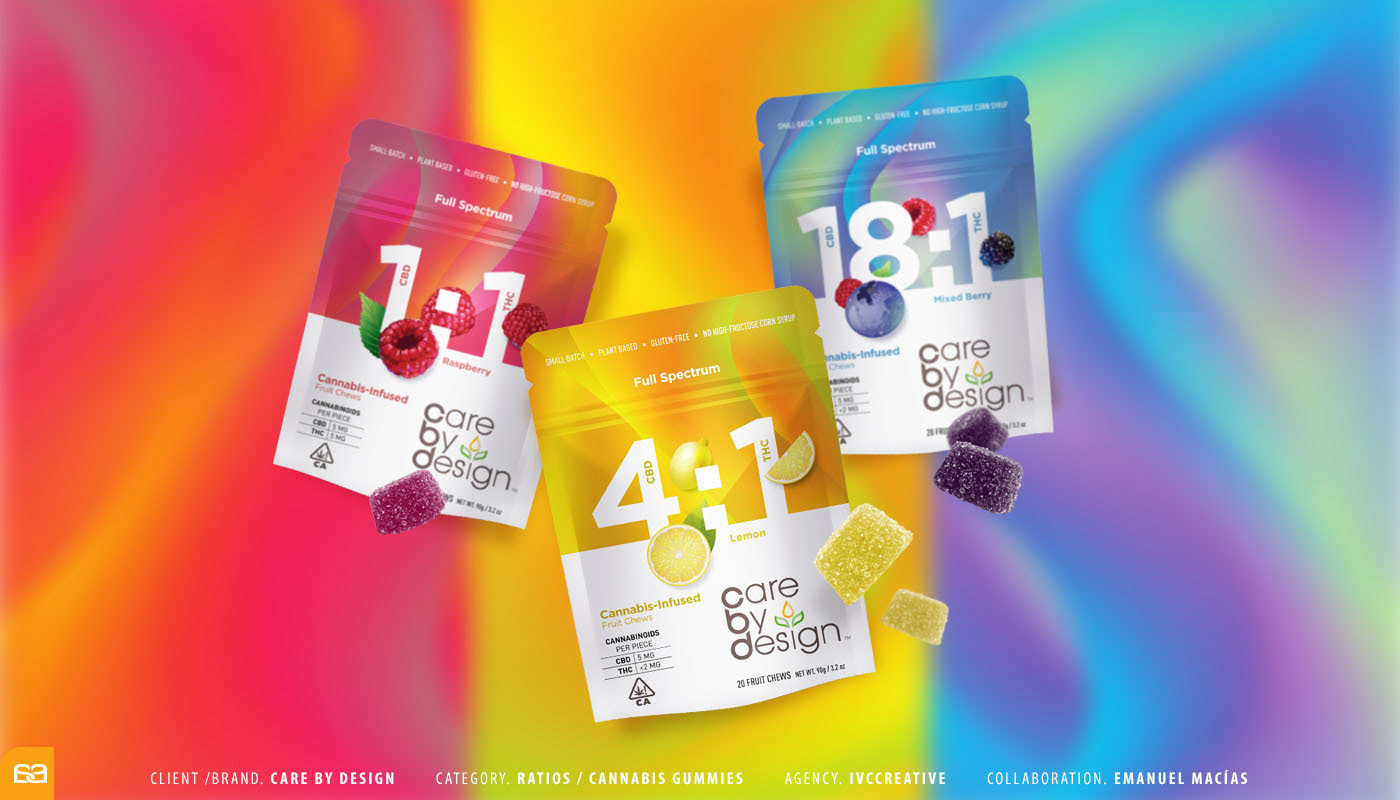
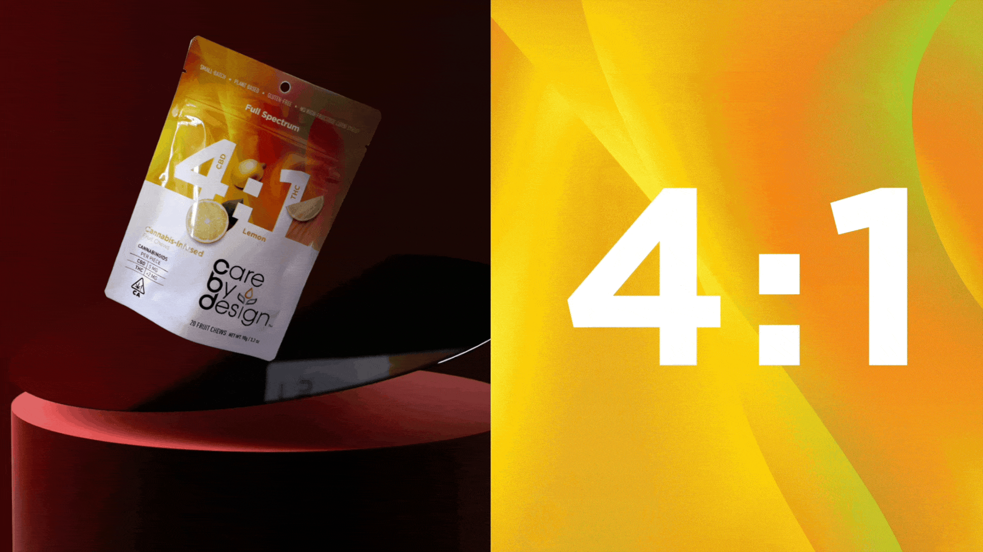
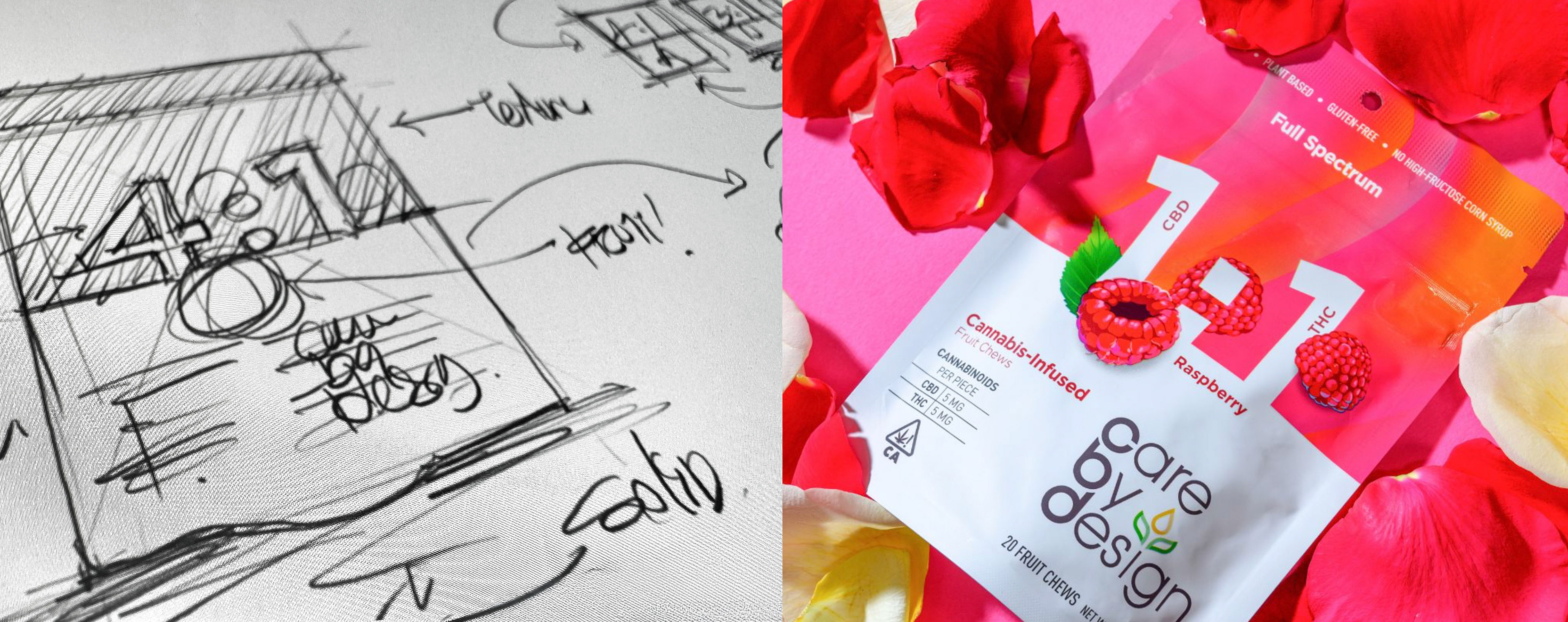
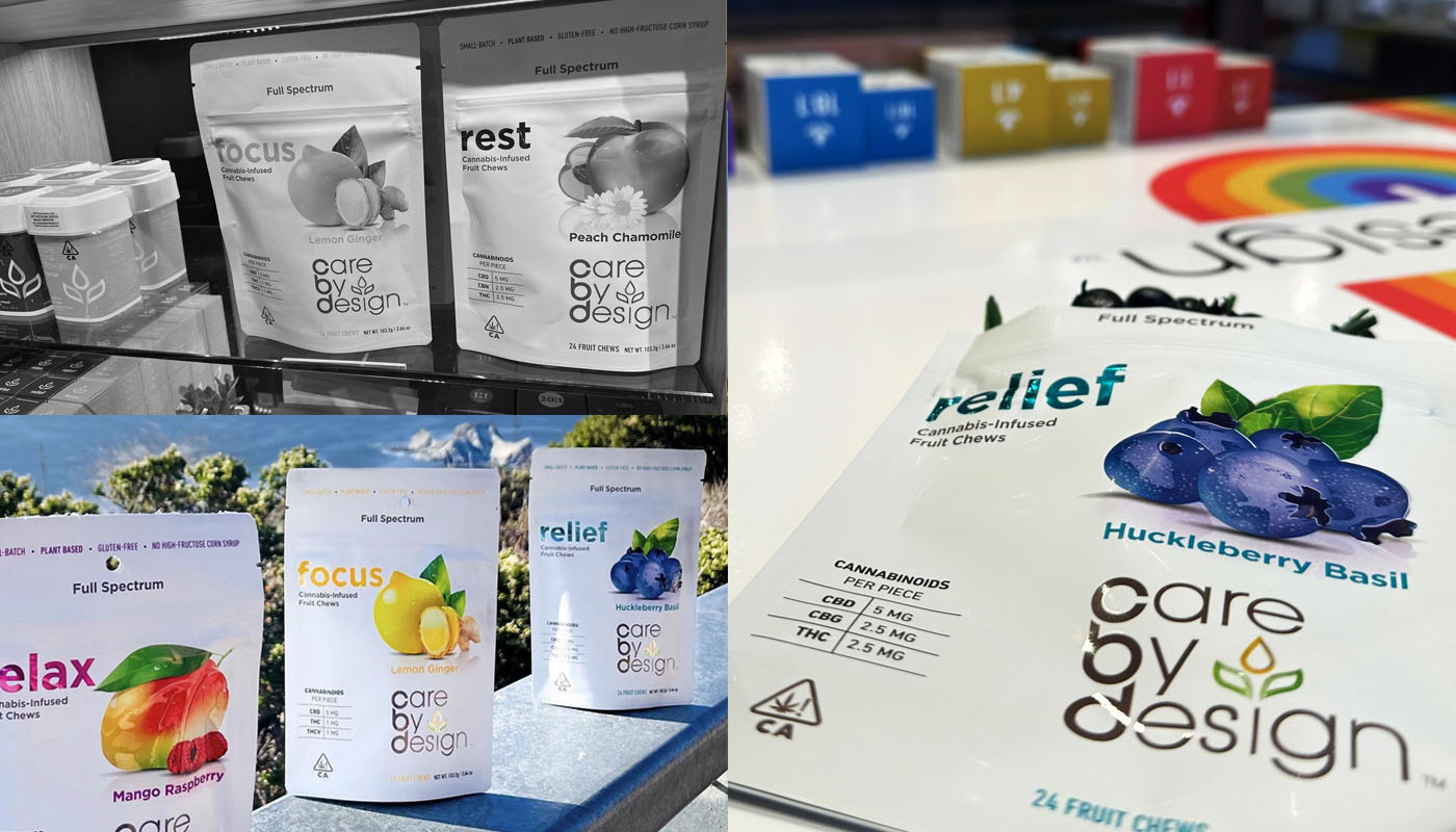
CARE BY DESIGN® RATIO
As a key brand within the CannaCraft® portfolio, Care By Design® sought to revitalize its cannabis-infused product line. The project was commissioned to IVC Creative®, who entrusted the creative execution and design leadership to Alex Viveros. The strategic framework focused on two primary pillars: first, enhancing shelf differentiation by highlighting the brand’s proprietary ratio-based formulas (CBD to THC percentages); and second, establishing a robust chromatic system to categorize its diverse flavor profiles and product ranges.
The result is a sophisticated packaging system with high-impact shelf presence. By balancing clinical precision with vibrant lifestyle aesthetics, the redesign achieved significant market success, positioning the brand as both a trusted wellness authority and a visually dominant player in the retail environment.
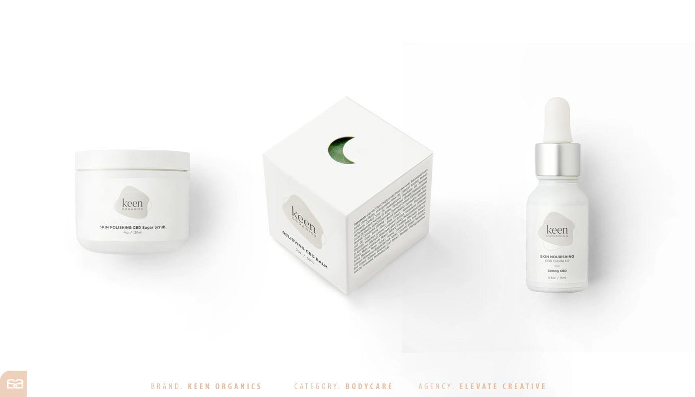
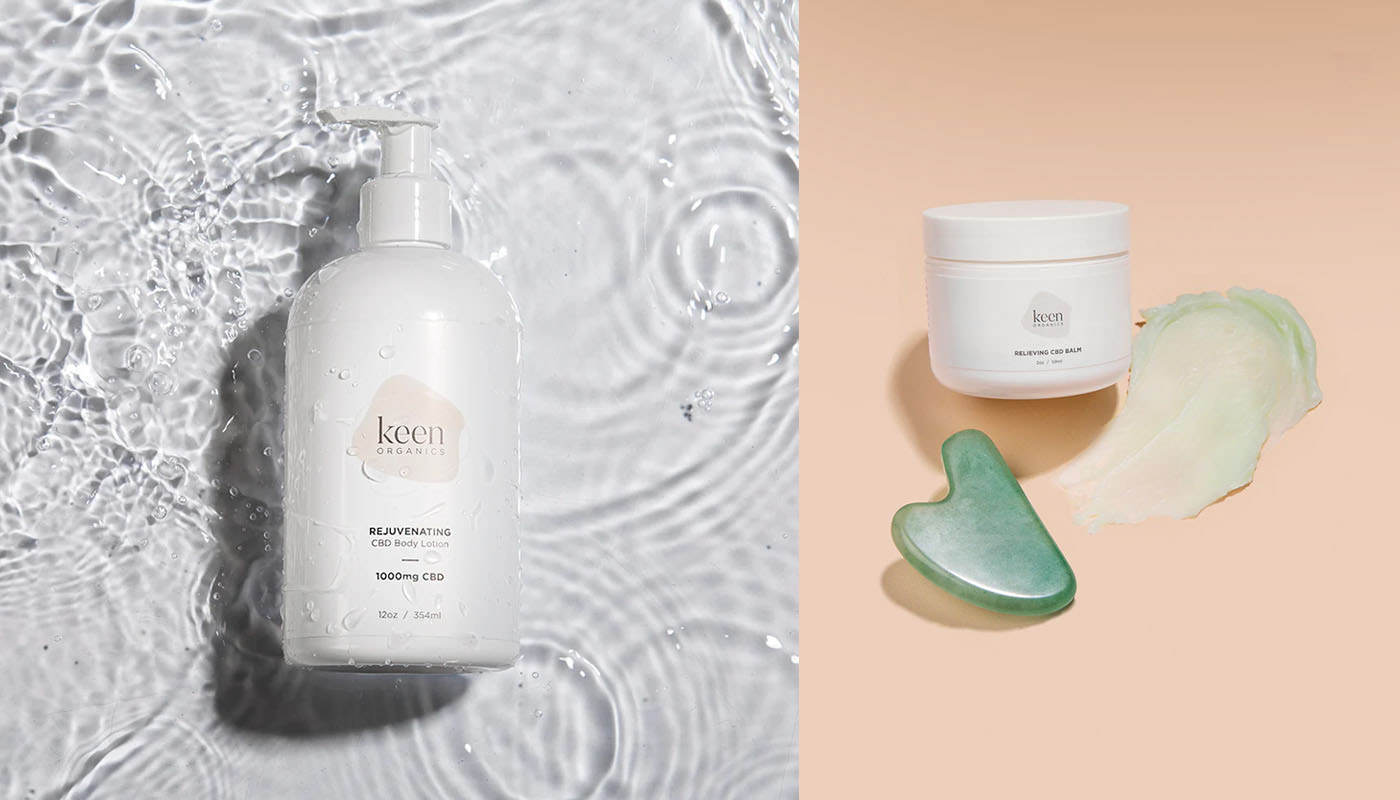
KLEEN ORGANICS ®
As a premium skincare and beauty line formulated with high-quality CBD (cannabidiol), this brand is engineered to alleviate pain, reduce stress, and target signs of aging. The brand sought a refined and delicate visual identity to distinguish its diverse product range within the competitive wellness market. Alex Viveros developed a cohesive brand system utilizing organic, clean silhouettes that allow the design to "breathe," ensuring a sophisticated presence across all packaging formats.
The creative approach prioritizes minimalist aesthetics and airy compositions, reflecting the purity and restorative nature of the ingredients. By balancing negative space with fluid, organic forms, the new identity shifts the brand toward a high-end apothecary feel that resonates with health-conscious and luxury-oriented consumers.

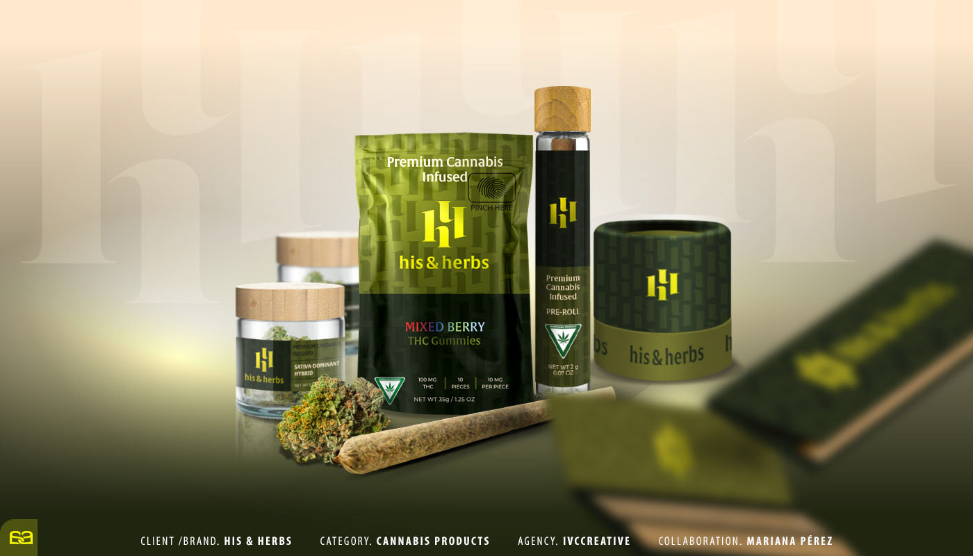
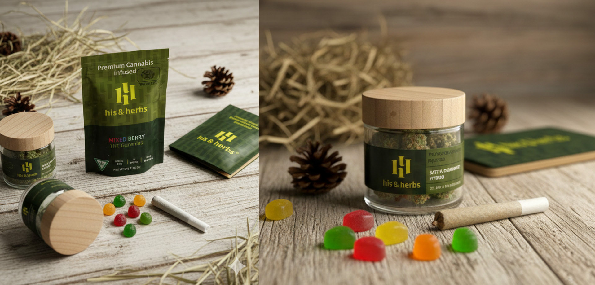
HIS & HERBS ®
As a disruptive force in the California cannabis market, this emerging brand partnered with IVC Creative® to develop a bold and unforgettable identity, with Alex Viveros leading the design execution. The conceptual framework is anchored by a "typographic banner" approach, where the rhythmic multiplication of the brand’s most symbolic character creates a visual metaphor for an endless path of communication.
The resulting identity transcends traditional logos, evolving into a versatile, pattern-based mark system that ensures high brand recall and a dominant shelf presence. This strategic use of typography transforms the brand into a modern icon, seamlessly blending a sophisticated aesthetic with a distinctive graphic language that resonates within the competitive Californian retail landscape.
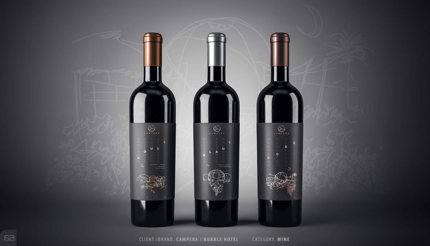
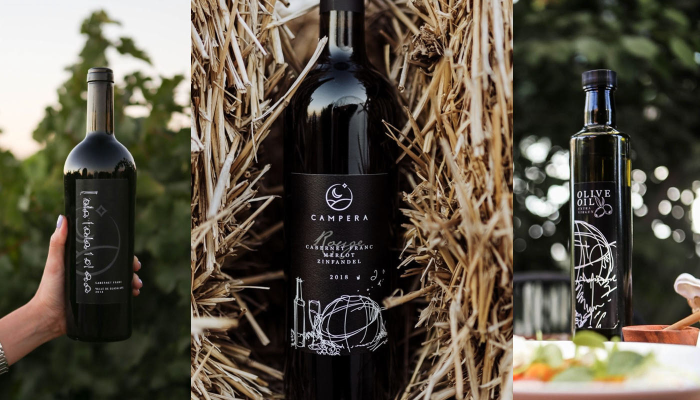
CAMPERA ®
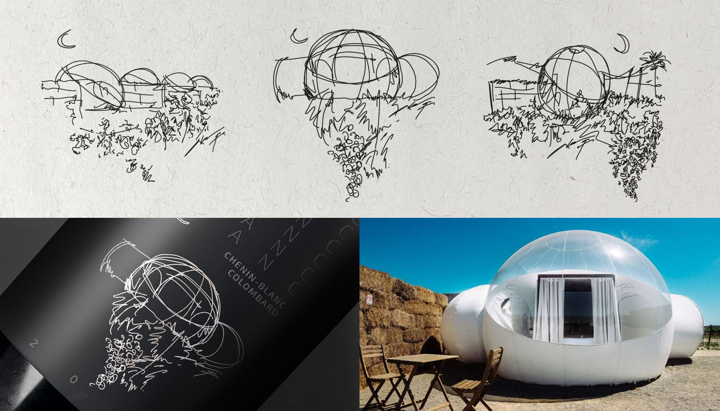
Recognized as a premier boutique glamping destination in Mexico, this exclusive "bubble hotel" offers a unique luxury experience in the heart of Valle de Guadalupe. Nestled among rolling vineyards, its iconic transparent suites allow guests to stargaze from the comfort of their beds. To expand its brand ecosystem into the viticulture sector, the hotel commissioned Alex Viveros to design the visual identity for its signature wine line.
The creative concept is driven by a series of custom sketches crafted by the artist, directly inspired by the interplay between the hotel's avant-garde architecture and the natural landscape. This artistic approach ensures that the ethereal experience of staying at the resort extends seamlessly to the palate, bridging the gap between luxury hospitality and premium winemaking through a sophisticated and evocative design system.
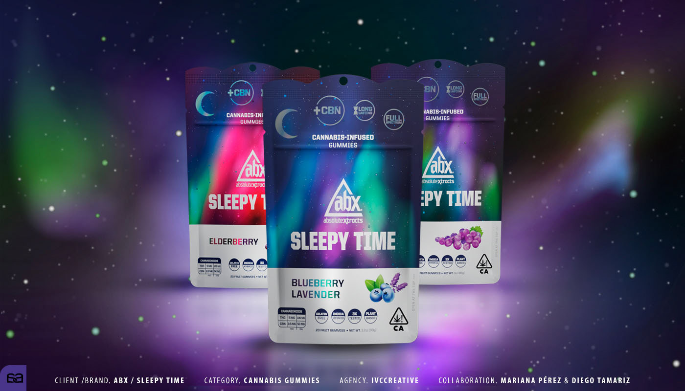
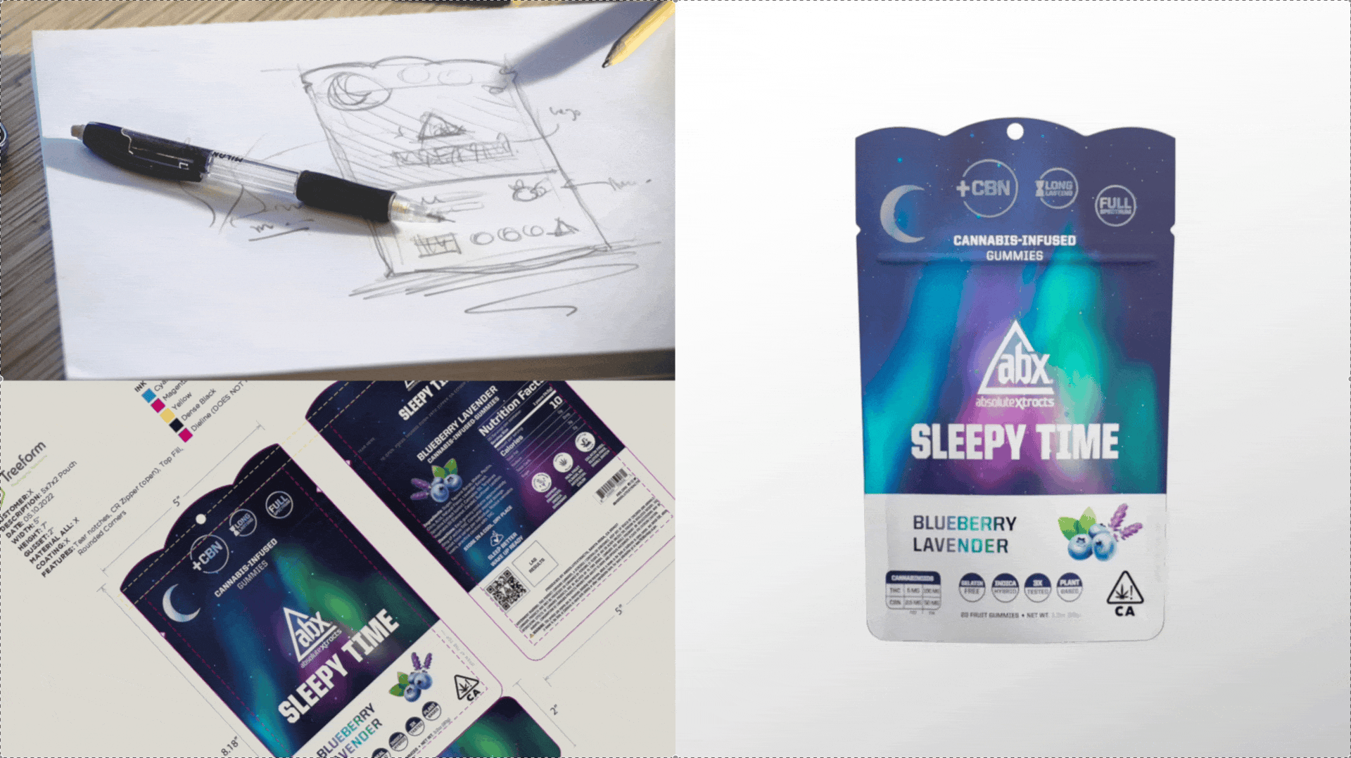
SLEEPY TIME ®
As a leader in the California cannabis industry, Absolute Xtracts (ABX®) specializes in high-quality extracts and concentrates. For the launch of their Sleepy Time® line, the brand required a visual identity that perfectly aligned with the product’s specific functional positioning. Under the creative leadership of Alex Viveros, in collaboration with the talented team at IVC Creative®, we developed a high-impact packaging system designed to dominate the retail shelf.
The creative direction draws deep inspiration from the serene beauty of the Aurora Borealis and the tranquility of the natural world. By blending a celestial color palette with organic textures, the design communicates a sense of calm and restorative rest. This strategic aesthetic not only differentiates the line from traditional extracts but also establishes an emotional connection with consumers seeking a premium, nature-inspired solution for wellness.
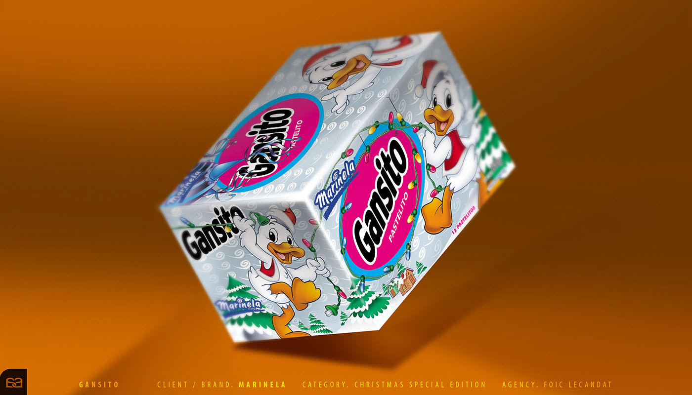
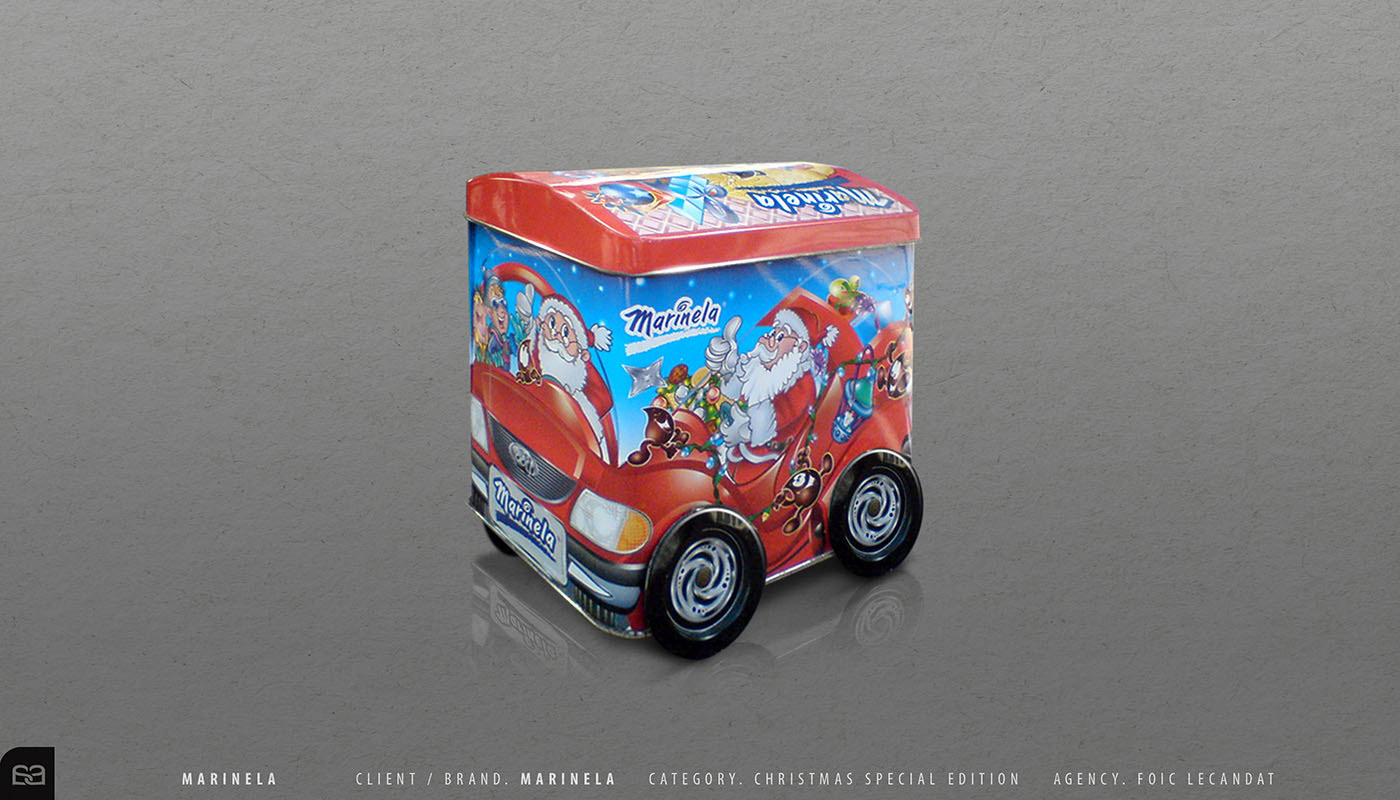
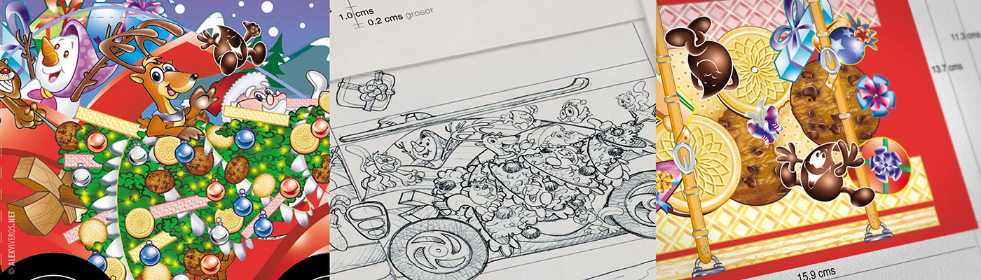
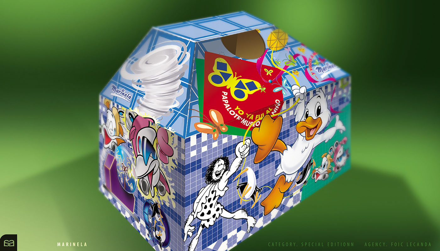
GRUPO BIMBO ®
Foic Lecanda®, a prominent Mexican agency managing high-stakes projects for Grupo Bimbo®, entrusted Alex Viveros with the design and development of an extensive portfolio of packaging for their diverse product lines. This collaboration involved executing complex briefs for commemorative editions and strategic co-branding alliances, requiring a high level of creative responsibility to maintain brand equity while introducing fresh, innovative visual narratives.
The challenge lay in the seamless integration of unique illustrative styles across multiple sub-brands, ensuring that each design captured market trends while delivering measurable commercial results. From conceptualization to final production, the work demanded a master-level understanding of packaging hierarchy and the ability to harmonize iconic brand characters with modern, trend-setting aesthetics for one of the world’s largest baking companies.
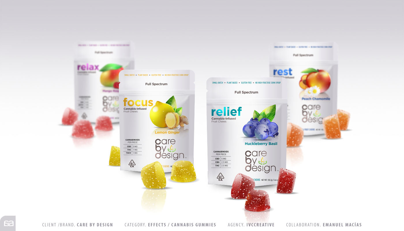
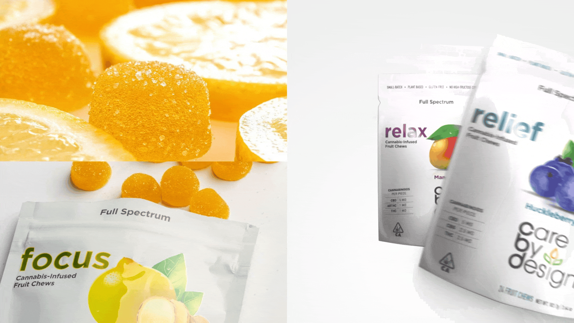
CARE BY DESIGN ® FULL SPECTRUM
For the launch of the Full Spectrum gummy line, Care By Design® sought a visual identity that could cut through the "visual noise" typical of the cannabis retail market. In a strategic collaboration with IVC Creative®, Alex Viveros led the conceptual and creative development of a packaging system defined by sophisticated minimalism. The objective was to pivot away from cluttered industry tropes and toward a clean, premium aesthetic that emphasizes purity and professional-grade quality.
The result is a distinctive and unique presence on the shelf. By utilizing a restrained design language, high-end finishes, and a focused typographic hierarchy, the packaging creates a notable differentiation in a crowded marketplace. This project demonstrates the power of "less is more," positioning the Full Spectrum line as the gold standard for consumers seeking clarity, trust, and a modern wellness experience.
This visual overhaul led to a substantial uptick in sales velocity and enhanced consumer loyalty, solidifying the brand’s authority as a leader in the premium cannabis-infused space.
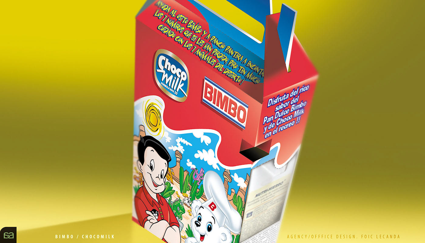
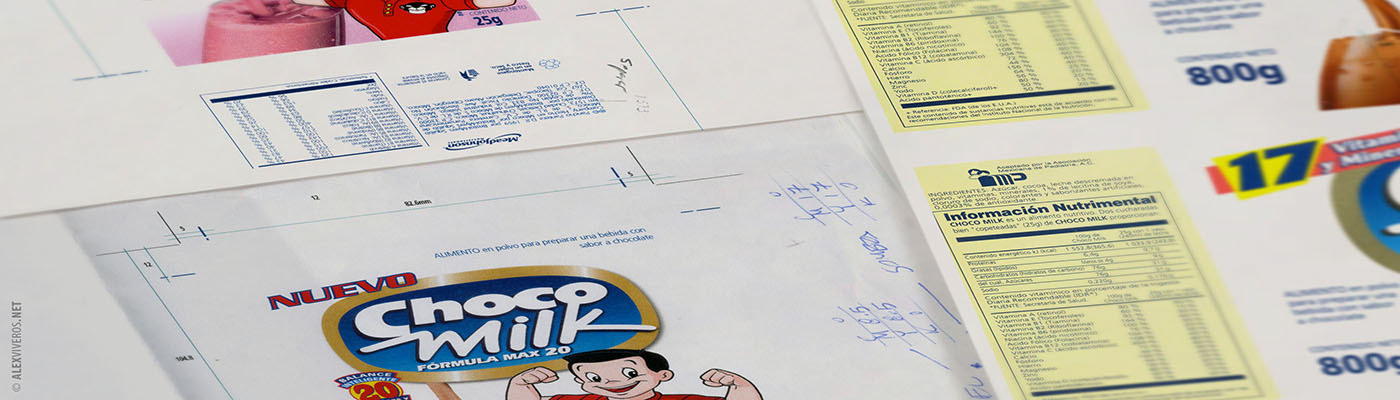
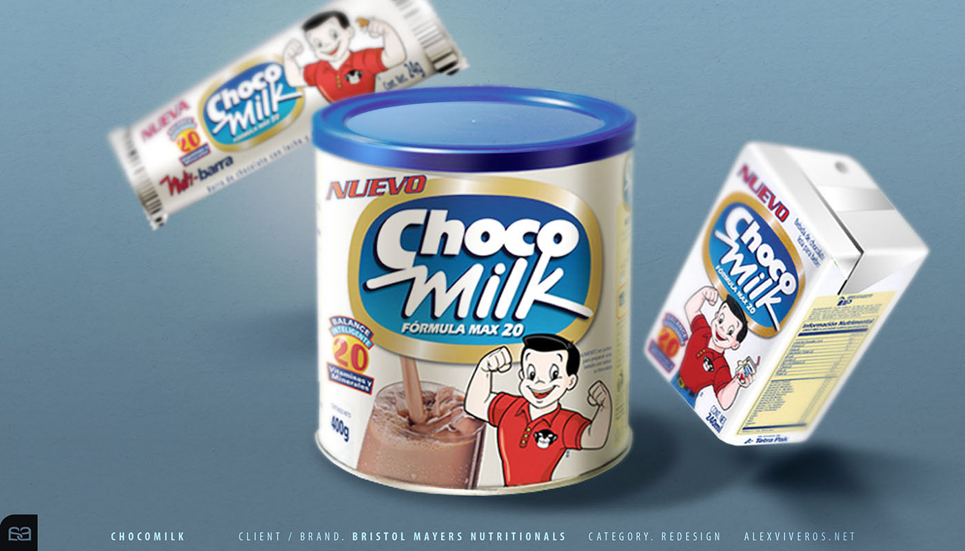
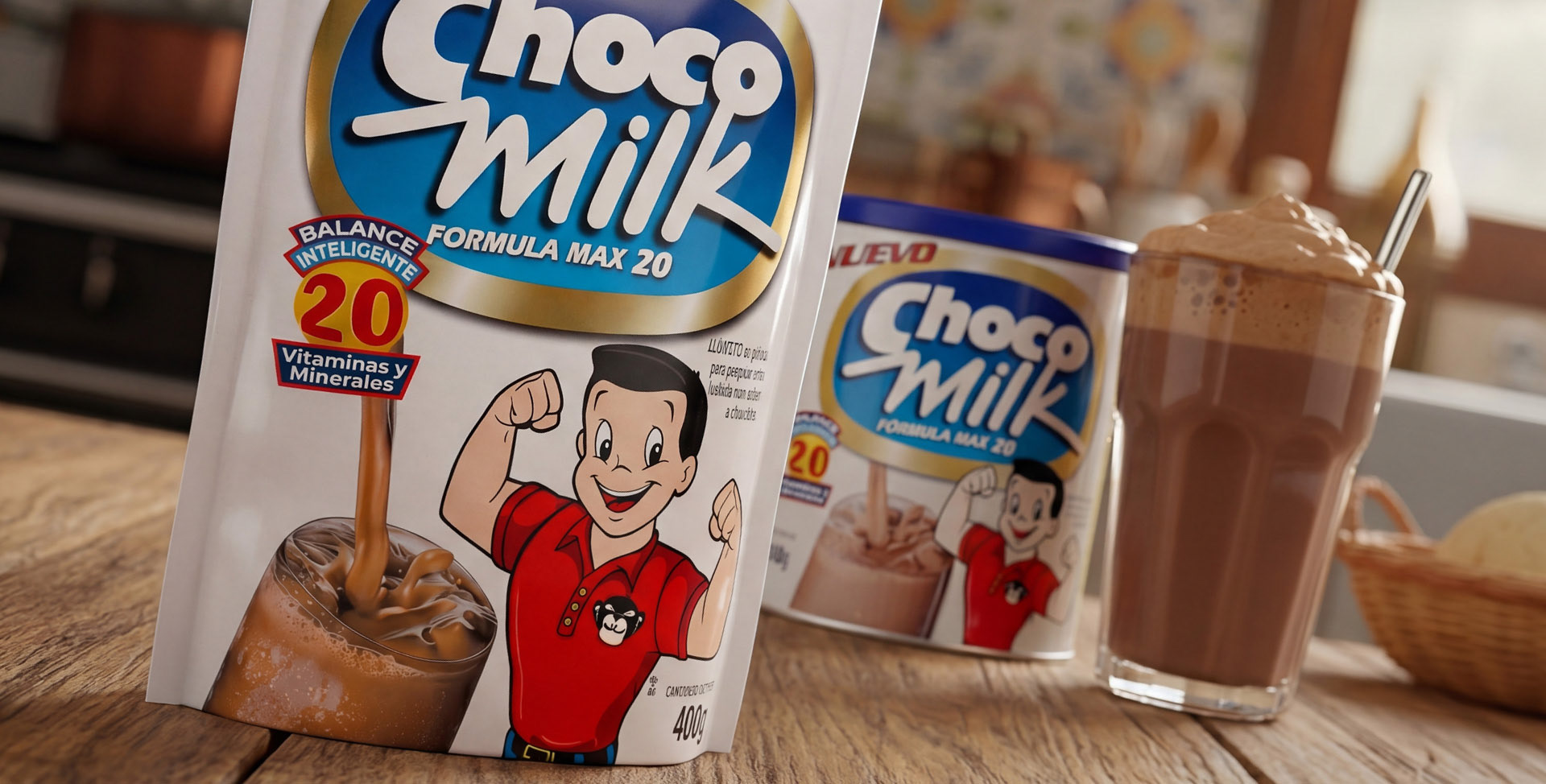
CHOCOMILK ®
When Mead Johnson Nutritionals® reclaimed the iconic ChocoMilk® brand for its major year 2000 relaunch, they turned to Alex Viveros to lead the creative revitalization of their entire product range. Having previously executed the successful visual refresh of the brand's legendary mascot, Pancho Pantera®, Alex was entrusted with translating this updated energy across multiple packaging formats. This project served as a definitive "masterclass" in commercial packaging, setting the strategic and technical standards that would define his professional trajectory.
The redesign was engineered to bridge the gap between tradition and modernity, ensuring that the brand’s beloved mascot resonated with a new generation of consumers without losing its historical equity. Decades later, the visual guidelines established during this collaboration continue to endure, with ChocoMilk® maintaining its position as a dominant market leader—a testament to the timelessness and commercial efficacy of the design strategy.
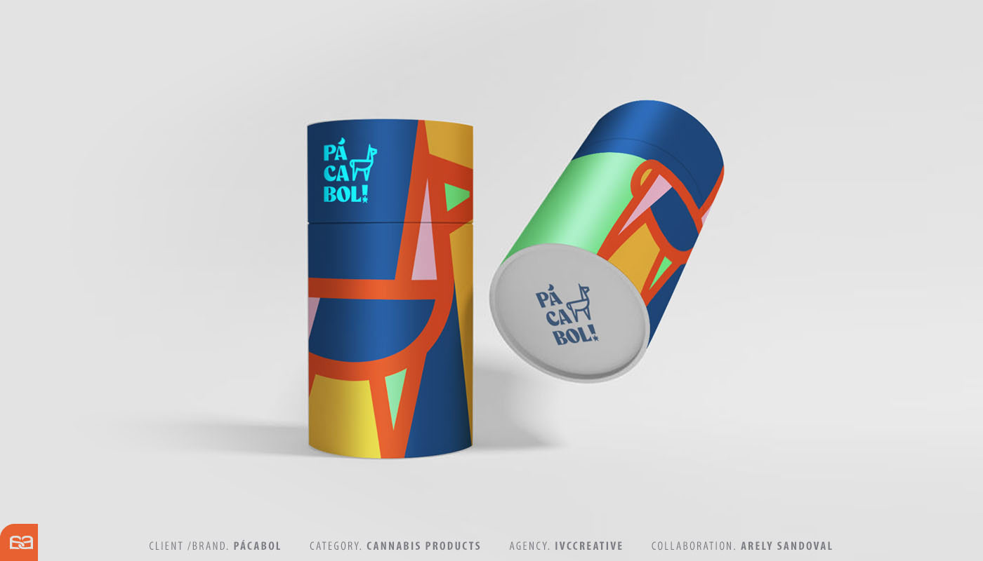
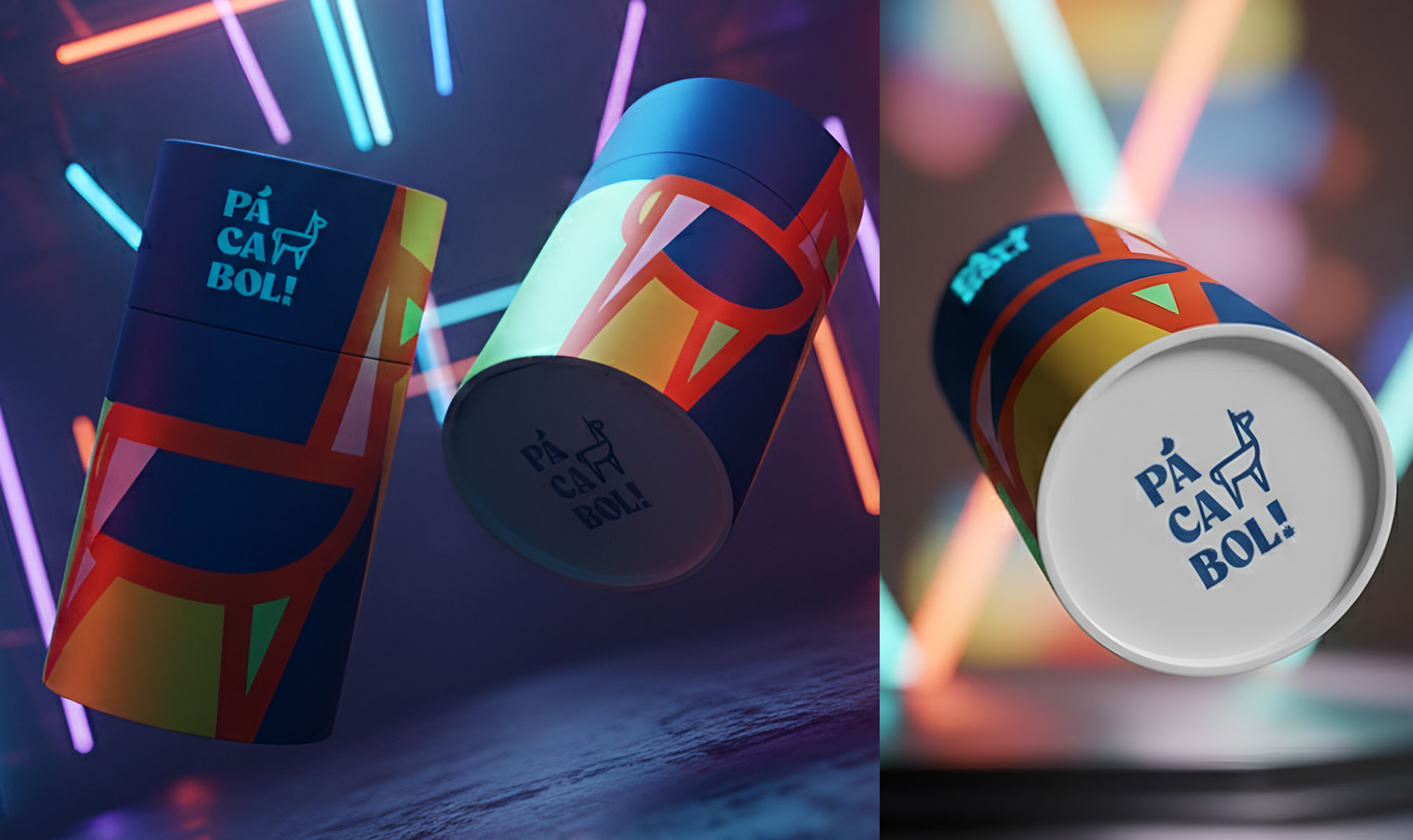
PACABOL ®
To celebrate the official launch of PACABOL, we developed a series of commemorative packaging designs engineered to showcase the brand’s conceptual prowess and original identity. Partnering closely with their creative team, Alex Viveros led the development of a distinctive and vibrant chromatic palette that breaks away from category conventions. This strategic use of color was designed to amplify the brand's disruptive spirit and ensure an immediate emotional connection with its audience.
The project resulted in a high-energy visual system that balances professional design precision with a playful, engaging soul.
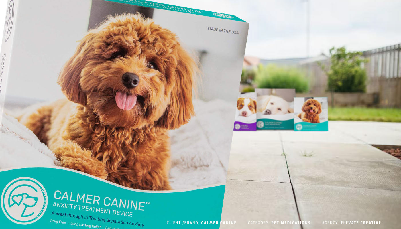
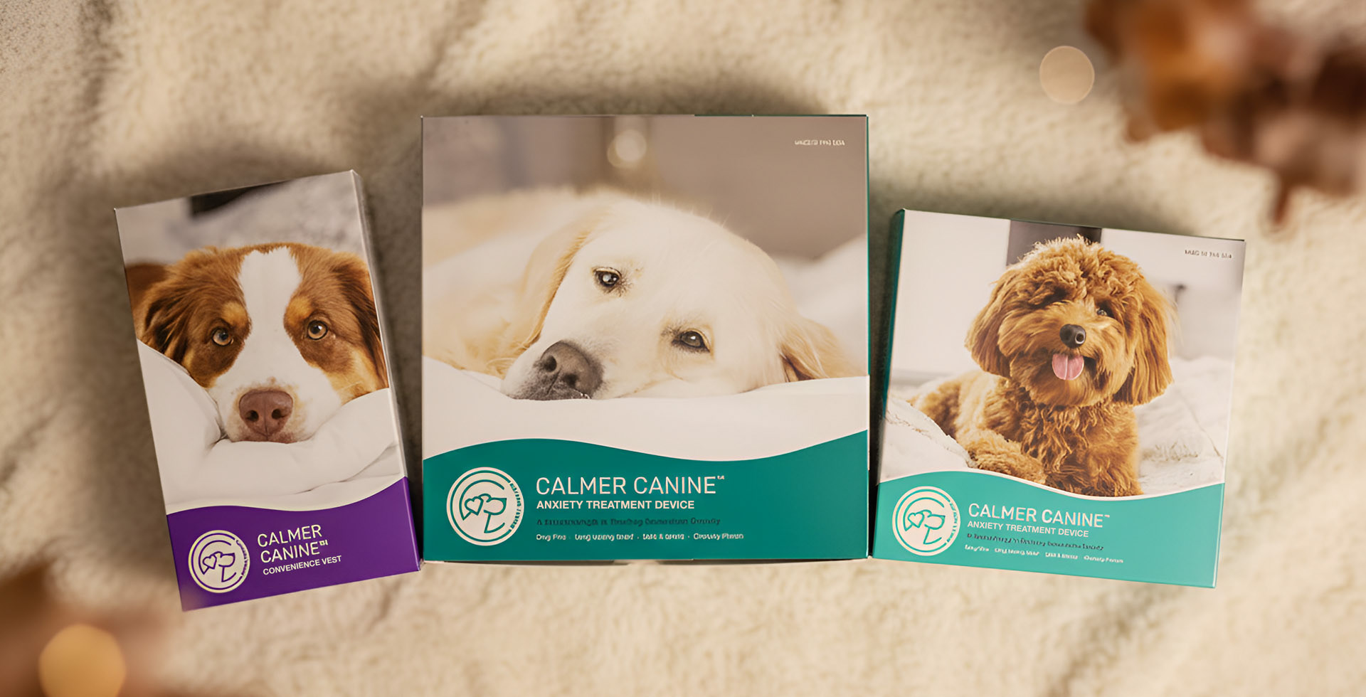
CALMER CANINE ®
To support the launch of its expanded product line, this revolutionary, drug-free, and non-invasive treatment system—designed to alleviate canine separation anxiety using pulsed electromagnetic field (tPEMF) signals—entrusted Alex Viveros with the development of a packaging system that mirrors the calming nature of its technology.
The resulting design balances clinical efficacy with a gentle, approachable aesthetic. By utilizing fluid, undulating patterns and a meticulous typographic layout, the packaging communicates both the sophistication of the tPEMF science and the brand’s core promise: restoring peace of mind for both pets and their owners. This project stands as a prime example of how technical medical solutions can be translated into premium, lifestyle-oriented consumer goods.
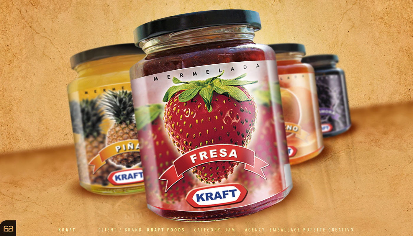
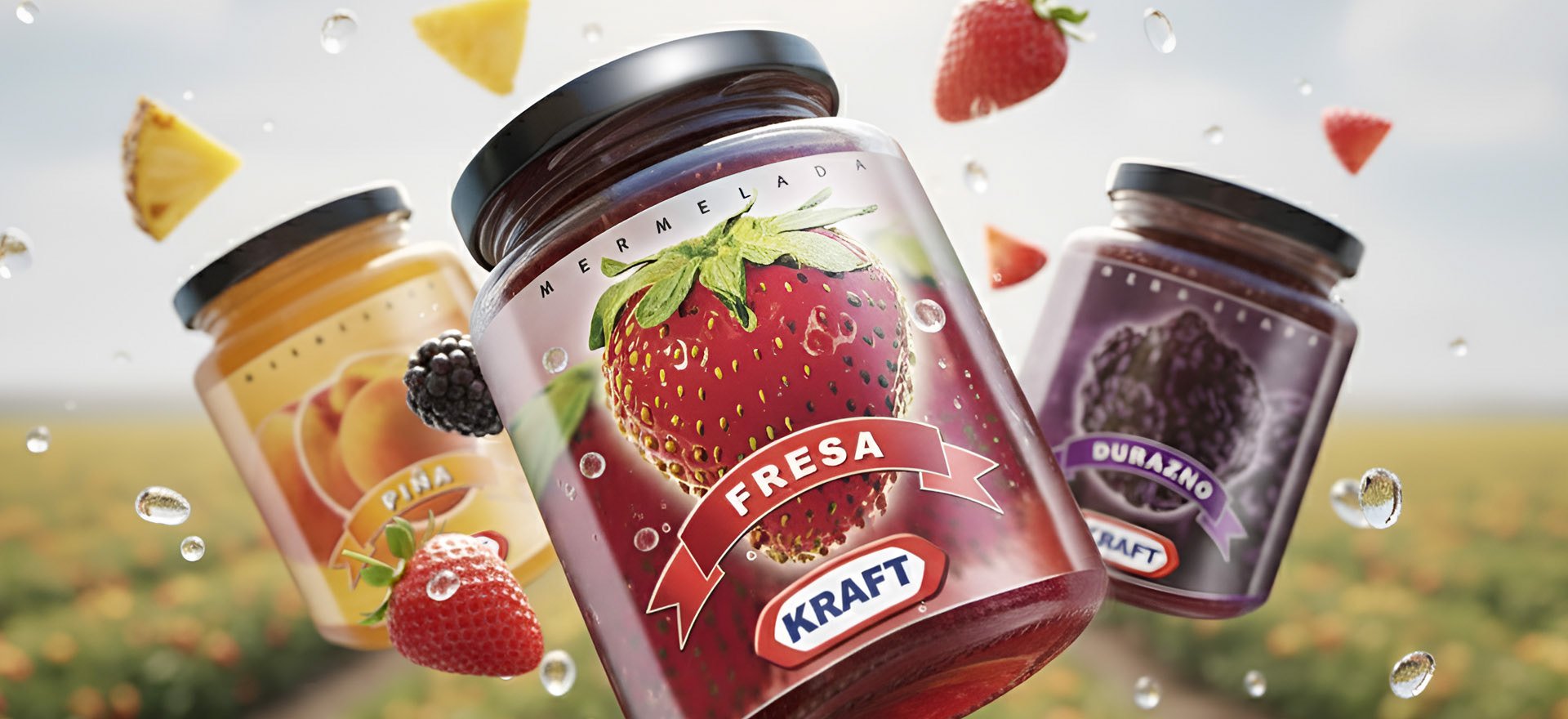
KRAFT JAMS ®
The Strategic Challenge In a relentless pursuit of brand evolution, The Kraft Heinz Company® aimed to pivot its jam portfolio toward a freshness-centric and natural positioning. The objective was to establish a clear competitive advantage by disrupting the traditional category visual codes.
The strategic intervention involved a visual hierarchy shift, elevating the fruit to the foreground as the undisputed "hero" of the packaging. This aesthetic approach reinforces an organic narrative, evoking a premium sensory experience for the modern consumer.
The result was a significant boost in on-shelf standout and brand resonance. This refresh successfully solidified Kraft's authority in the category, aligning the product with contemporary consumer demands for authenticity and natural ingredients.
The result was a significant boost in on-shelf standout and brand resonance. This refresh successfully solidified Kraft's authority in the category, aligning the product with contemporary consumer demands for authenticity and natural ingredients.
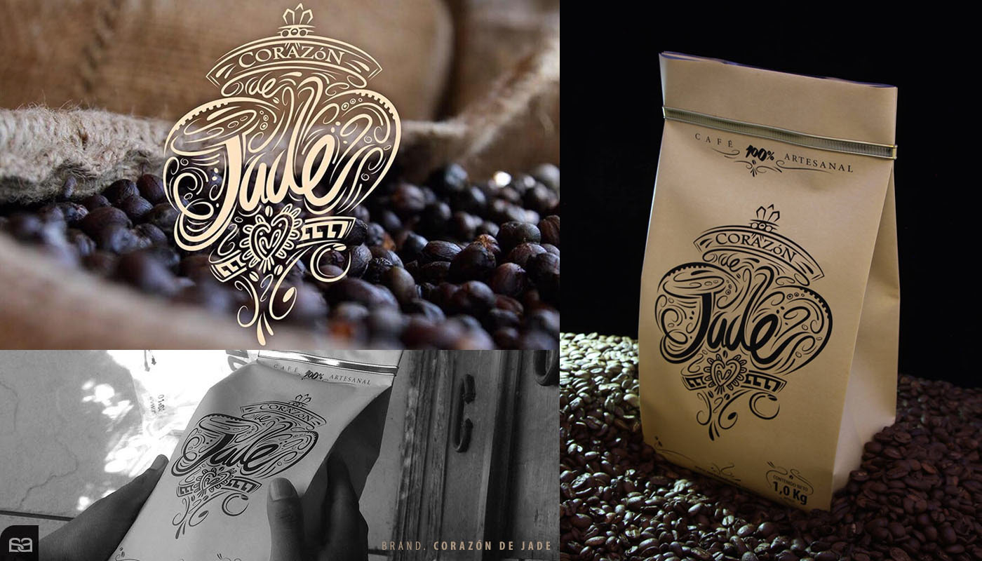
CORAZÓN DE JADE ®
Corazón de Jade México® is a profound social initiative led by Josué Ramírez España and a dedicated group of Mexican citizens committed to transforming the lives of indigenous communities and their children through education and empowerment. A cornerstone of this mission is the development of their own artisanal coffee brand—a laudable project designed to foster economic self-sustainability within the highlands of Chiapas.
Driven by a commitment to pro-community advocacy, Alex Viveros collaborated on this initiative by creating a unique and distinctive typographic identity. The design balances cultural heritage with a modern, artisanal aesthetic, ensuring that the brand’s visual storytelling is as impactful as its social mission. This project reflects a core pillar of Alex’s professional philosophy: leveraging high-level design to amplify the voice of social causes and create tangible change.
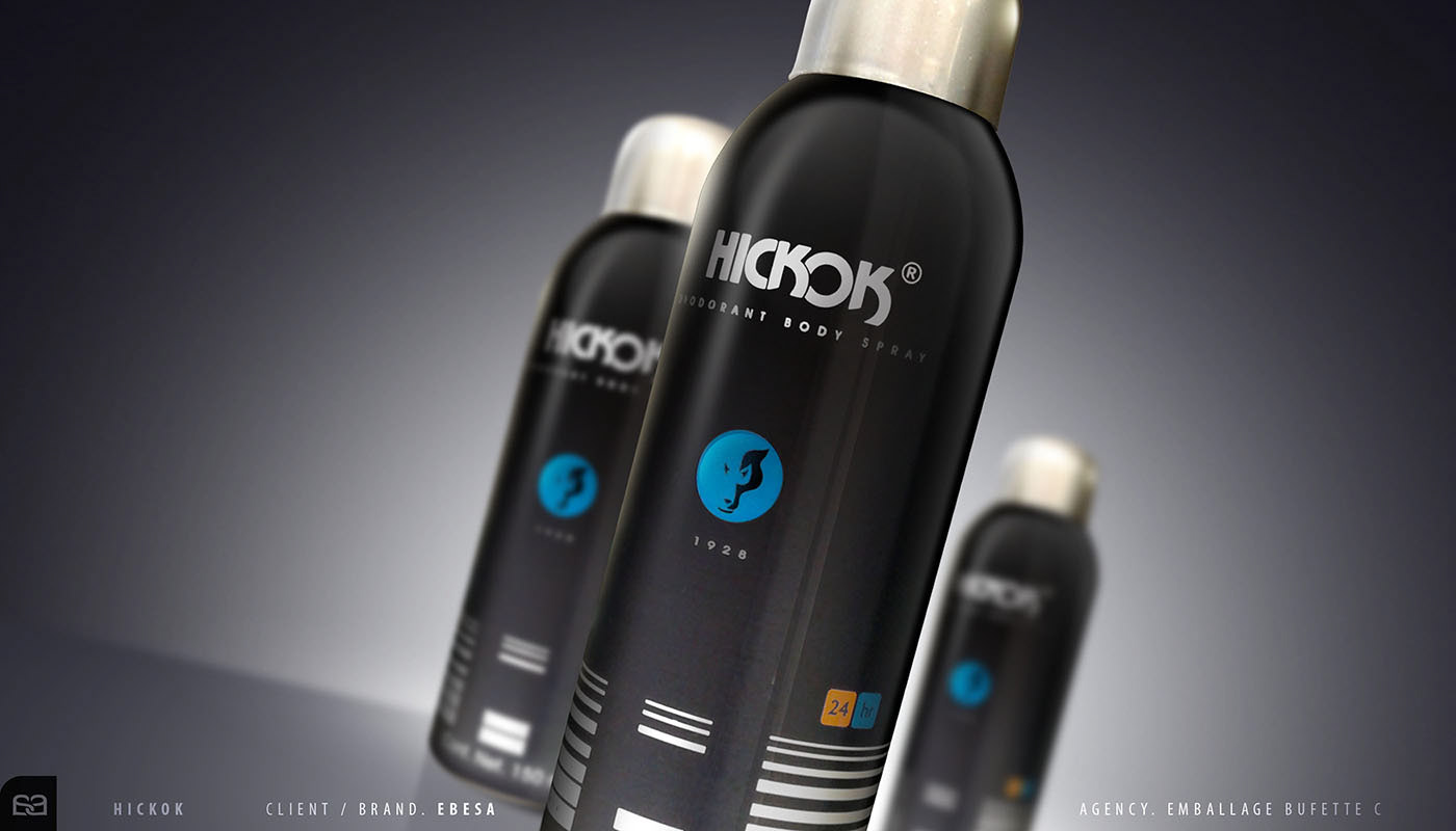
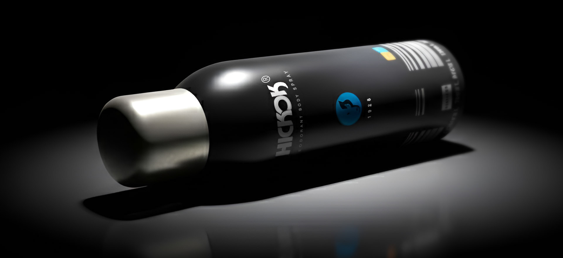
HICKOK ®
Established in 1928, Hickok® has long been an icon of craftsmanship, seamlessly blending traditional leatherwork techniques with contemporary trends in personal care. To mark a new era, the brand sought a visual identity refresh that would amplify its presence while honoring its historical roots, turning to Alex Viveros to engineer a design that captured this evolved brand soul.
The strategic intervention centered on a "Minimalist Authority" aesthetic. We introduced a matte-black monochromatic vessel, designed to serve as a sophisticated canvas for the brand’s iconic logo. By strategically placing the hallmark as a primary design element, we established an immediate narrative of trust and timeless elegance. This approach strips away the noise, allowing the brand’s legacy to become its most distinctive visual asset.
The resulting bold, dark silhouette created a premium vacuum in a crowded category, successfully repositioning Hickok® as a contemporary leader in the masculine grooming space.