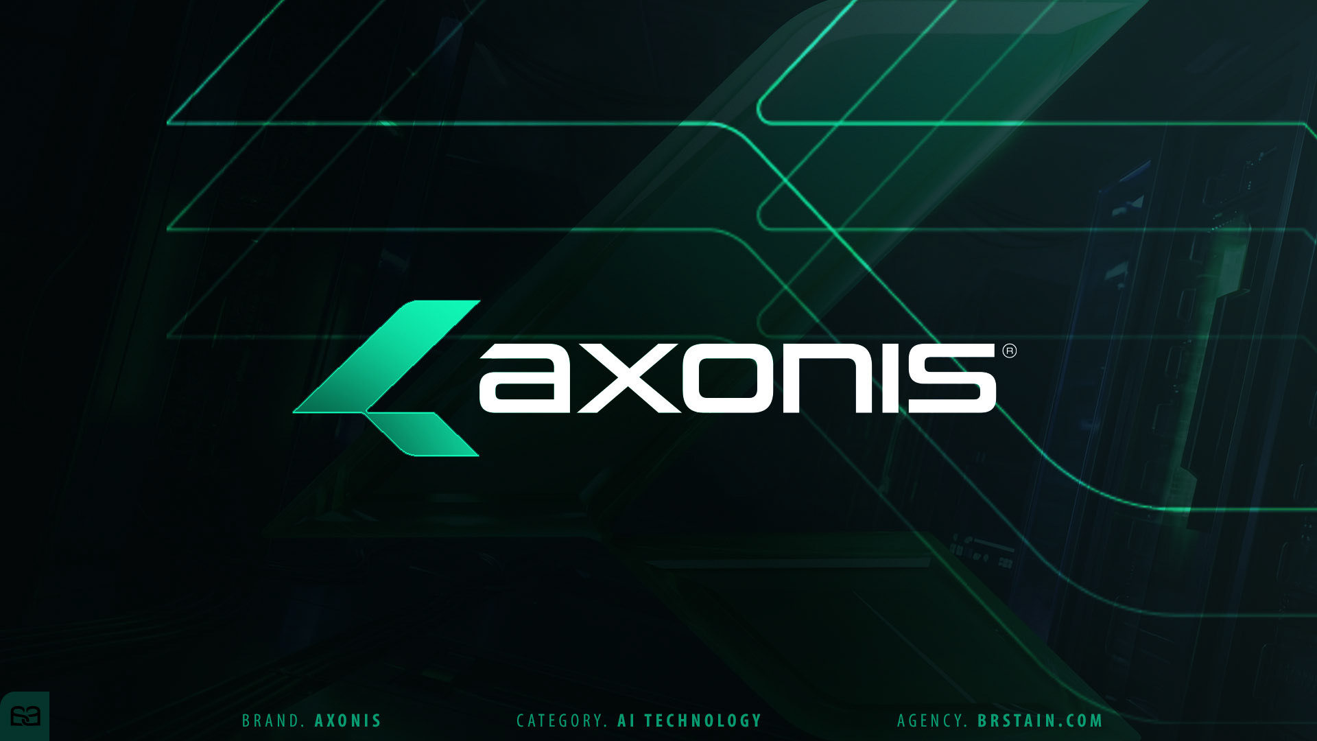
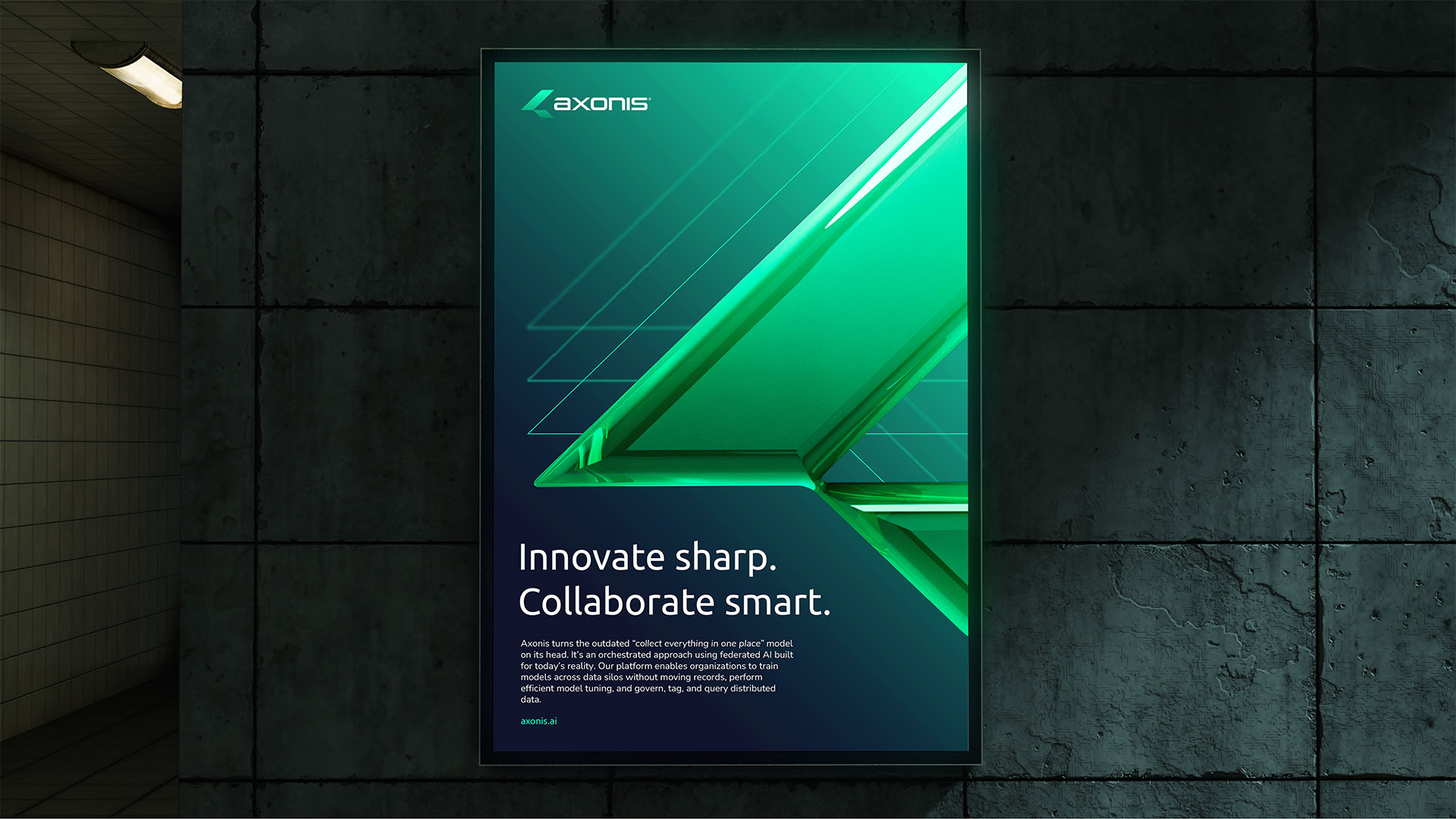
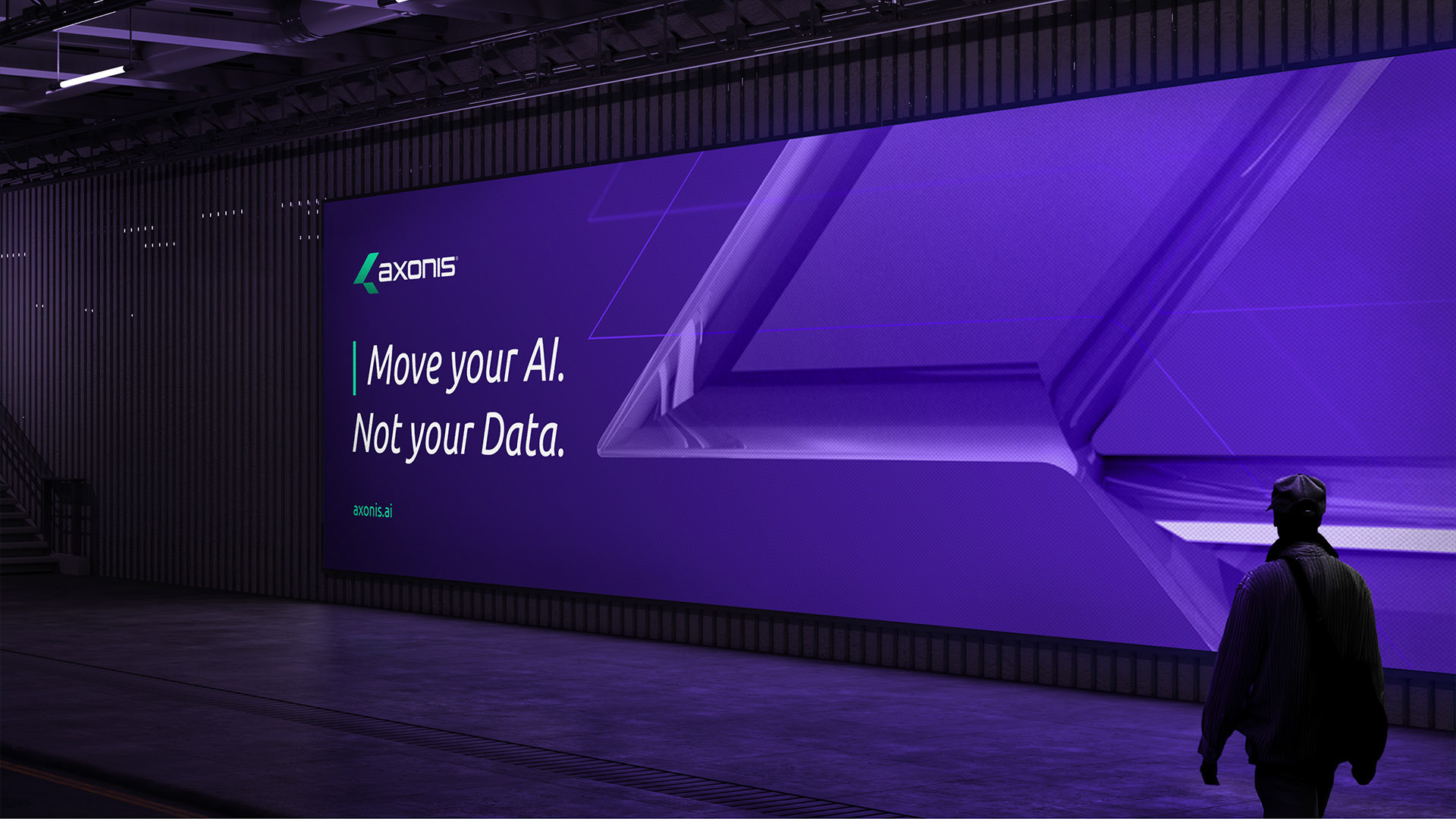
AXONIS ®
To bring its transformative federated AI technology to market, we built a brand designed for the future of data and intelligence—clear, assertive, and engineered to compete within a rapidly evolving landscape.
Led by Alex Viveros and Brstain.com, in strategic partnership with Bluetext®—Axonis’ parent agency—we developed a complete brand platform spanning naming, messaging, logo, visual identity, and digital experience.
This collaborative effort resulted in a refined and scalable system that positions Axonis® as a bold new leader in federated AI, supported by a cohesive brand architecture built to grow with the technology it represents.


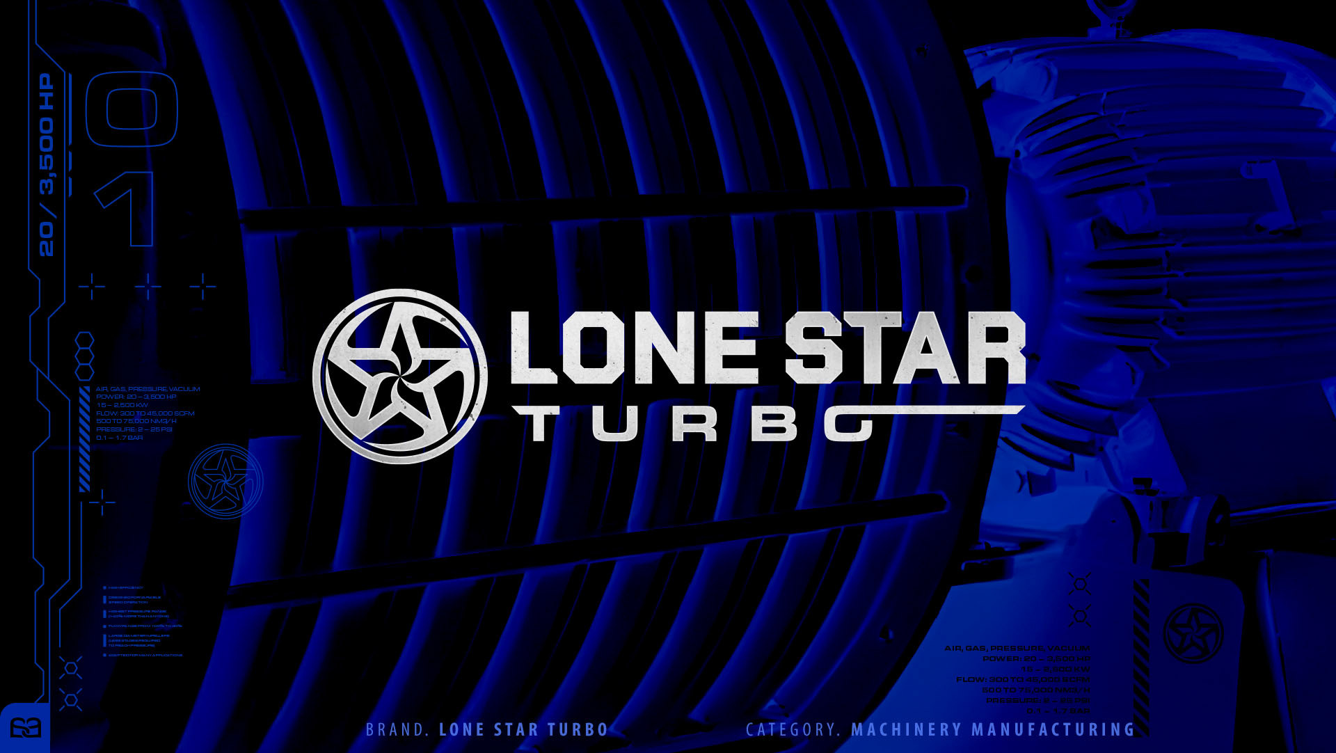
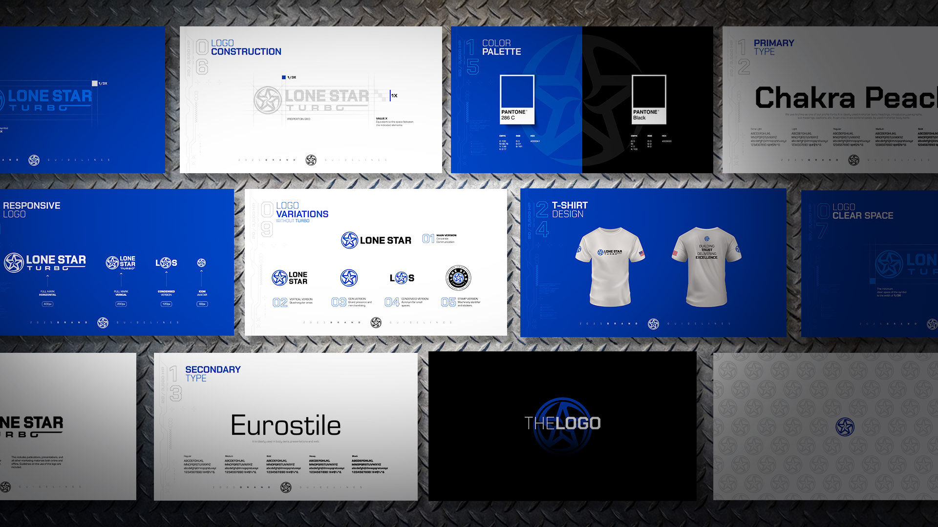
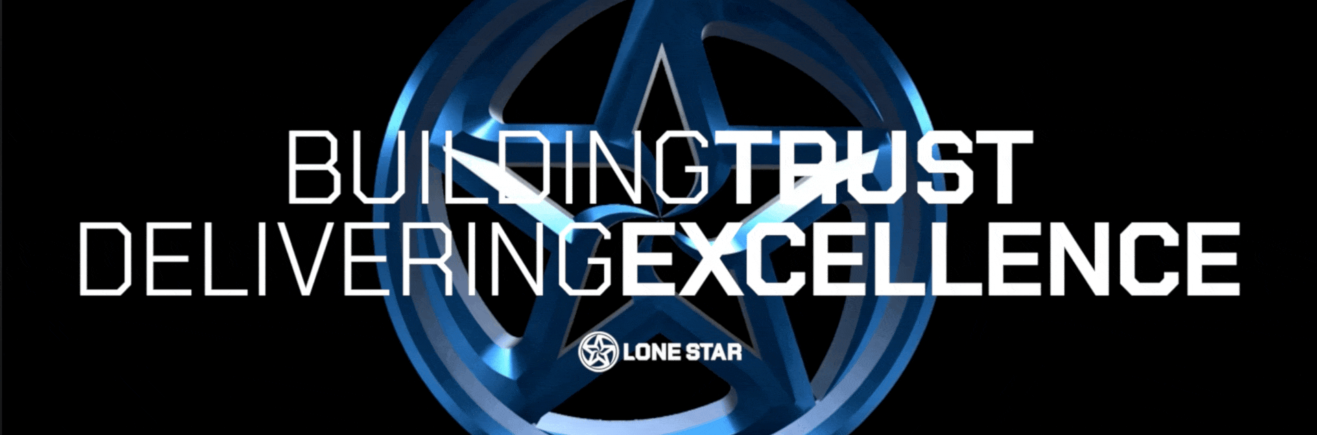
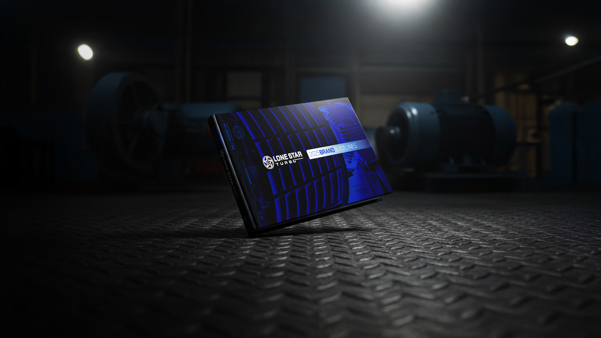
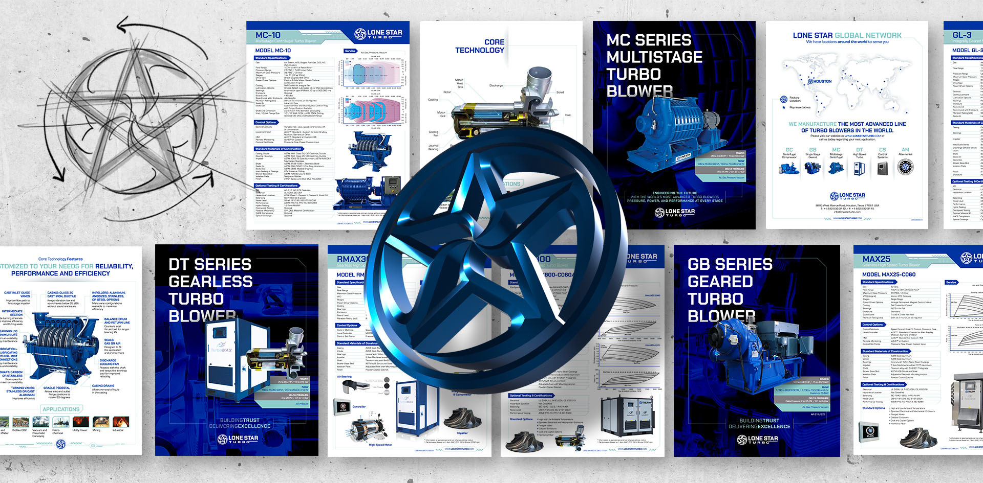
LONE STAR TURBO ®
A global leader in the design and manufacturing of centrifugal blowers, compressors, and advanced control systems, headquartered in Houston, Texas, Lone Star Turbo® serves critical industries including water, petrochemicals, mining, and carbon capture—where performance and reliability are essential.
As the company set its sights on expanding its market reach and reinforcing its global positioning within these highly competitive sectors, a comprehensive brand evolution became essential.
Led by Alex Viveros, the identity system centers on a disciplined, functional icon that translates engineering precision, rotational energy, and industrial strength into a clear visual architecture. Designed to scale across equipment, digital platforms, and international applications, the system reinforces brand consistency while sharpening differentiation in a demanding industrial landscape.

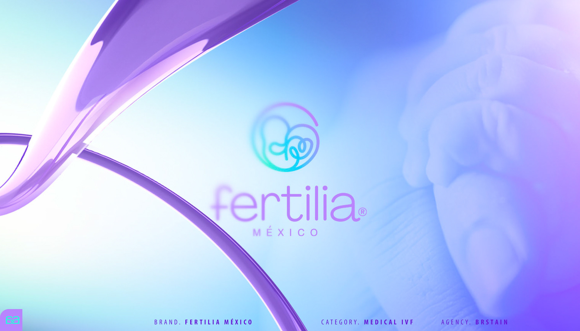
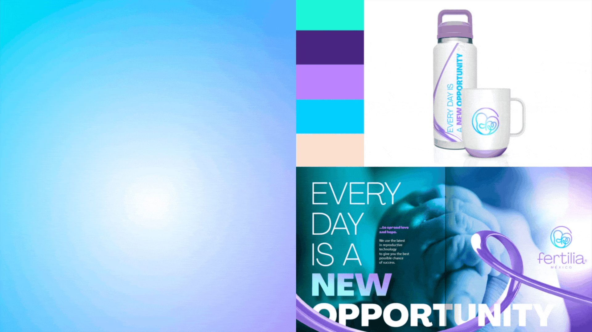
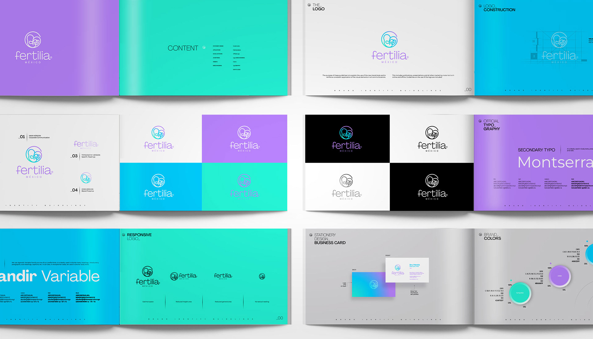
FERTILIA ®
A specialized fertility and reproductive health center focused on advanced treatments supported by clinical precision and human care. As the brand expanded its services and strengthened its medical positioning, clarity and differentiation within a sensitive, highly competitive sector became critical.
Invited to collaborate through Brstain.com®, the identity system was developed under the creative direction of Alex Viveros to balance scientific rigor with emotional intelligence. The visual language combines structural discipline with subtle organic elements, creating a brand presence that communicates trust, precision, and empathy—while remaining scalable across clinical environments, digital platforms, and patient communication.

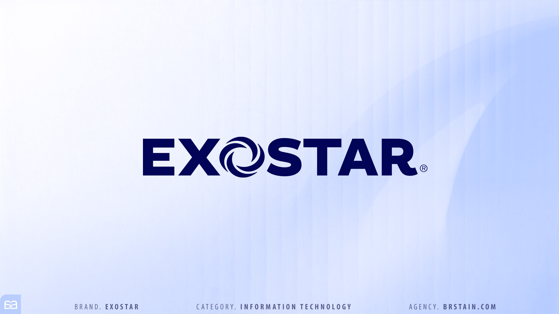
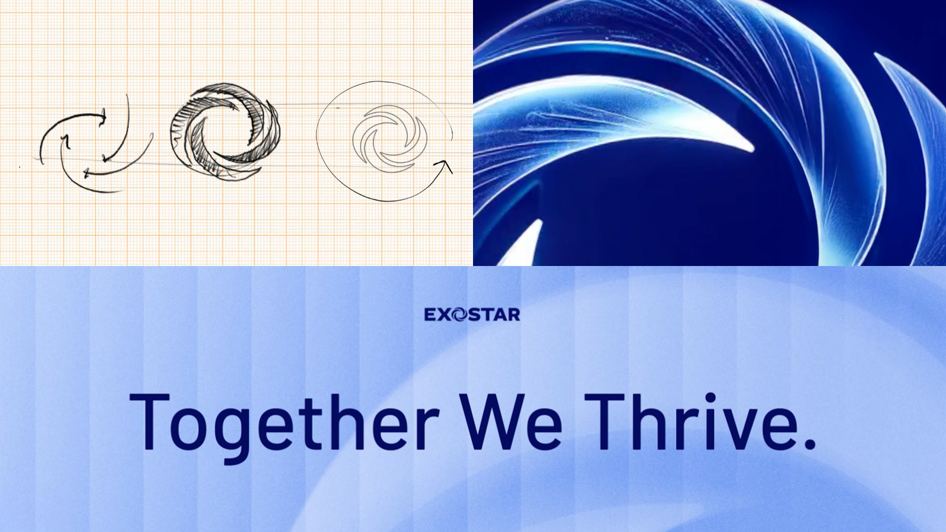
EXOSTAR ®
A technology-driven company focused on secure digital ecosystems and advanced data exchange solutions for highly regulated industries. As the brand strengthened its positioning across complex global markets, a more precise and scalable identity system became essential.
Through the collaboration framework led by BlueText®, and invited by Brstain.com® to direct the creative development, the identity system was built under the direction of Alex Viveros to reflect security, connectivity, and structural intelligence. The visual language translates digital architecture into a disciplined and adaptable system—designed to perform consistently across enterprise platforms, global communications, and high-level stakeholder environments.
Through the collaboration framework led by BlueText®, and invited by Brstain.com® to direct the creative development, the identity system was built under the direction of Alex Viveros to reflect security, connectivity, and structural intelligence. The visual language translates digital architecture into a disciplined and adaptable system—designed to perform consistently across enterprise platforms, global communications, and high-level stakeholder environments.

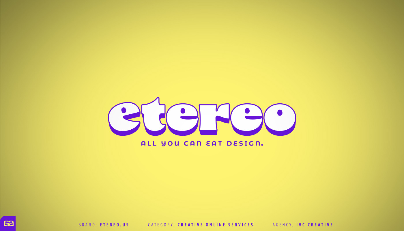
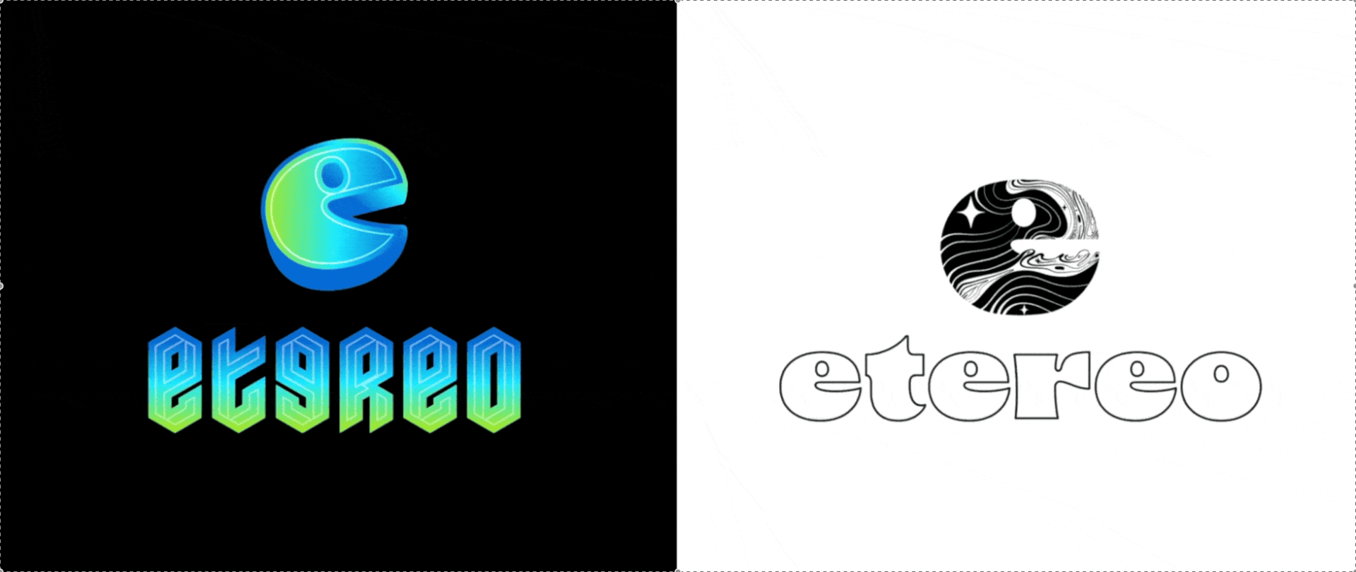
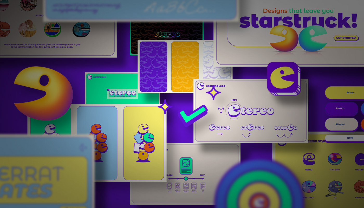
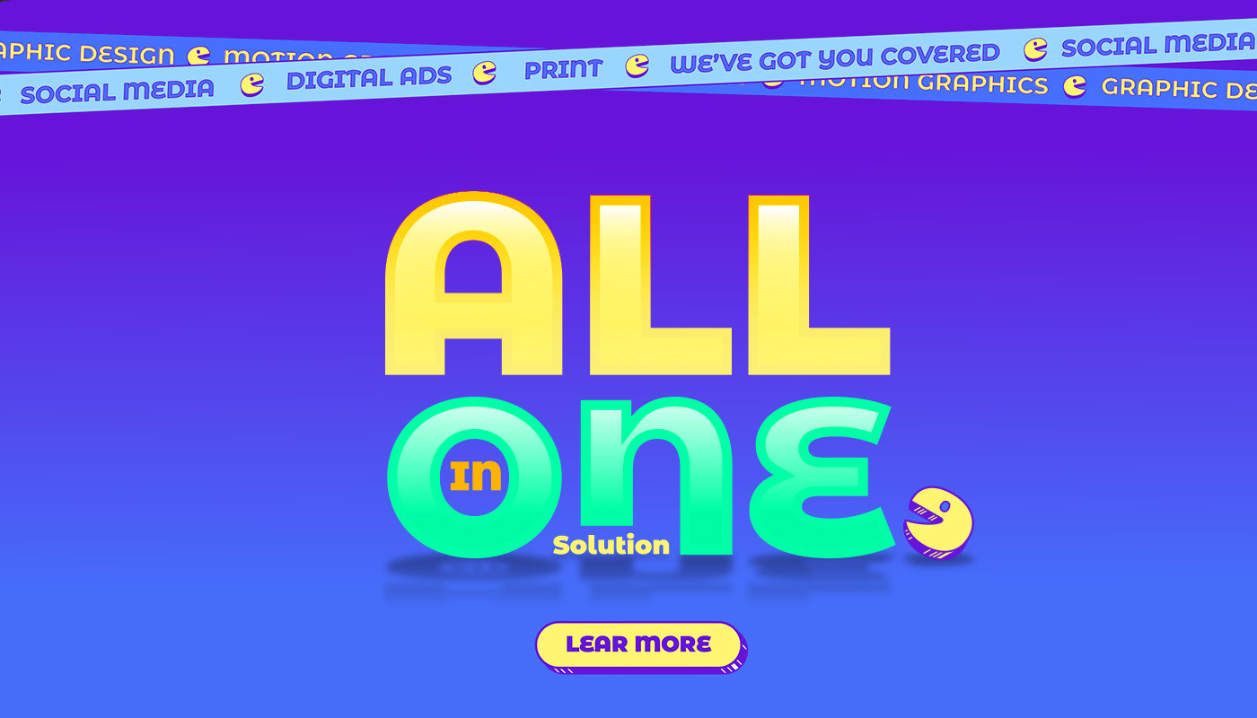
ETEREO ®
Created as a subscription-based platform, Etereo® was designed to operate as an extension of in-house creative teams. Offering design, branding, advertising, and 3D services, the model provides companies with an agile, always-on creative partner.
The concept was born from a “hunger” to devour every challenge our clients bring to the table. Built around a playful, mutable idea, we developed a flexible brand system that adapts across touchpoints while maintaining a distinct personality. It was a great experience, developed in close collaboration with the team at IVC Creative®.


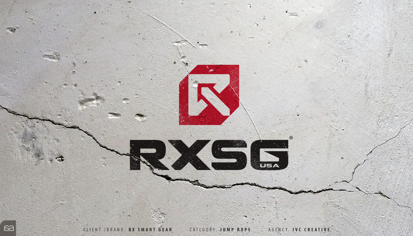
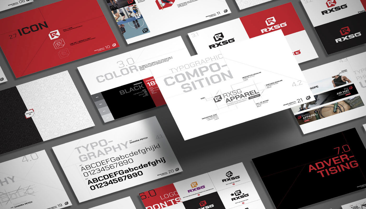
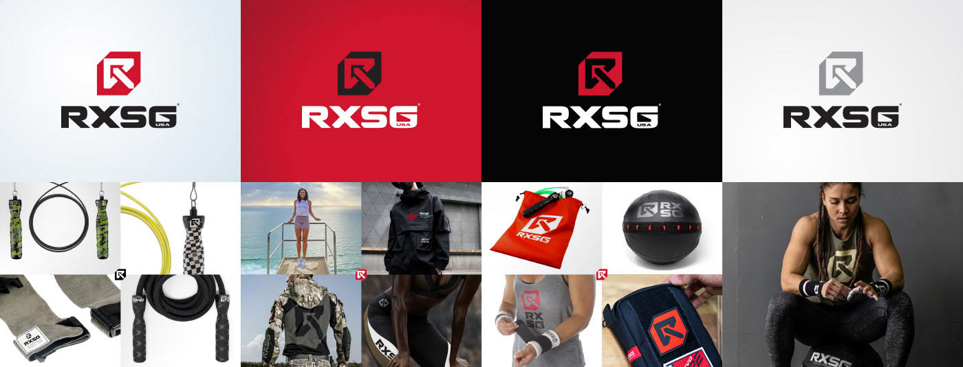
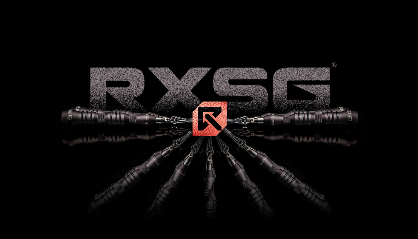
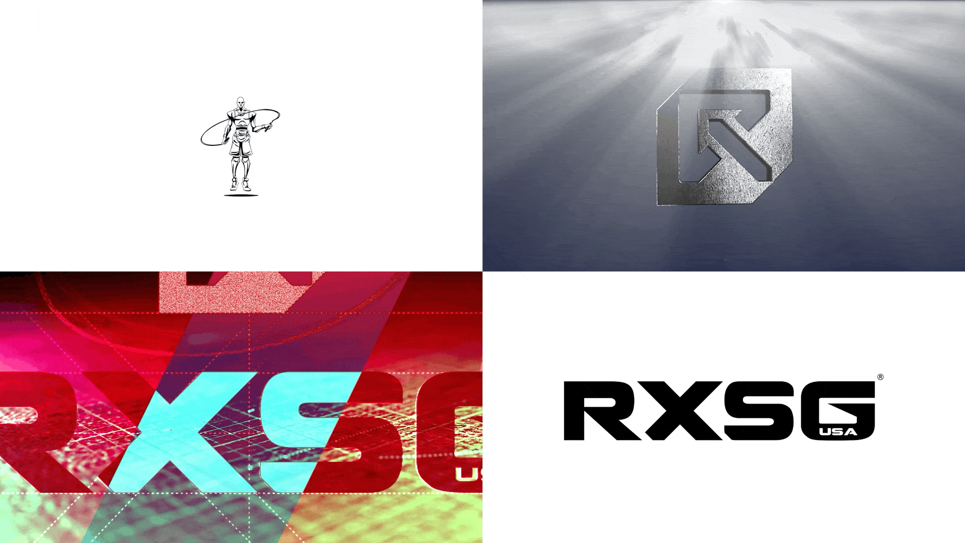
RXSG ®
RX Smart Gear (RXSG) is one of the world’s leading jump rope brands. We conducted a symbolic exploration to define an icon that could embody the strength, energy, and technology at the core of the brand—while delivering the memorability required in today’s highly competitive market.
The result is a bold, solid mark built from sharp angles and straight inner cuts, reinforcing a sense of power, precision, and performance.


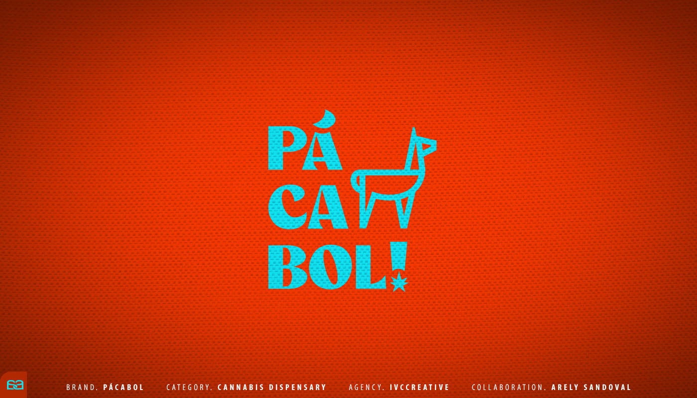
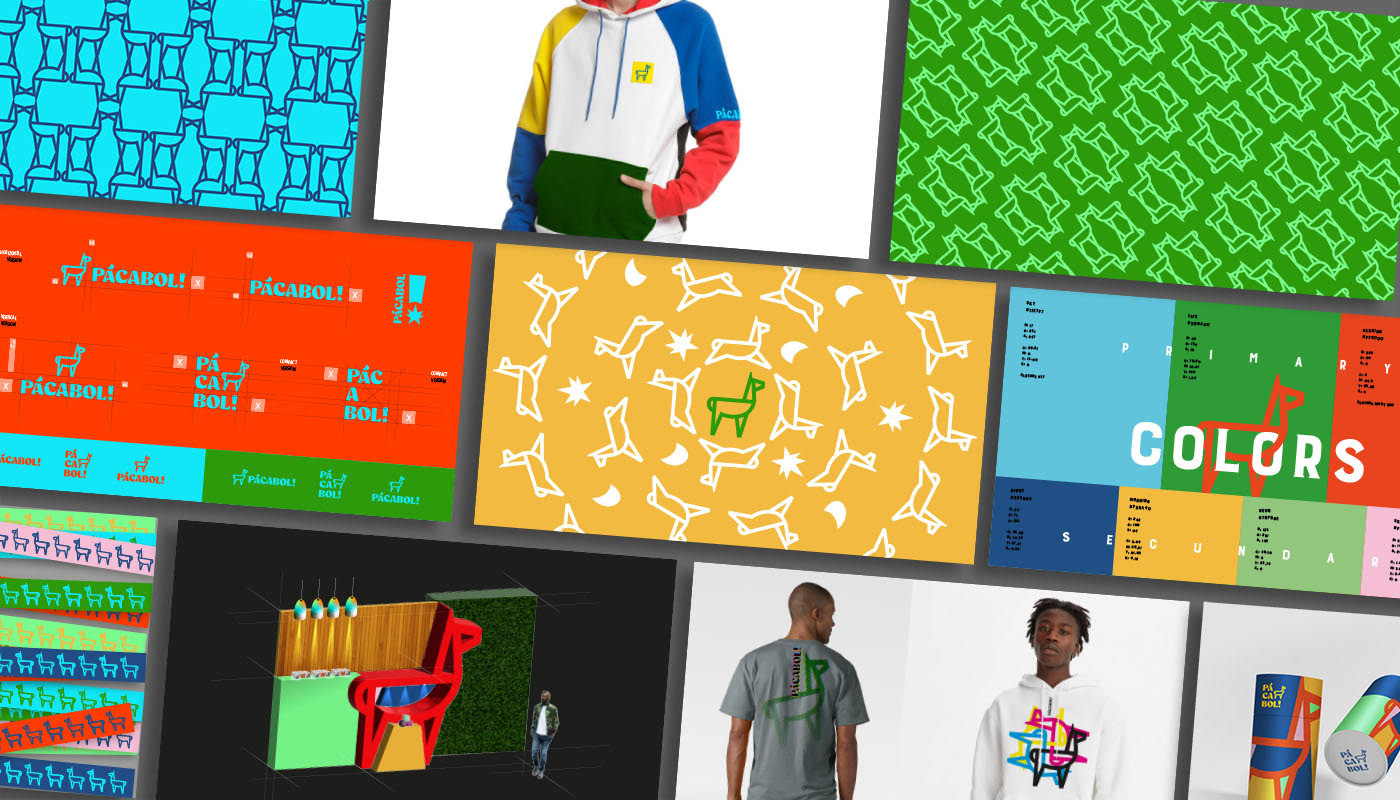
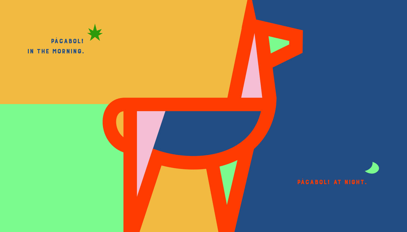
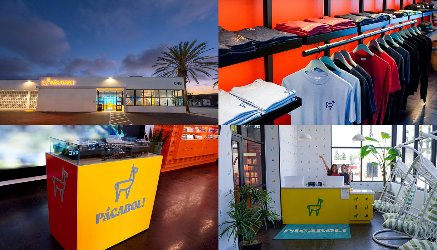
PACABOL ®
A sister brand to March and Ash®, one of Southern California’s leading cannabis dispensary groups, this concept was developed to offer a more playful and unexpected in-store experience. Inspired by the phrase “pack a bowl,” the brand embraces a fresh, retro, and irreverent attitude—crafted for a target audience looking for something different.
Bold typography, punchy color, and graphic simplicity come together in a flexible identity system designed to stand out across key retail touchpoints.
It was an incredible experience bringing this project to life in collaboration with Arely Sandoval, part of the team at IVC Creative®.

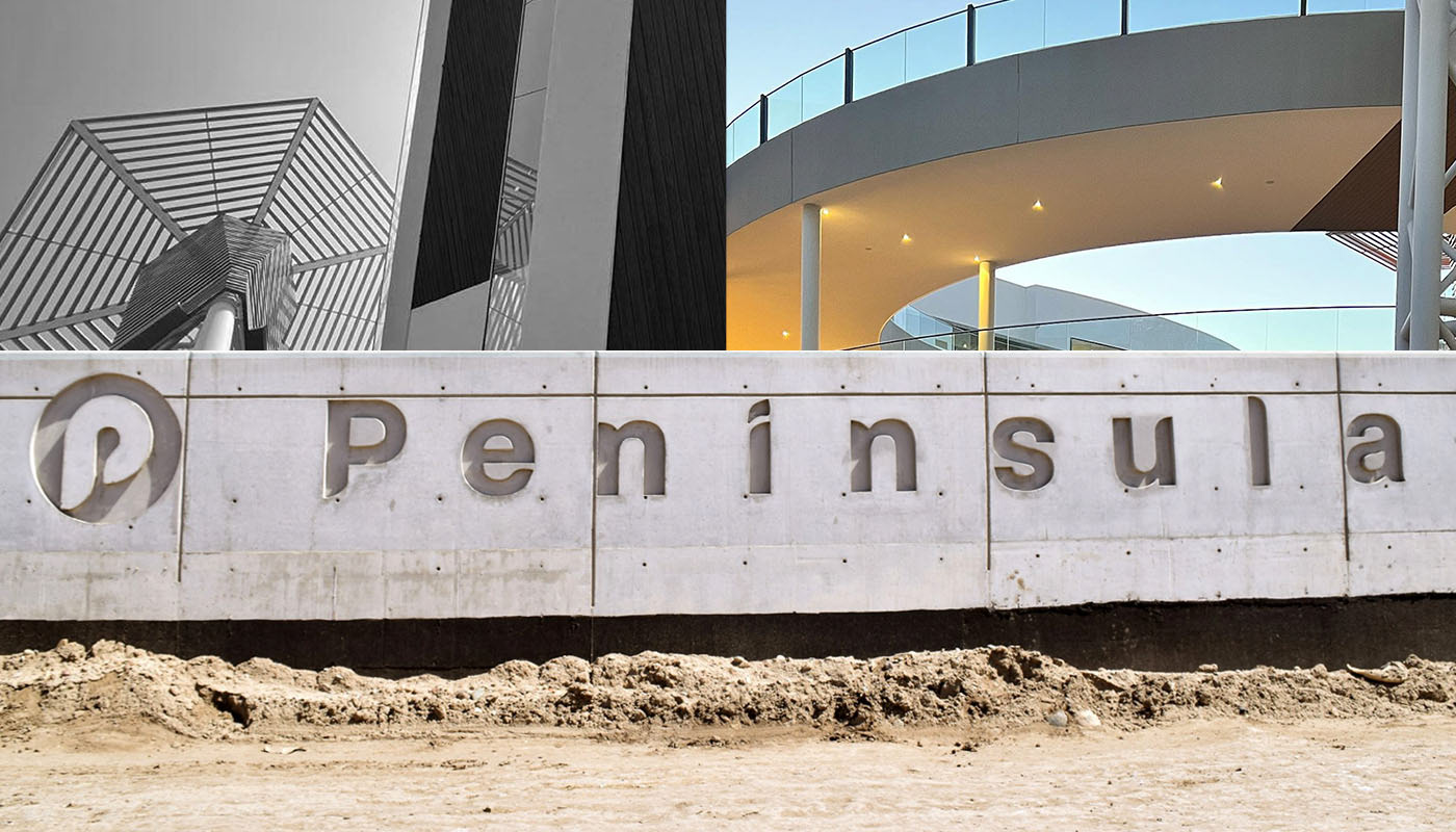
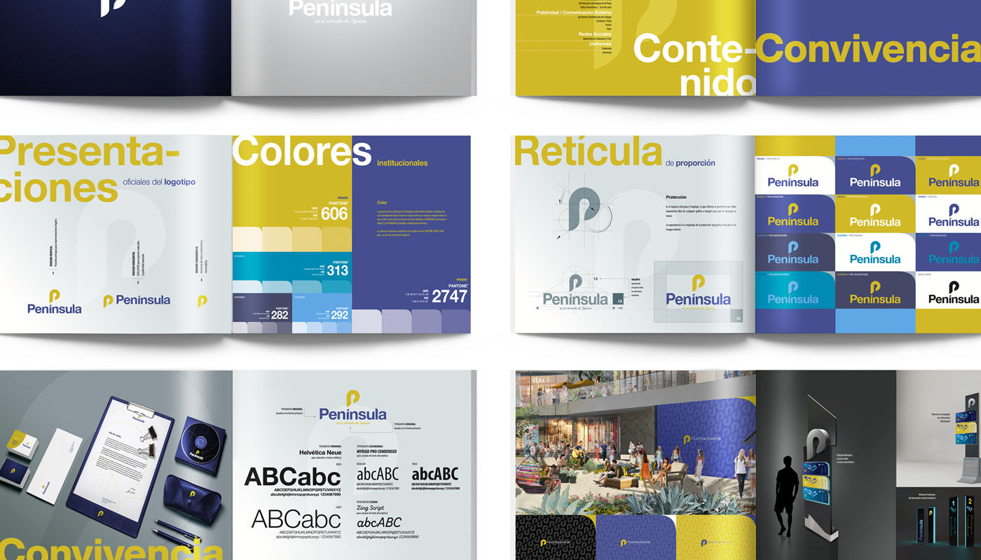
PENÍNSULA ®
The original emblem for Baja California’s largest shopping mall. The goal was to create a clean, minimal identity—one that feels elevated and contemporary, while connecting with an audience that values quality, comfort, and a refined lifestyle.
The result is a simple, timeless mark designed to scale across the full retail ecosystem. Designed by Alex Viveros, the identity is modern, welcoming, and built to feel premium and effortlessly recognizable.
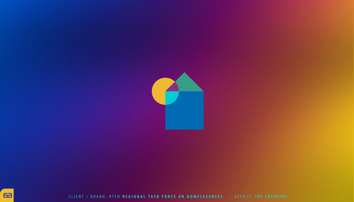
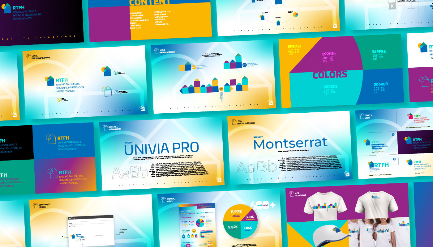
RTFH ®
San Diego’s Regional Task Force on Homelessness (RTFH®) is a nonprofit organization that serves as the countywide hub for data, technical analysis, and strategic planning to address homelessness across San Diego County, California.
Capturing both mission and complexity within a single symbol was a key challenge. The icon is built from a set of basic geometric forms that converge into an abstract whole—evoking the idea of “home” as both a universal need and a structure that can take many shapes.

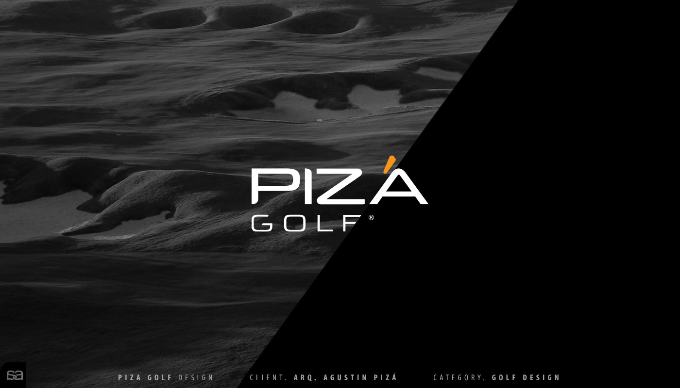
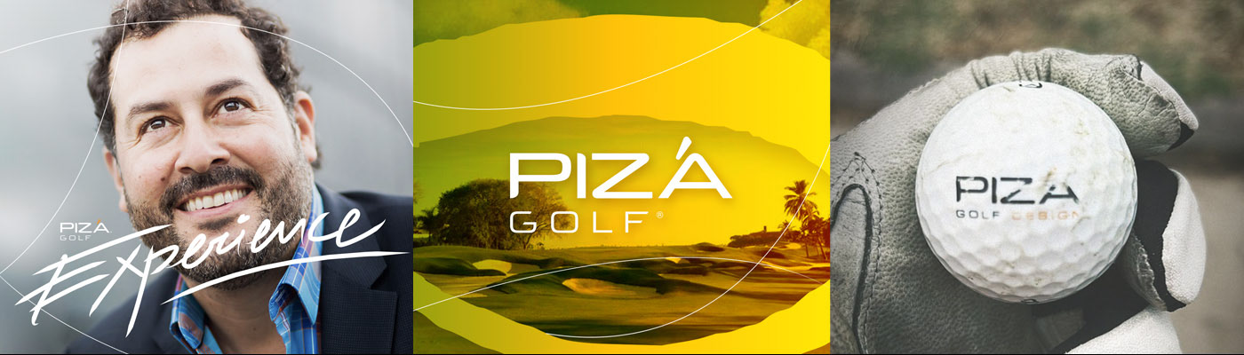
PIZÁ GOLF ®
For over 15 years, Pizá Golf® has trusted Alex Viveros to lead its creative direction and visual communication. We developed a custom brand system rooted in bespoke typographic interactions—crafted specifically for the name—and a visual flow that mirrors the rhythm, precision, and elegance of the game.
A defining element of the identity is the accent on the Á: a distinctive signature that elevates the wordmark, adds character, and sets the brand apart with a refined, memorable gesture.
All early concepts, as well as the brand’s strongest taglines, were created by Alex Viveros in collaboration with the firm’s founder and leader, the respected architect Agustín Pizá.
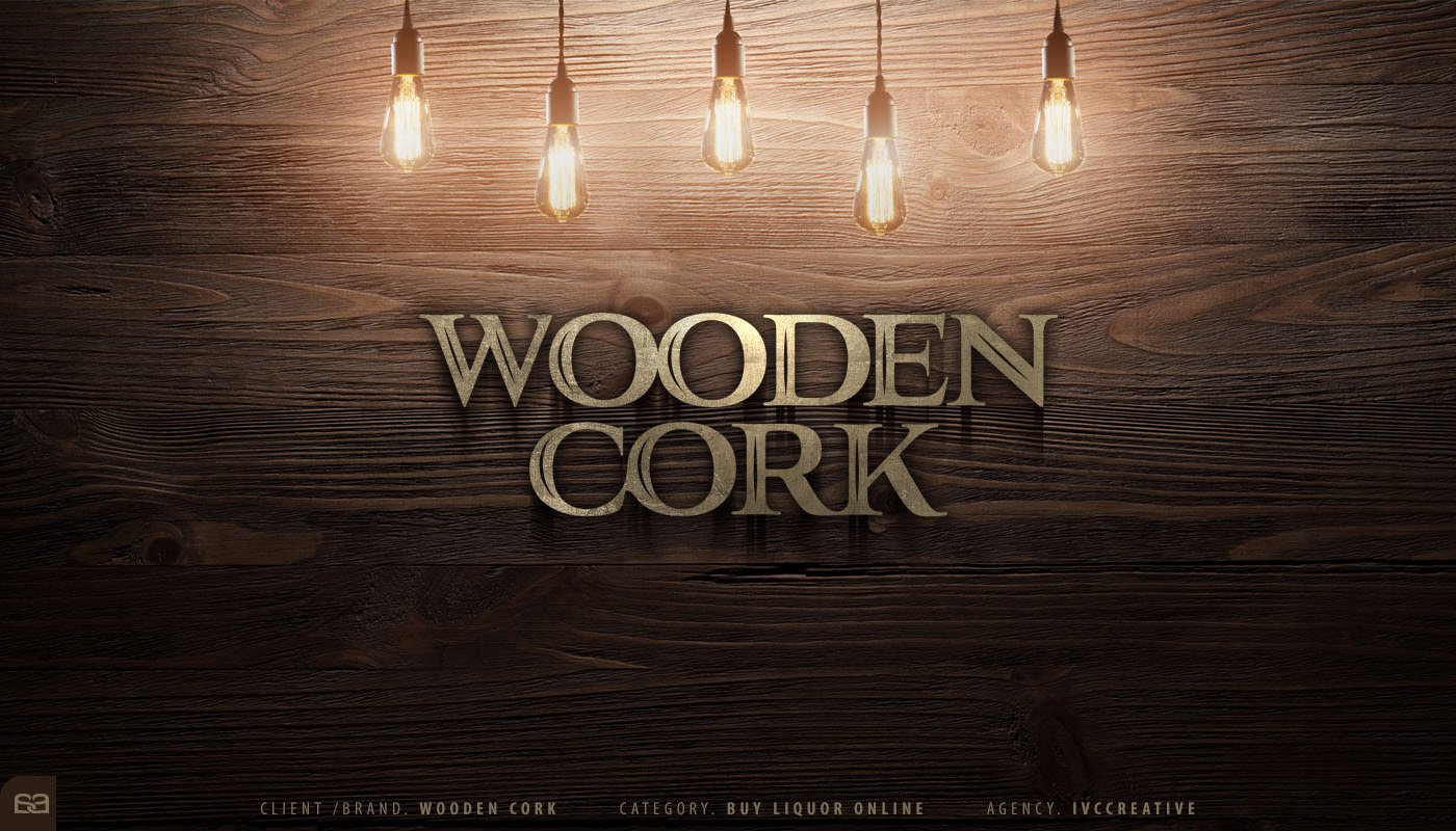
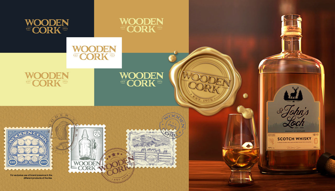
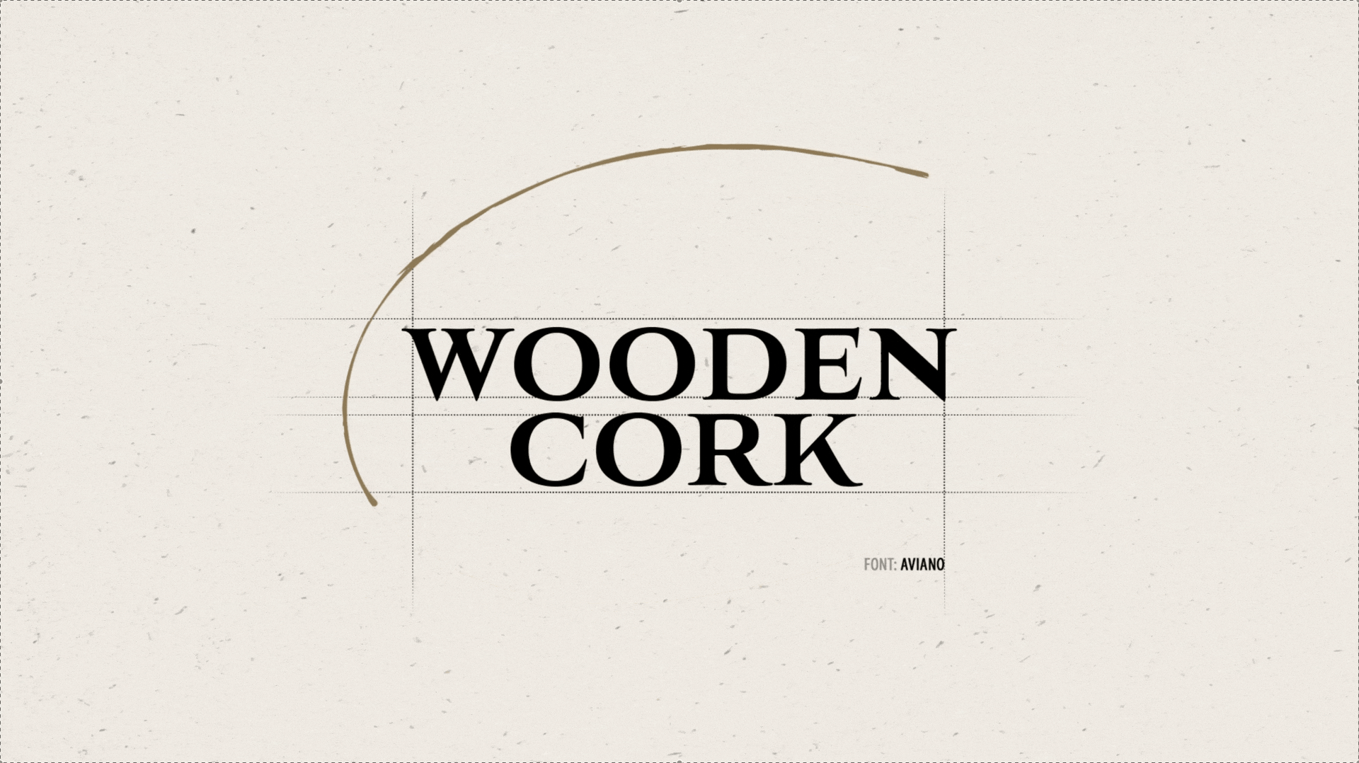
WOODEN CORK ®
As one of the leading online liquor retailers, Wooden Cork® sought a rebrand that could elevate its presence while honoring the heritage behind the name. The direction focused on refining the brand’s classic character—bringing more sophistication to its typography and visual language while amplifying the nostalgia and trust built over years of service.
The strengthened illustrated elements add depth and authority to the mark, reinforcing a sense of craftsmanship and timeless credibility. Led by Alex Viveros, the team at IVC® Creative delivered a refreshed identity that feels both iconic and contemporary—designed to perform across premium retail and digital touchpoints.
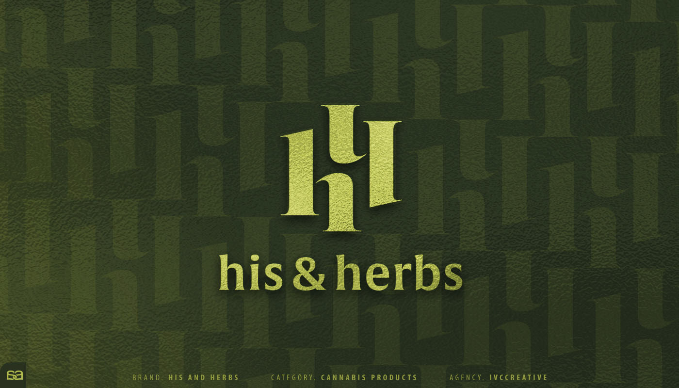
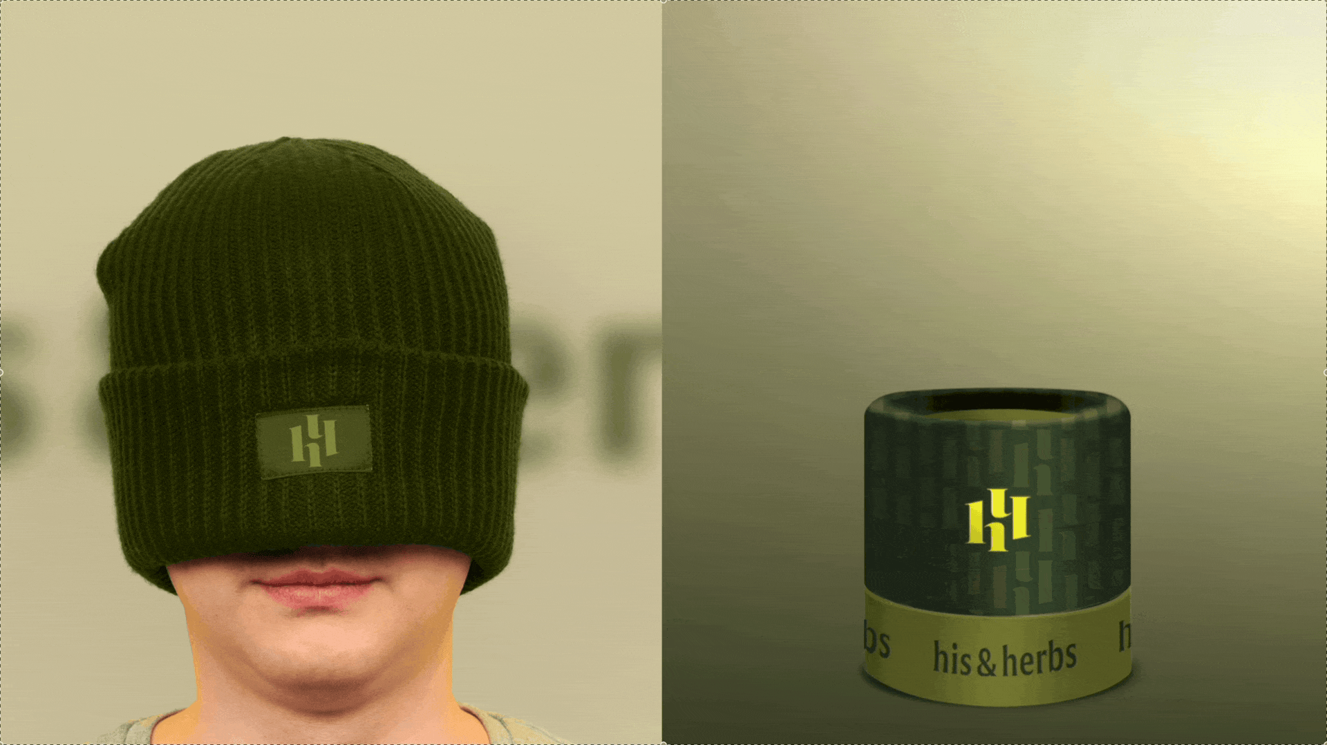
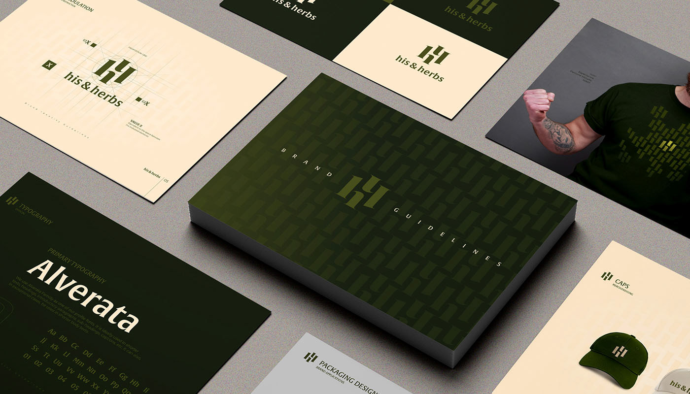
HIS & HERBS ®
A California-based cannabis company, His & Herbs® set out to build a strong, bold, and memorable identity. Through a focused exploration of the brand’s core symbolism, we developed a distinctive visual concept rooted in the repetition of its most iconic letter—H.
By multiplying the character, the system becomes both a recognizable signature and a modular graphic language, creating an endless communication path that scales across touchpoints while reinforcing consistency and recall.
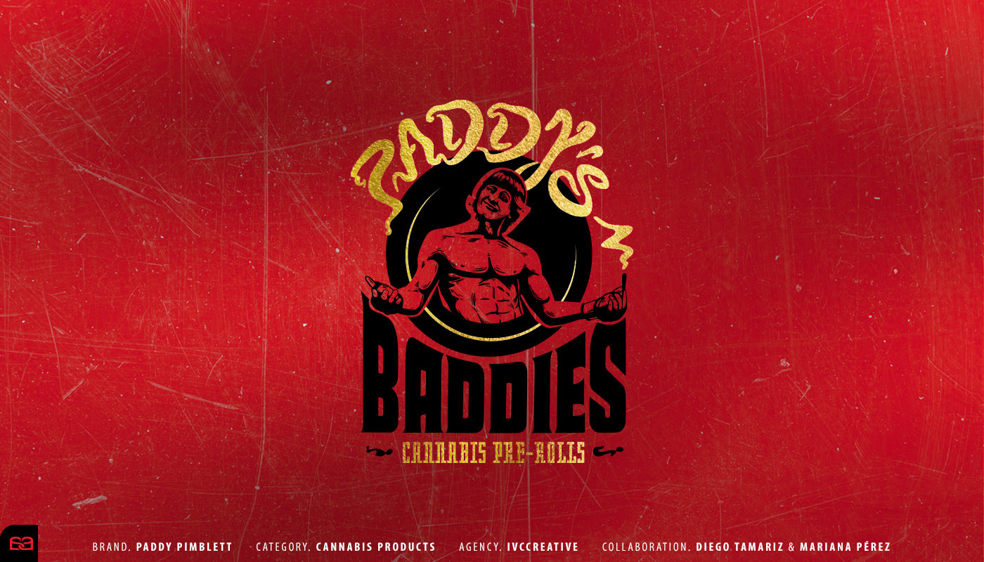
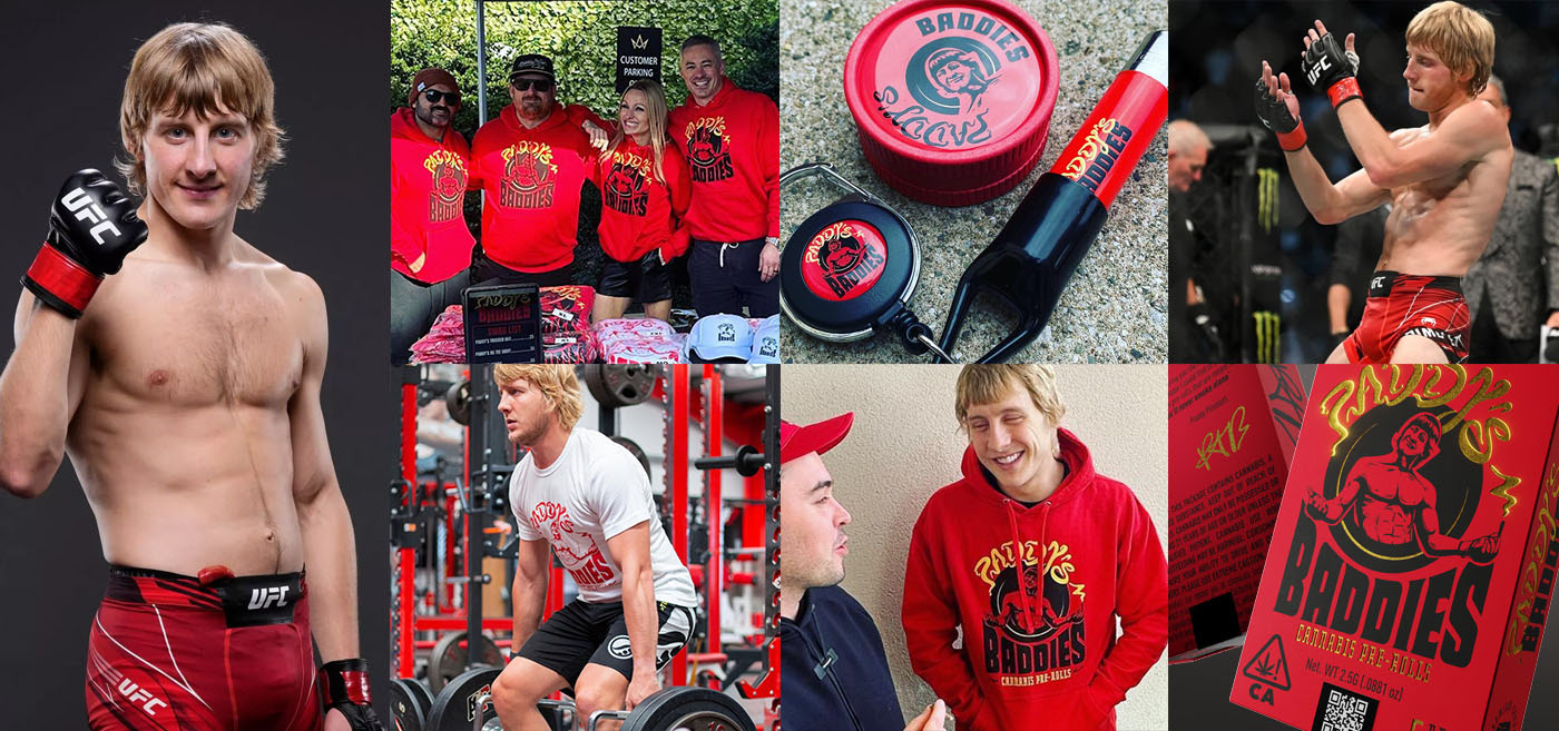
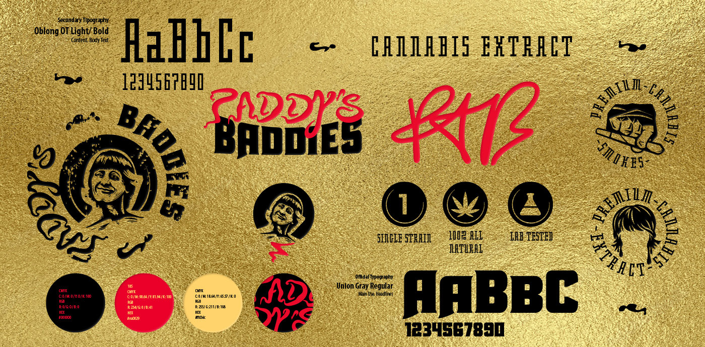
PADDY'S BADDIES ®
Built around the larger-than-life persona of Paddy “The Baddy” Pimblett, this identity translates a UFC® Champion’s charisma into a cannabis brand with unmistakable attitude. Known for his bold presence, confidence, and crowd-energizing personality, Paddy’s personal brand became the creative anchor for every decision—from tone of voice to visual expression.
The result is a joyful, high-impact system that feels strong, playful, and unapologetically entertaining—capturing the same magnetic energy that defines him inside the Octagon and turning it into a memorable product experience.


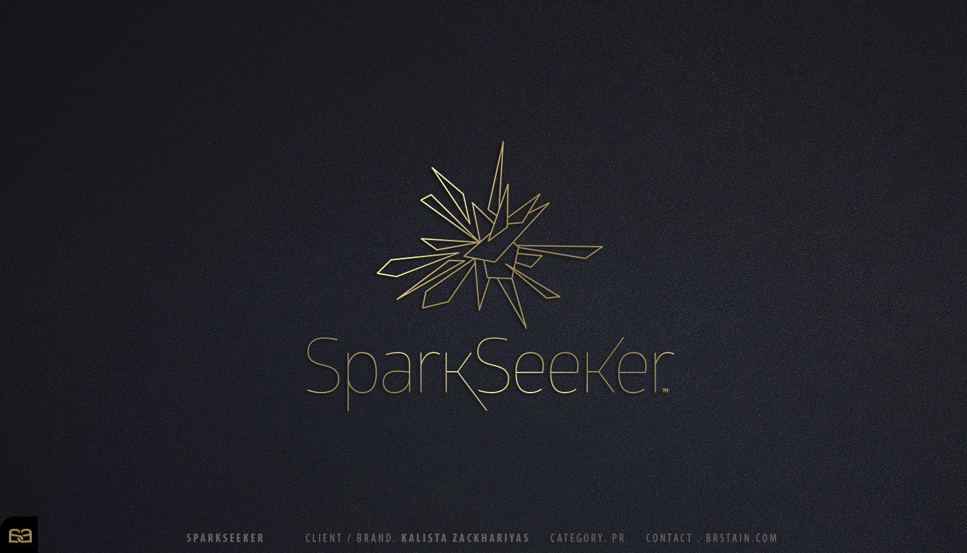
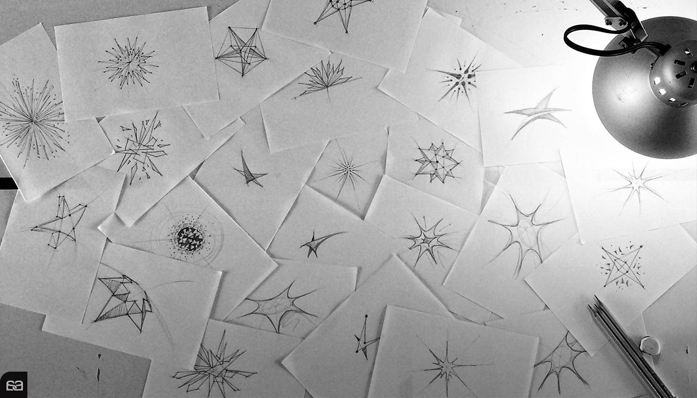
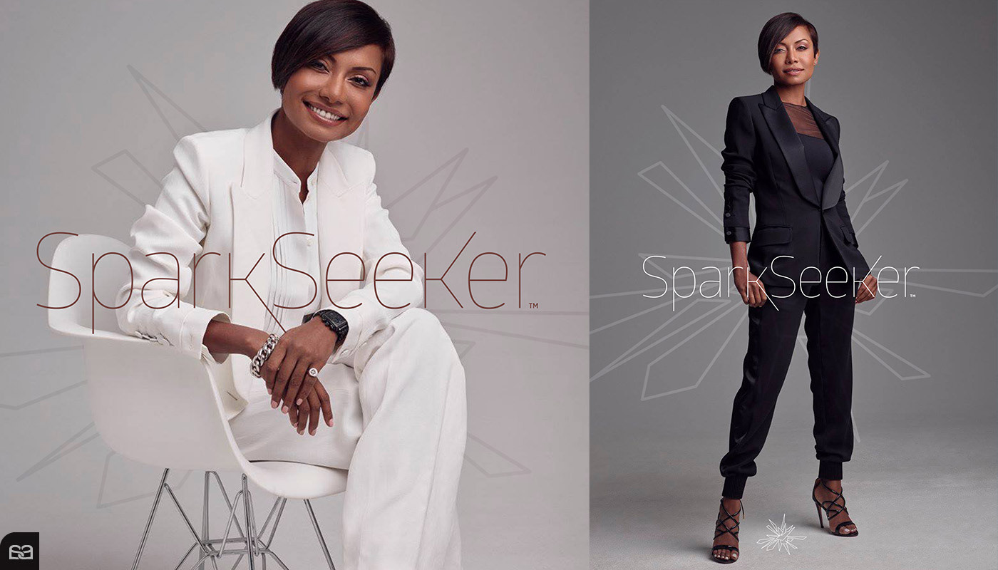
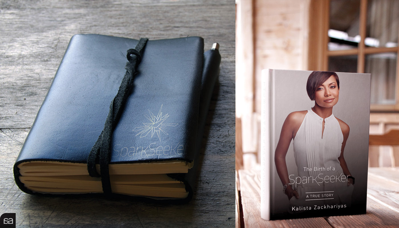
SPARK SEEKER ®
The personal brand of Kalista Zackhariyas, a Sri Lankan actress, writer, and emerging filmmaker shaped by an early immersion in the arts. Defined by complex roles, unconventional choices, and an honest engagement with the creative profession, the brand is conceived as a metaphor for inner pursuit—representing persistence, movement, and the continuous search for meaning within a non-linear creative path.
The identity is anchored by a precise and controlled custom typography that balances sensitivity and determination, extending seamlessly into editorial applications such as the design and covers of her texts. Each element reinforces ideas of process, introspection, and permanence, positioning Spark Seeker® as an evolving identity rather than a fixed destination.
VERTIKA ®
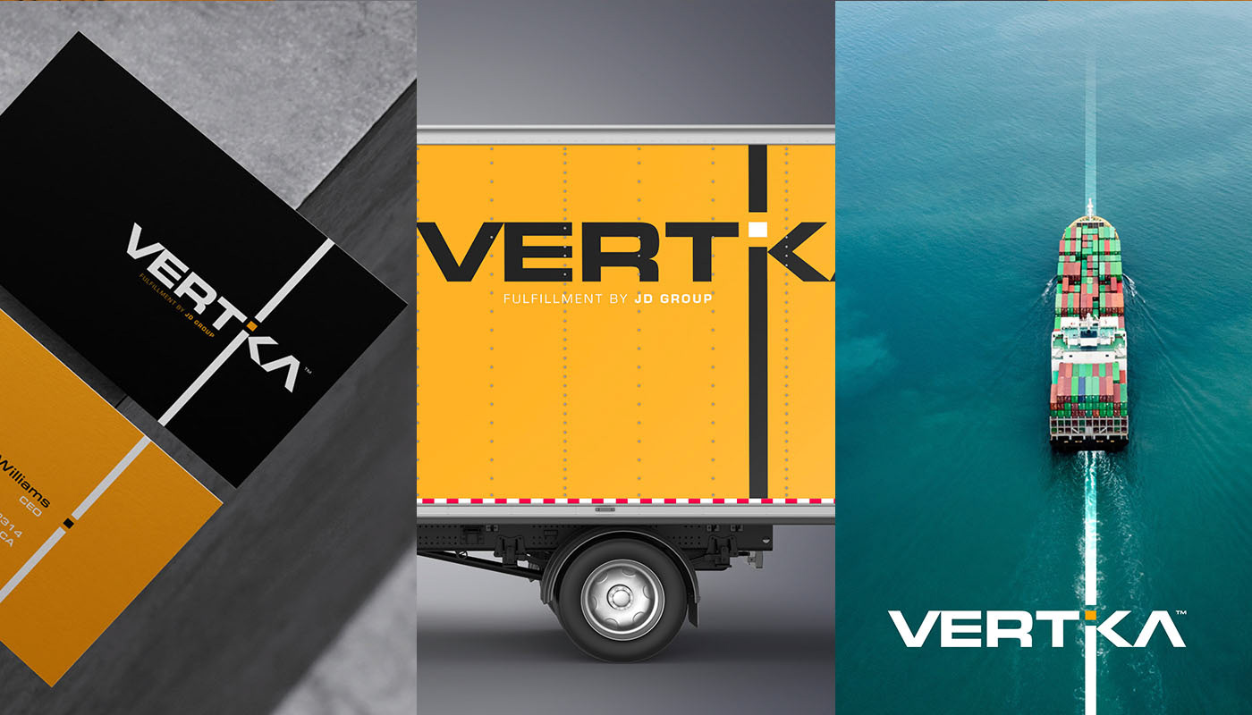
A sister company of JD Logistic®, Vertika® is a leader in direct fulfillment operations along the southern border of the United States. Built on a solid and highly functional brand foundation, the identity reflects the company’s core promise: efficiency through structure, clarity, and control across every stage of distribution.
The visual system is grounded in a conceptual study of linearity—true to its name—expressing distribution, movement, and operational flow through precise alignments and disciplined geometry. A continuous linear axis, intersected by a single point of action, symbolizes coordination, precision, and fulfillment at the exact moment it matters. This approach mirrors Vertika’s logistics model, where products move seamlessly along a clearly defined path, optimizing time, space, and performance for its clients.


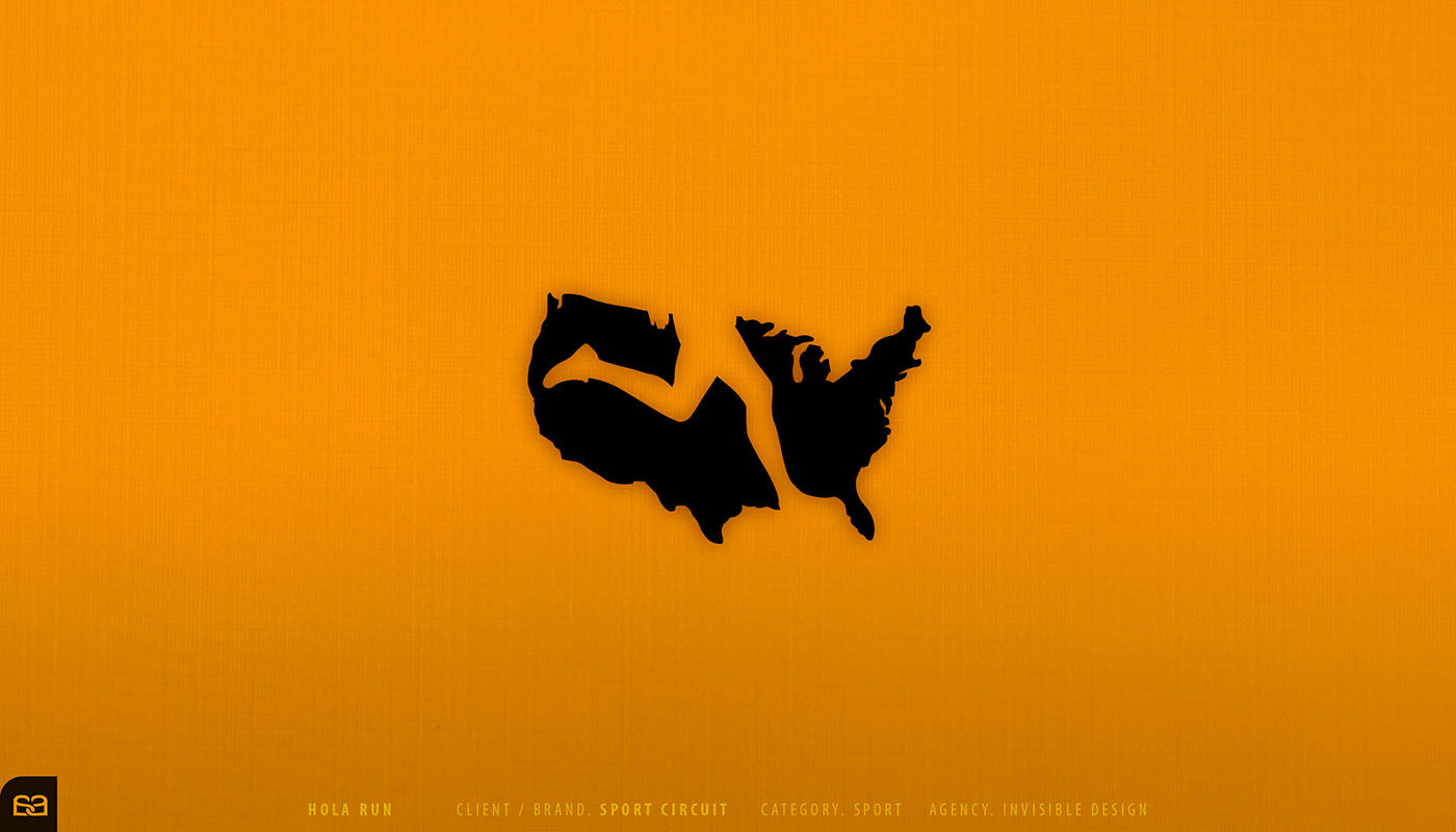
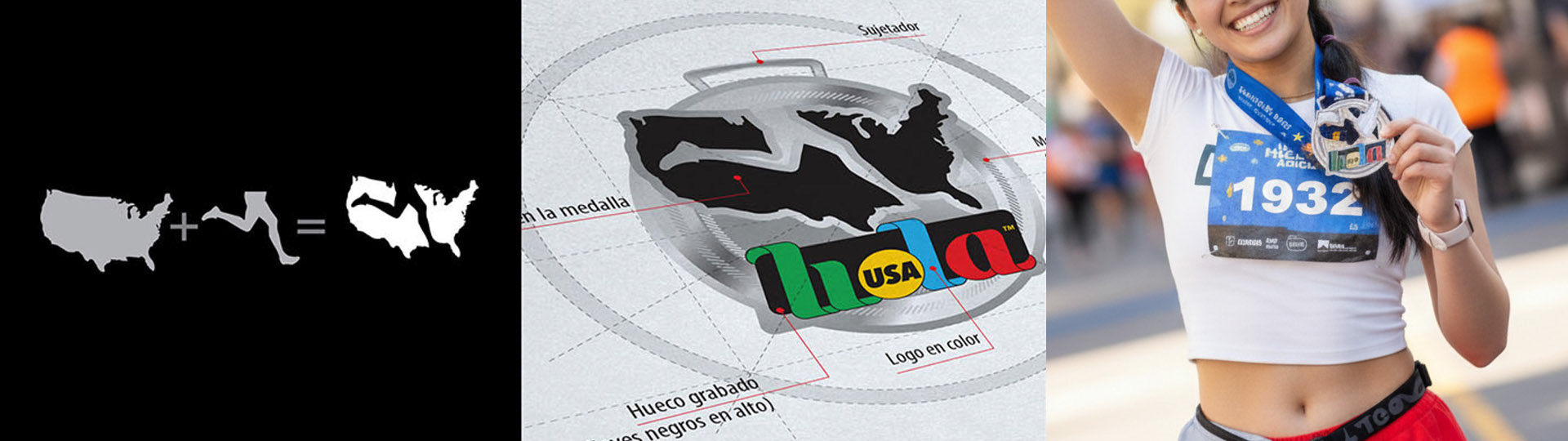
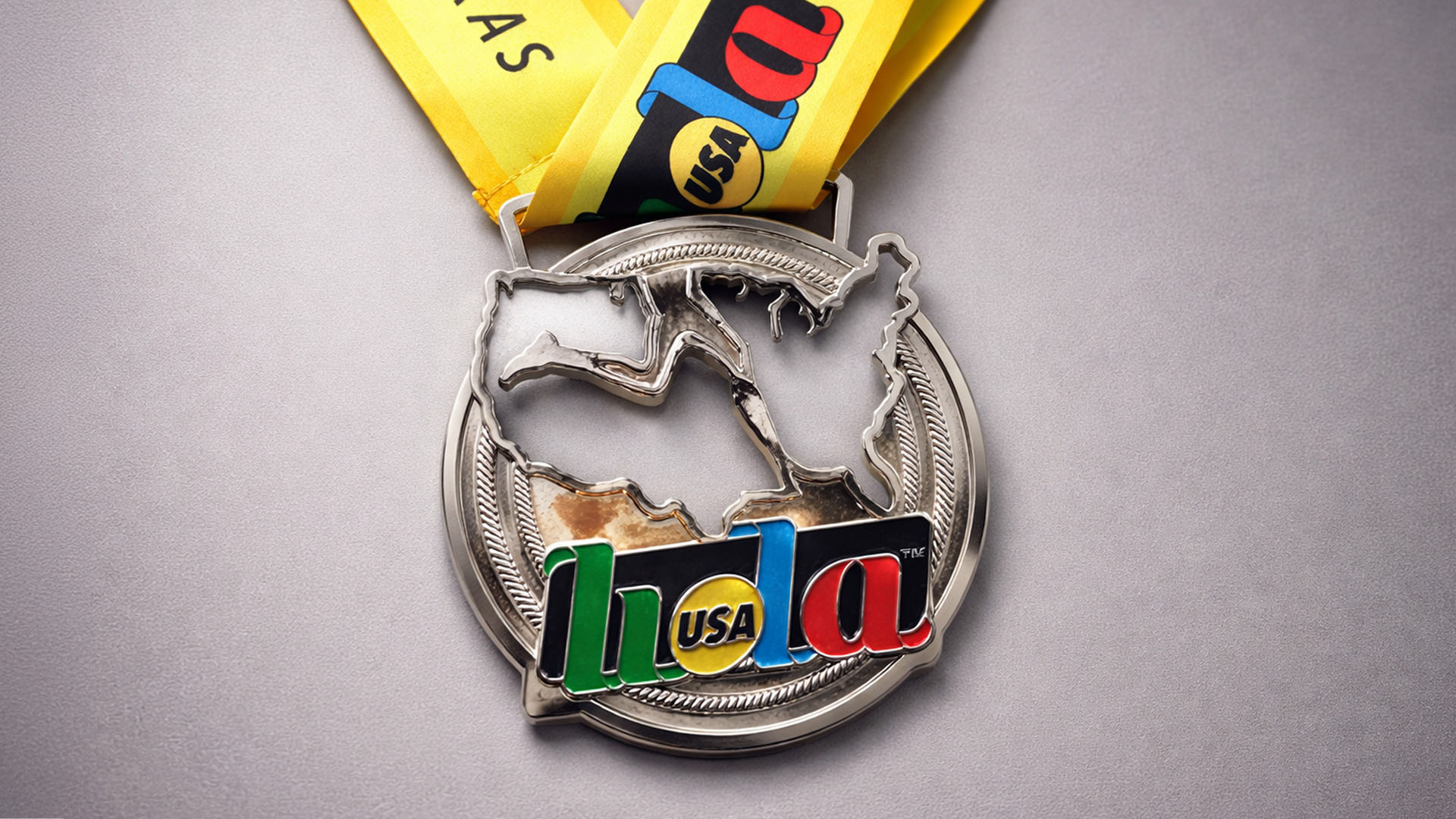
HOLA RUN ®
Hola Run was developed as the U.S.-based sister event of Sport Circuit®, a leading brand in the organization of races and half marathons across Central America. The project was commissioned by Invisible Agency, led by creative director Faustino Sánchez, who entrusted Alex Viveros with the exclusive design of the event’s commemorative medals.
Based on the premise of merging running with its geographical context, the design resolves into a highly legible and distinctive icon. Territorial symbolism and dynamic form converge to create a strong visual statement, reinforcing brand recognition and positioning Hola Run as a unique and memorable event within the competitive landscape of international road races.
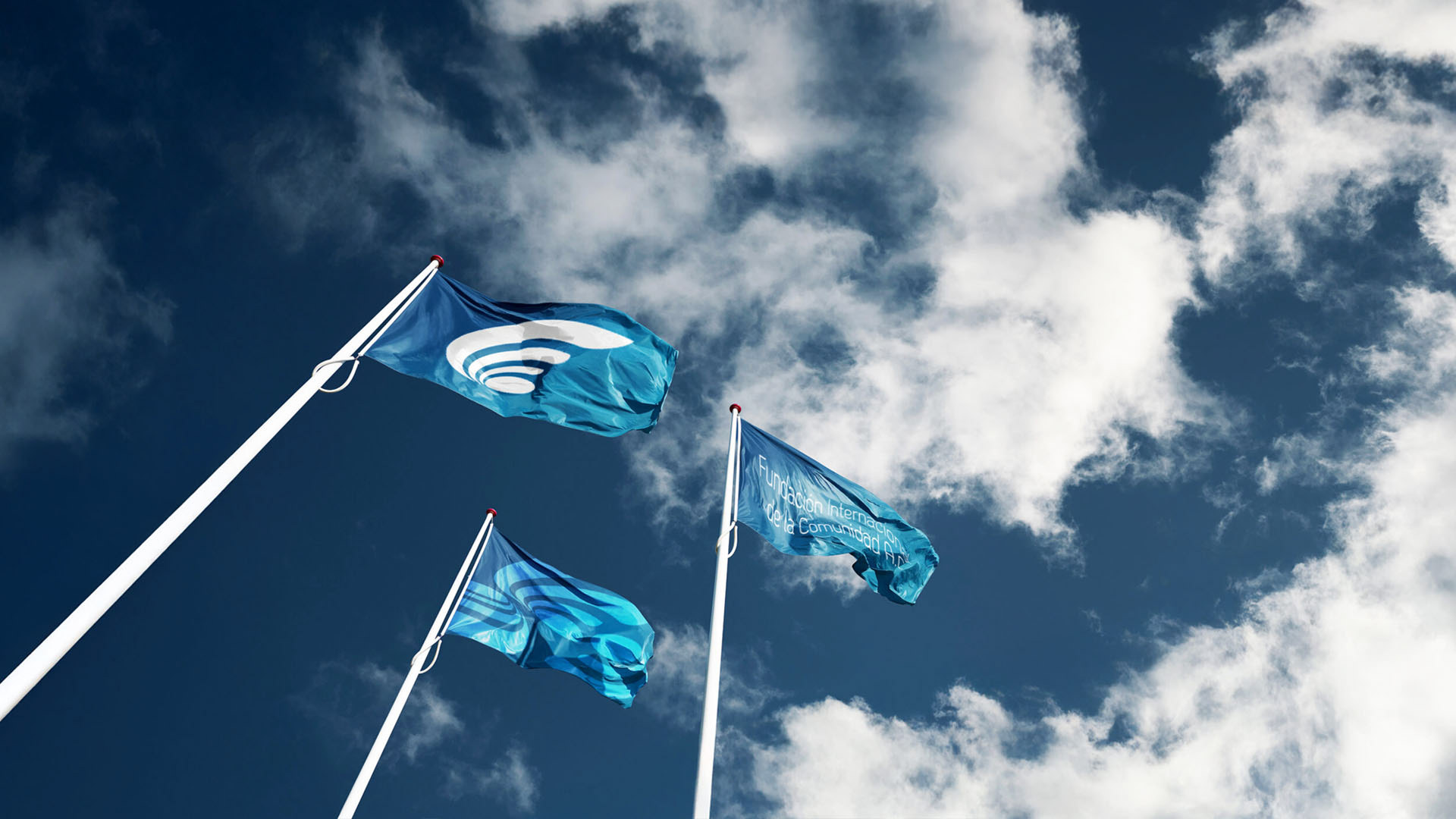
FIC ®
Founded in the early 2000s, the International Community Foundation, A.C. (FIC®) is a philanthropic organization headquartered in Baja California, Mexico. Since its establishment, FIC has worked with Alex Viveros on the development of its visual identity, maintaining a consistent and recognizable brand presence to this day.
Inspired by the natural geometry of a seashell, the icon reflects steady progress, collective effort, and sustained growth. Its upward spiral conveys continuity and purpose, aligning the foundation’s visual language with its commitment to social development and community impact.

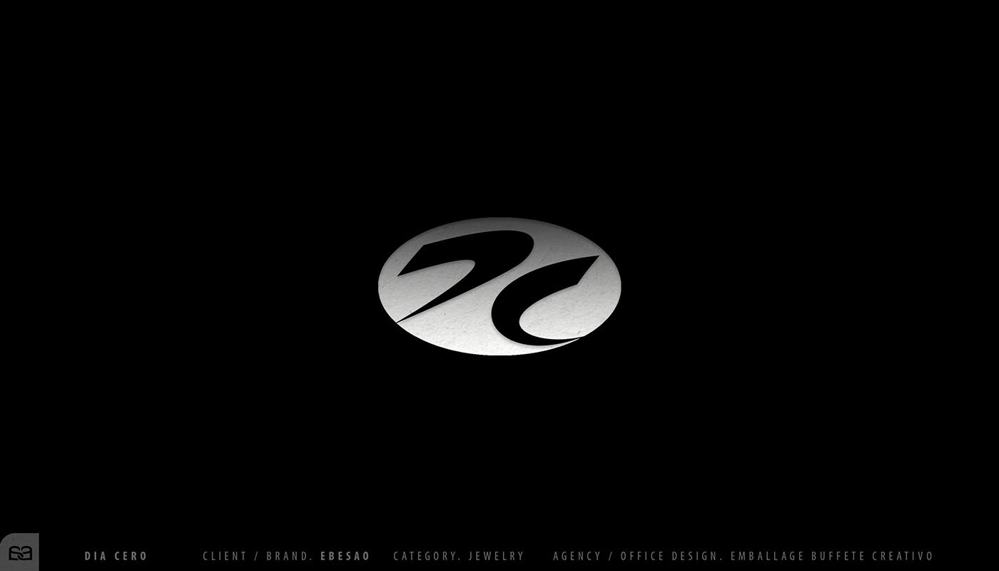
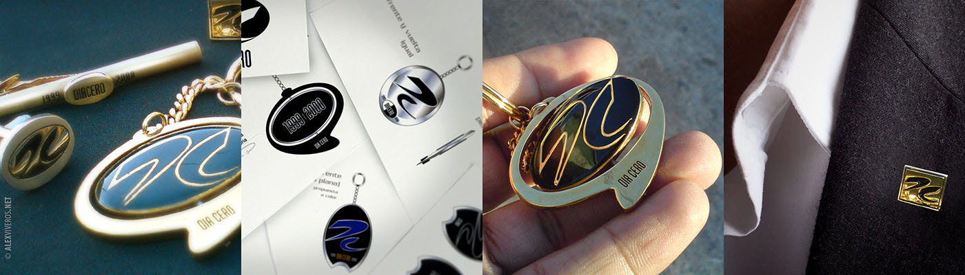
DIA CERO ®
To commemorate the turn of the millennium, EBESA®, a Mexican brand dedicated to the creation of contemporary jewelry and fashion accessories, commissioned Alex Viveros to develop a brand that would symbolically represent the beginning of a new era.
DÍA CERO® was conceived as both a name and a concept—marking a temporal reset, a point of origin, and a moment of transition. The visual identity is built around a minimal, organic symbol whose flowing geometry suggests continuity, duality, and movement, evoking the passage from one cycle to another.
Beyond the identity itself, Alex Viveros was responsible for the naming, brand system, and the design direction of the entire jewelry collection, overseeing materials, finishes, and applications to ensure a cohesive relationship between brand and object. The result is a timeless mark translated into tangible form, where graphic identity and product design merge into a single commemorative artifact.
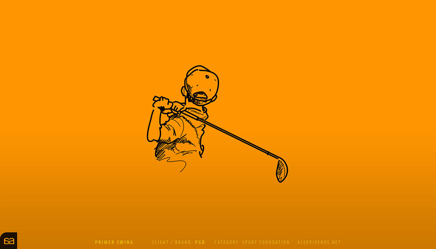
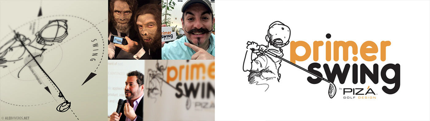
PRIMER SWING ®
Is a non-profit organization founded by architect Agustín Pizá, Director of Pizá Golf®, with the mission of supporting children and young people from underprivileged communities by introducing them to the game of golf as a tool for life skills and personal development. The visual identity was commissioned from Alex Viveros.
Conceived as a visual metaphor for beginnings, the identity is rooted in a sketch of a child taking his first swing, his gaze projecting forward as a symbol of intention, growth, and possibility. Through a raw, human line, the mark reframes golf not as an elite sport, but as a vehicle for hope and opportunity.
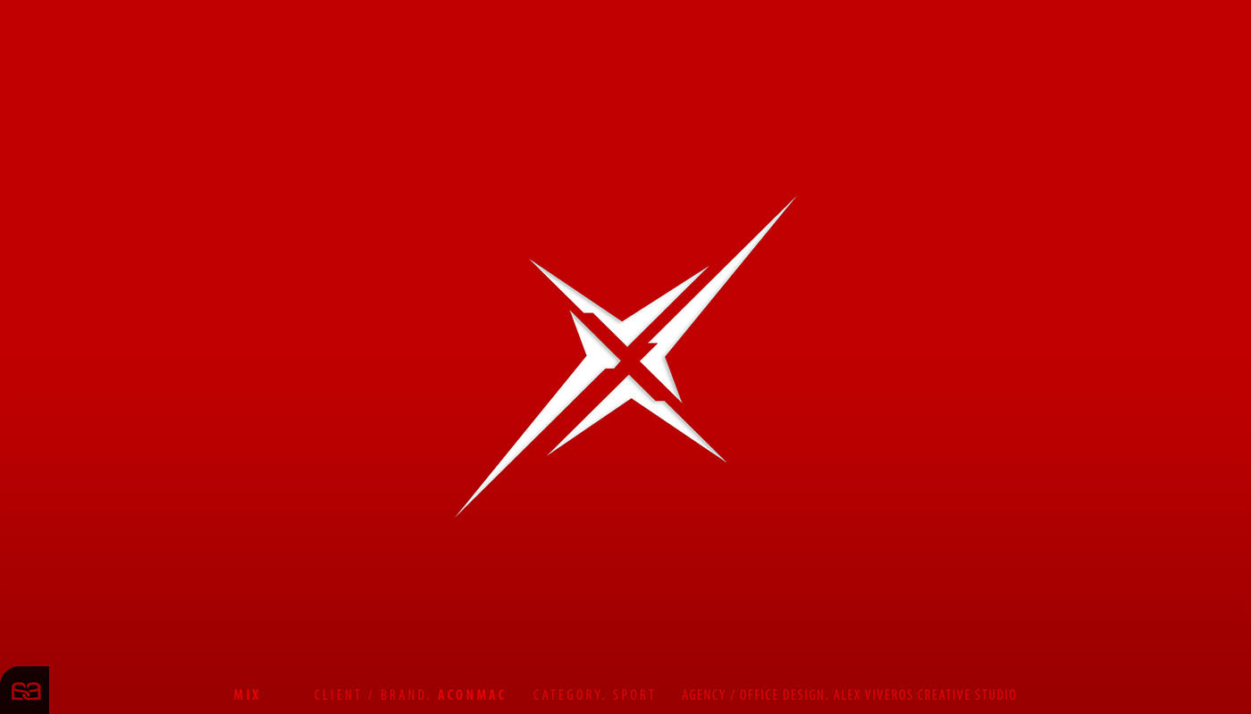
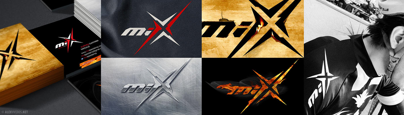
MIX ®
A Mexican–American brand focused on the design and production of apparel and accessories for motocross and cycling, MIX was conceived as a mutable brand system—capable of adapting its visual expression without losing recognition or strength.
The identity is built around a bold, dynamic, and highly memorable symbol, designed to convey speed, impact, and agility. Its sharp geometry and aggressive construction allow the mark to transform across materials, textures, and applications, responding to the physical demands of performance gear and competitive environments.
MIX functions as a flexible visual platform where identity, movement, and attitude intersect—translating energy into form across every surface it inhabits.
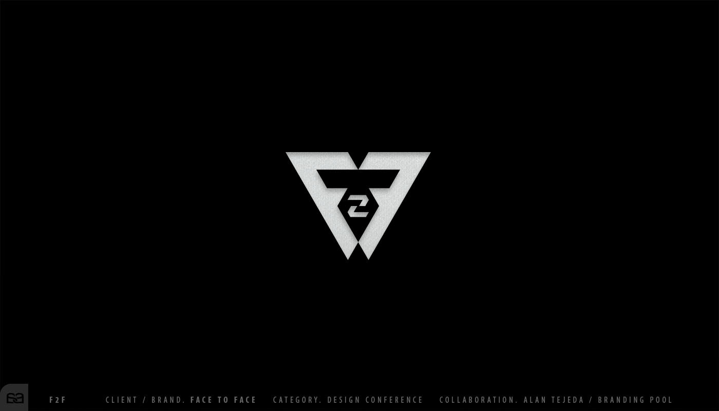
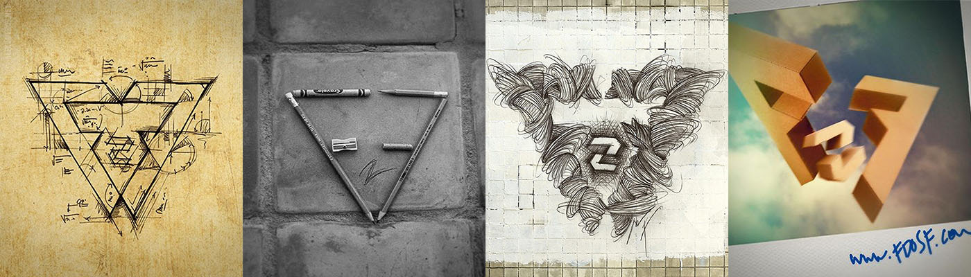
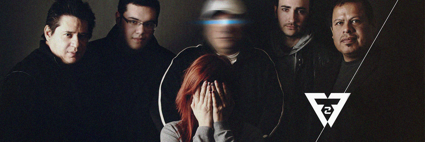
F2F ®
Face-to-Face (F2F®) emerged from the encounter of creative leaders from two different generations, brought together to confront the contrast between the romantic ideals of the creative profession and the realities of the market.
The identity is defined by a symmetrical, frontal symbol—precise, balanced, and direct. Its geometry reinforces the idea of dialogue and confrontation on equal terms, transforming the mark into a visual expression of honesty, exchange, and shared experience.