

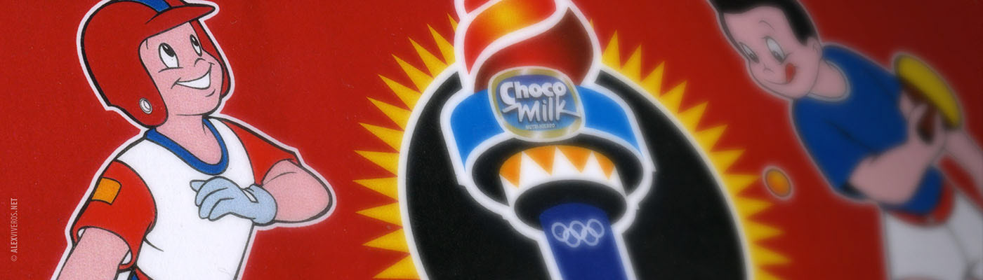
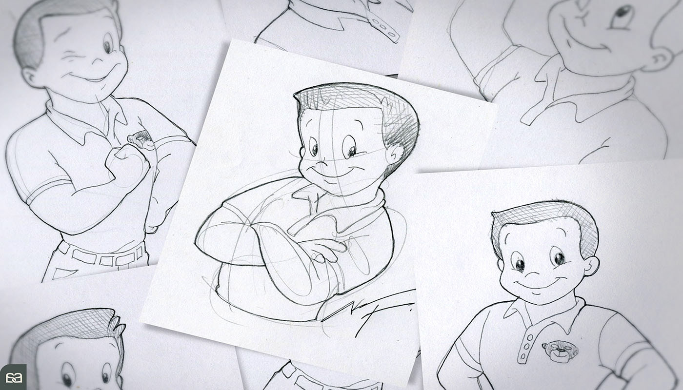
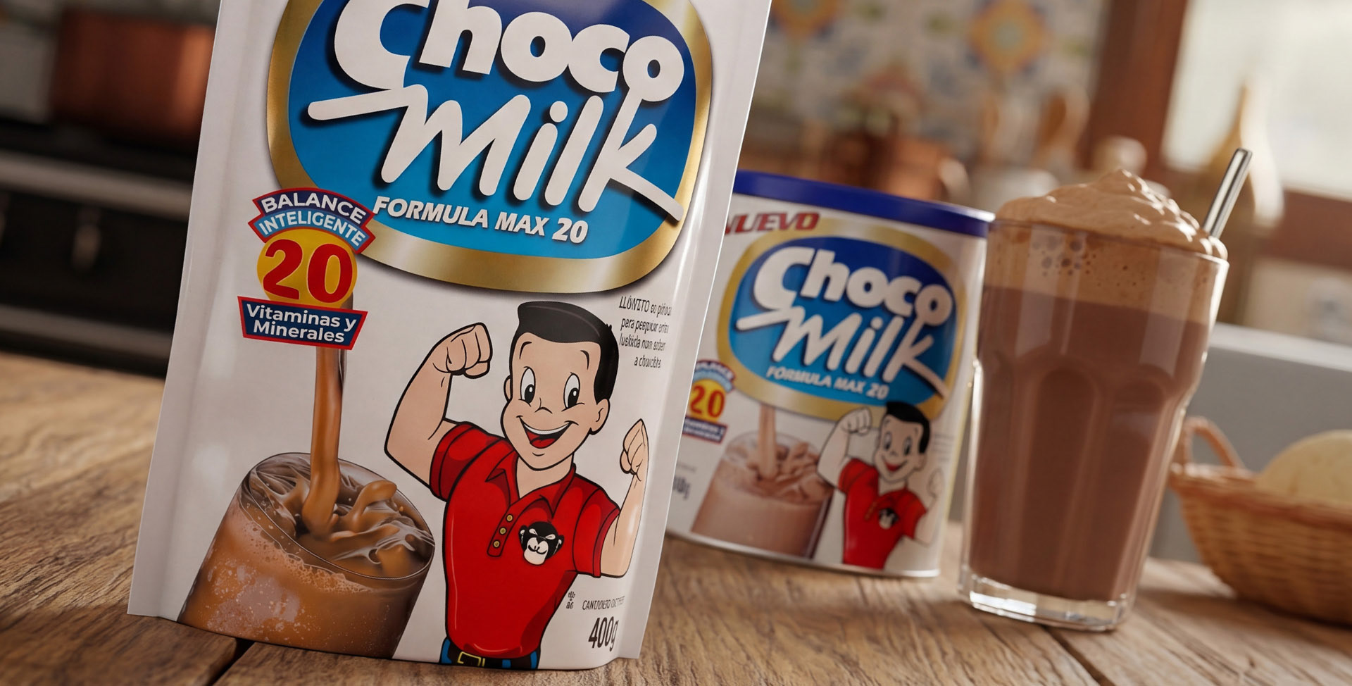
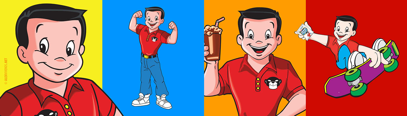
PANCHO PANTERA ®
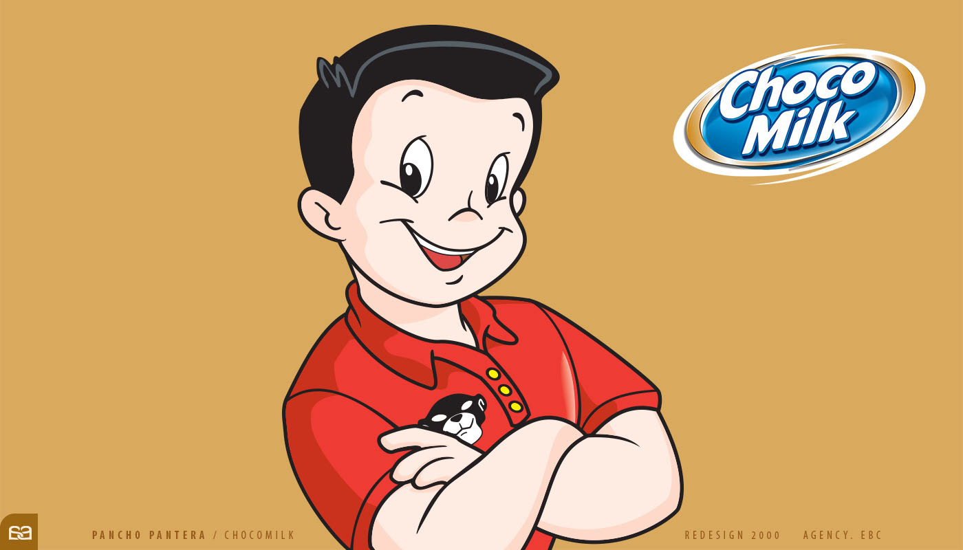
Since its inception in the late 1950s, the ChocoMilk® brand has been inextricably linked to its legendary ambassador: Pancho Pantera®. Originally created to promote nutrition and physical activity among Mexican youth, Pancho evolved from a rural figure into a contemporary athletic icon. Over decades, he became a profound cultural touchstone, anchored by his presence in television media and iconic product packaging.
For the brand’s major millennial relaunch in 2000, the company initially commissioned a studio in Los Angeles, CA. Although they initiated the project, the results failed to resonate with the brand’s authentic soul. Consequently, ChocoMilk® commissioned Alex Viveros to define the balance between global standards and the character’s essential heritage.
The result was a renewed Pancho Pantera® that redefined the brand’s aesthetic direction. To this day, while the character undergoes constant minor updates, the core essence and structural foundations established by Alex Viveros continue to dictate the visual legacy of the brand.
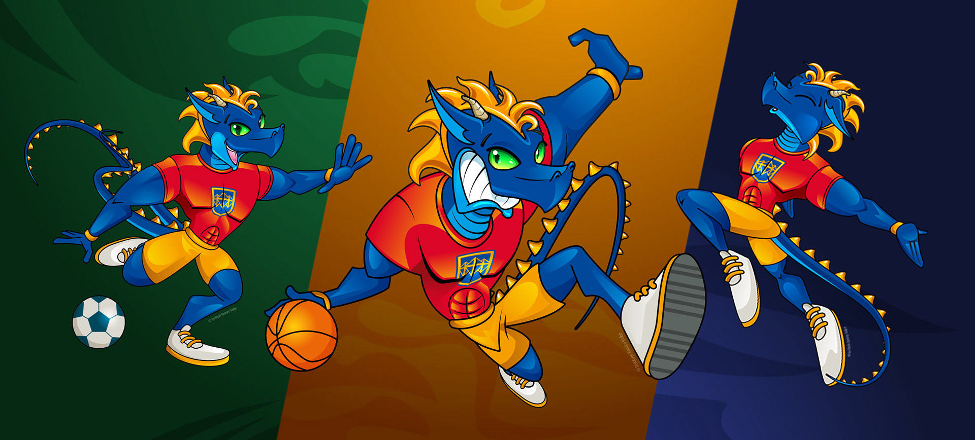
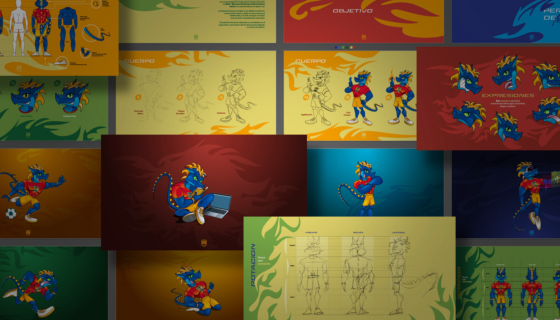
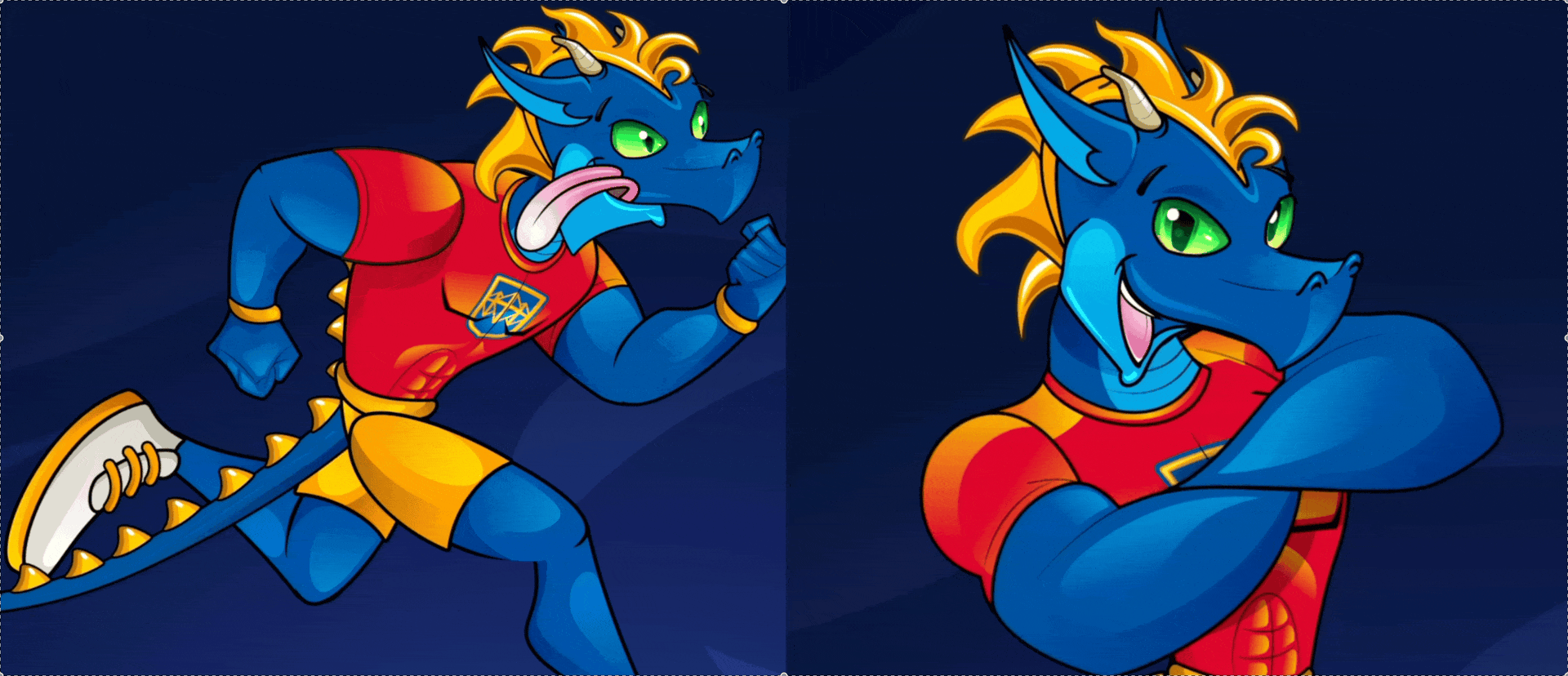
MAX THE DRAGON ®
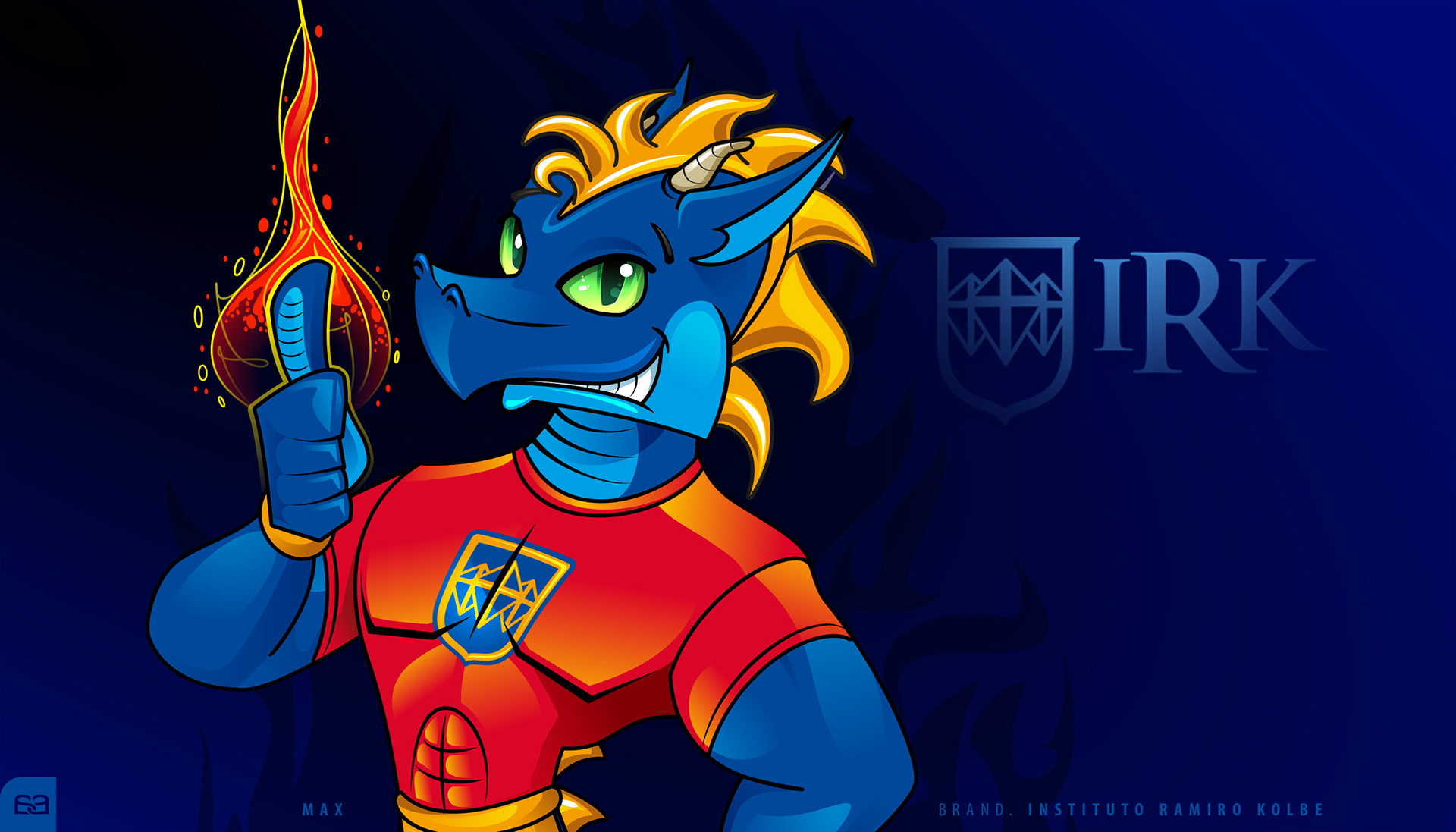
To commemorate its 20th anniversary, R. Kolbe Institute®—a premier institution specializing in bicultural academic development—commissioned Alex Viveros to create a mascot that would embody the school's identity. The objective was to design a mascot that resonated with youth while maintaining a strong institutional presence.
After a comprehensive conceptual study, Max the Dragon® was developed as the brand's official ambassador. Max symbolizes the strength and leadership that define the institute's core values; beyond serving as a friendly figure for students, Max became the primary banner for the school’s athletic clubs and competitive branches.
The project involved the development of an extensive Brand Character Book, establishing the technical guidelines for the character’s geometry, poses, and expressions to ensure consistency across all future media. This strategic foundation allowed for the successful creation of the official mascot suit (botarga), ensuring Max’s presence is felt physically at every institutional achievement and sporting event.

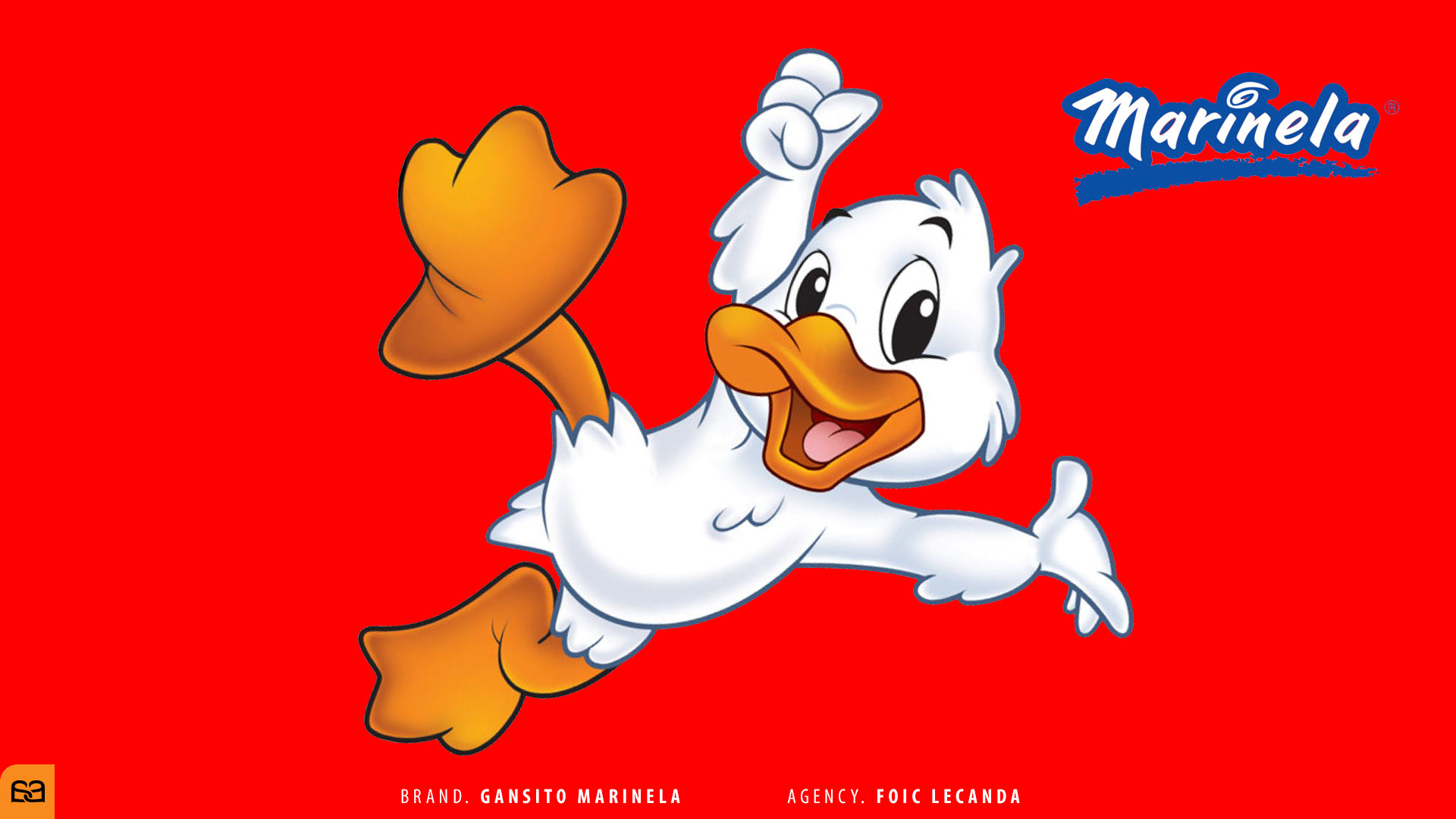
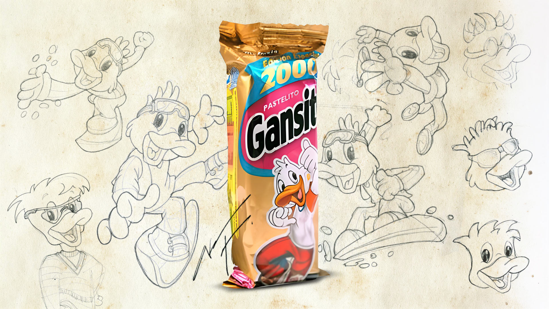
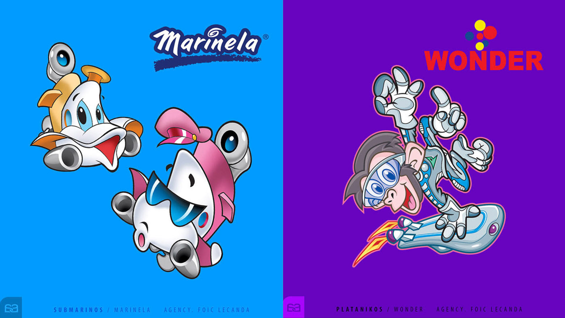
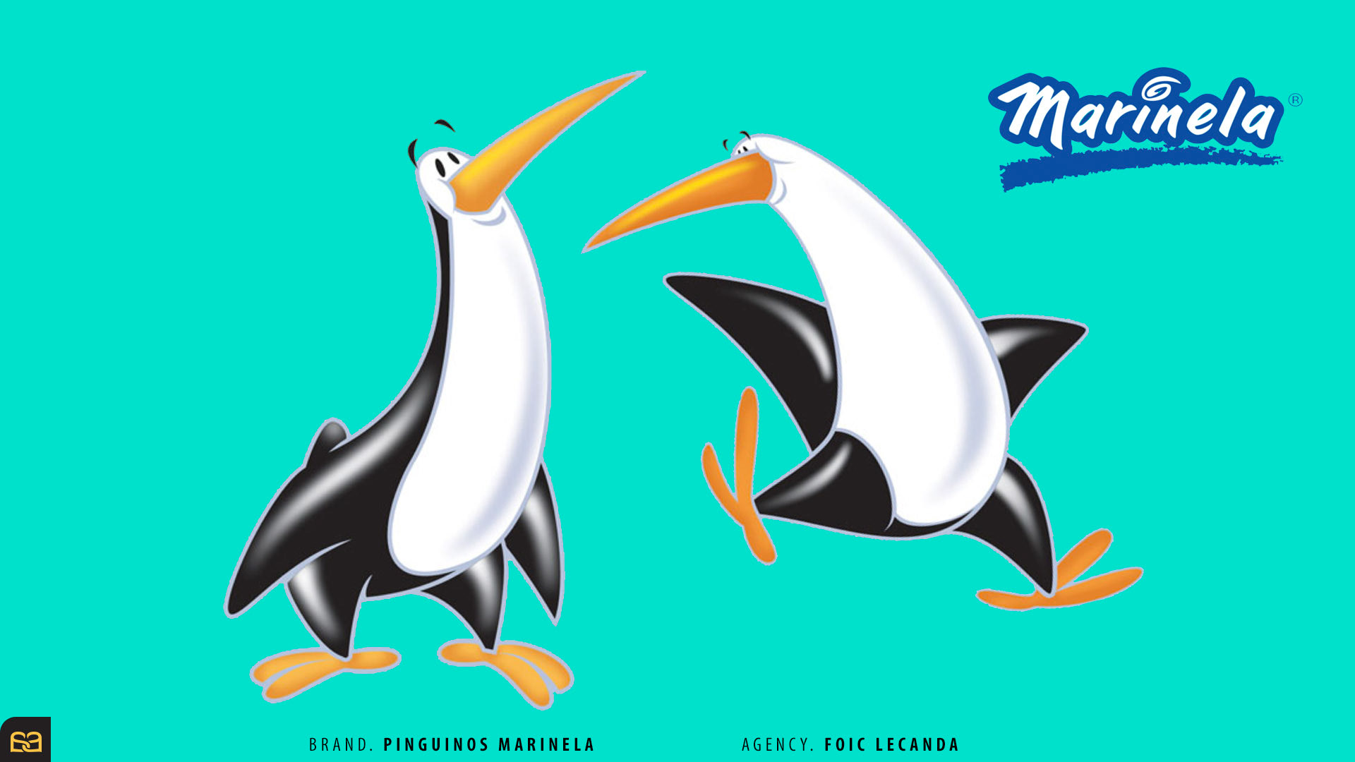
GRUPO BIMBO ® | ICONIC LEGACIES
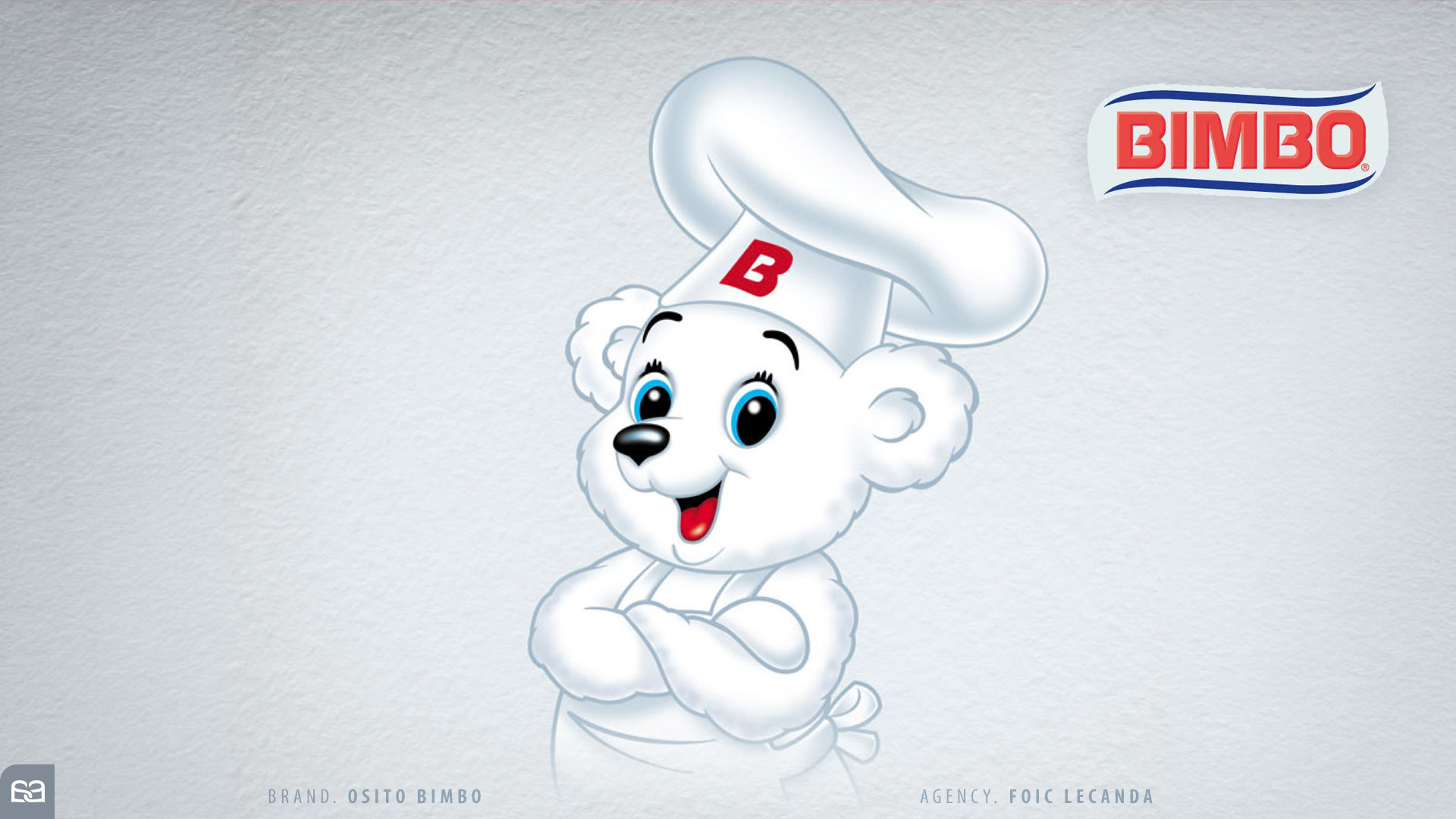
Through Alex Lecanda, Co-Director of Foic Lecanda®, I was granted the privilege of collaborating with the extensive brand family of Grupo Bimbo®. My role involved a diverse range of creative interventions: from developing iconic characters from their very inception to engineering dynamic poses and movements for established mascots in specialized campaigns.
Working with these household names was a profound masterclass in brand stewardship. Each character—from the beloved Gansito Marinela® and Osito Bimbo® to the vibrant worlds of Wonder® and Pinguinos Marinela®—possesses a unique DNA and a rich historical narrative. My mission was to decode these identities and ensure a seamless continuity of life for each character, respecting their past while preparing them for a modern audience.
This journey through the heart of Latin American pop culture allowed me to evolve as a creative and visual artist. Understanding the soul of a character and translating it into a technical Brand Character Book or a dynamic animation guide is a discipline that continues to define my professional standard today.
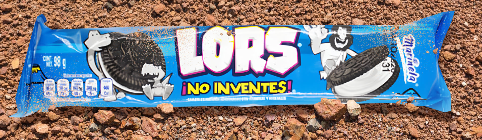
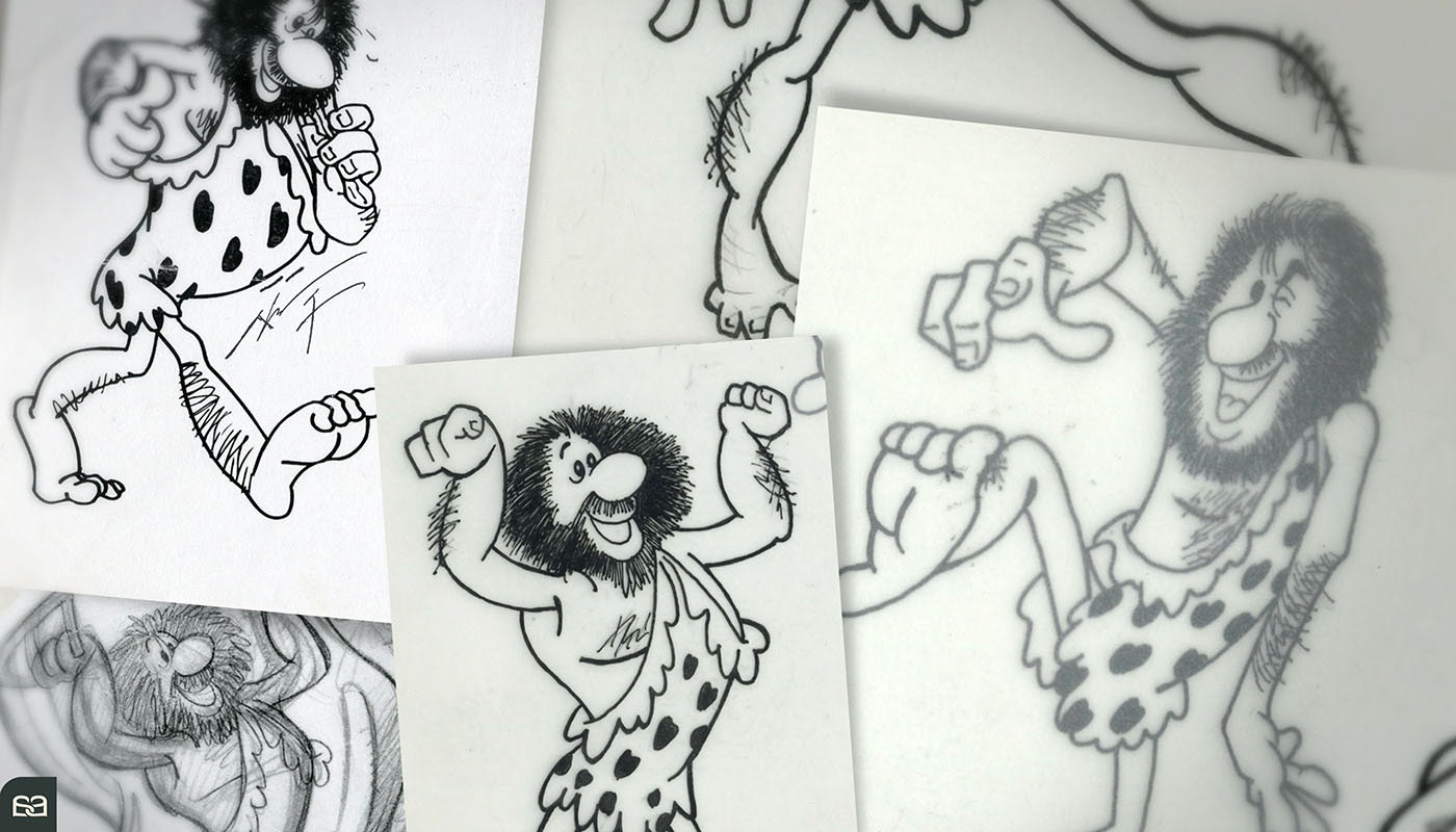
LORS ® CAVEMAN
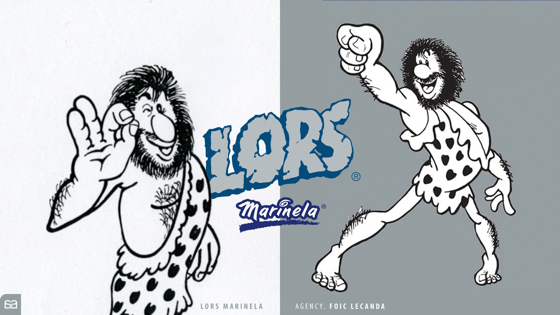
While the character was already established, Alex Viveros was commissioned to develop a dynamic library of poses and movements for the iconic Lors® Caveman, a flagship character for the Marinela® cookie brand. The specific challenge of this project lay in its technical execution: every stroke was hand-drawn using traditional analog techniques.
To preserve the character's essential "primitive" and rustic charm, Alex eschewed digital vectorization. This deliberate choice allowed the organic texture of the hand-drawn line to remain at the forefront, providing a warmth and authenticity that digital tools often struggle to replicate. Every gesture was carefully engineered to breathe new life into the caveman’s personality while respecting his established visual identity.
The process required a deep understanding of character anatomy and expression, translated through the timeless medium of ink and paper. The result is a vibrant, expressive character that continues to resonate with consumers through its unique, handcrafted aesthetic.
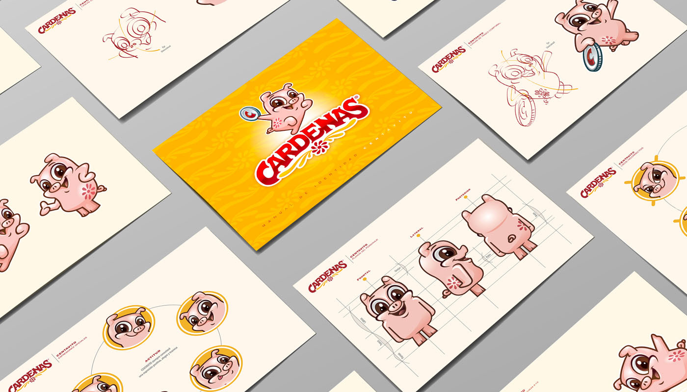
CENTAVITO CARDENAS ®
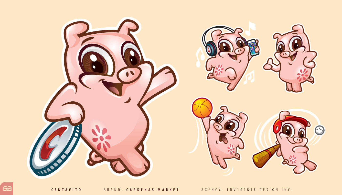
I had the privilege of collaborating with Faustino Sanchez, Director of Invisible Design Inc® in San Jose, CA, on multiple high-impact projects. When the opportunity arose to breathe life into a character for the Cardenas Markets® retail chain, the challenge was as compelling as it was culturally significant.
Centavito® is inspired by the traditional Latin American "cochinito" (piggy bank). He serves as the family’s charismatic advisor and "financial optimizer," guiding customers through their purchasing decisions with optimism and wit. Centavito® is more than a mascot; he is a fun, relatable, and trusted figure within the supermarket environment.
The development process included a comprehensive study of the character's psychological profile. This rigorous foundation ensured that across all media and campaigns, the character’s actions and tone never "betray" the original creative vision. Centavito remains a consistent, authentic representation of the brand’s values, maintaining a deep connection with the community he serves.
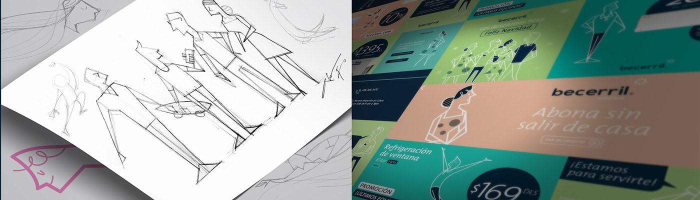
BECERRIL ®
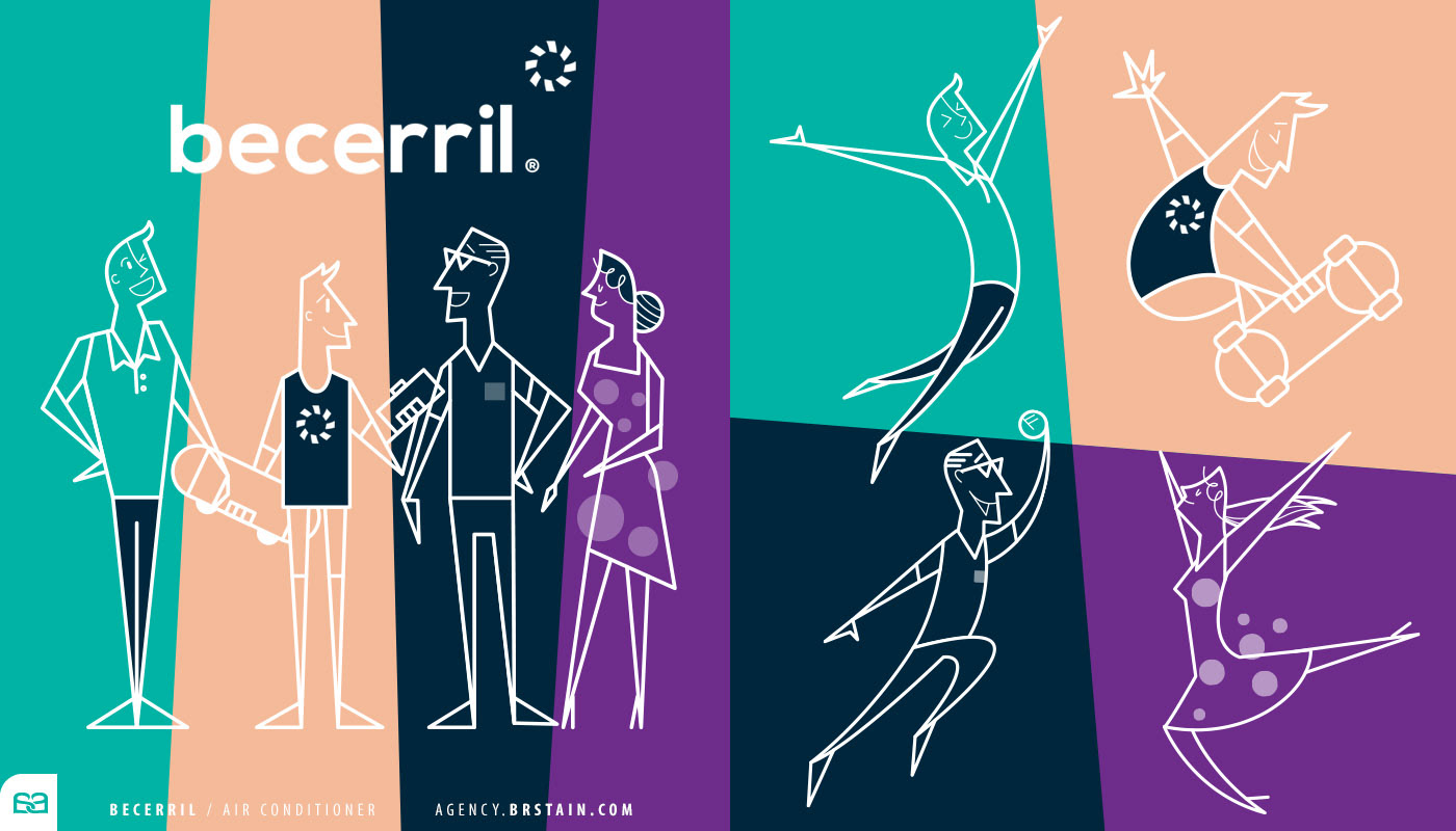
Founded in the 1950s, Becerril is a Mexican company specializing in HVAC systems — sales, installation, and manufacturing.
We leveraged the brand’s heritage as a strategic anchor, transforming its origin story into a scalable visual identity system.
In collaboration with Bristain.com®, we developed a family of brand characters inspired by 1950s graphic language — geometric line work, solid color palettes, and the optimistic spirit of early television animation.
The result went beyond a single campaign. It evolved into a flexible brand platform. These mascots enabled long-term campaign consistency, strengthened emotional recall, and elevated market positioning — reinforcing Becerril’s legacy while modernizing its presence.
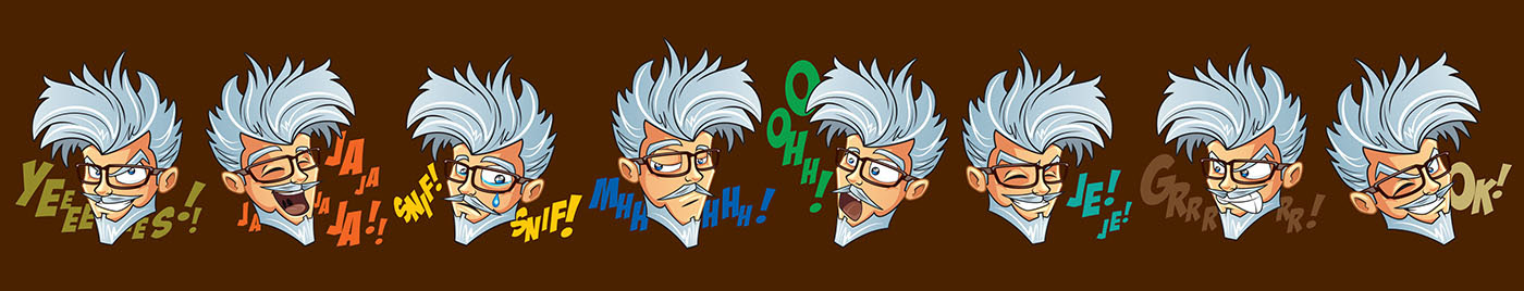
EL ABUELO ®
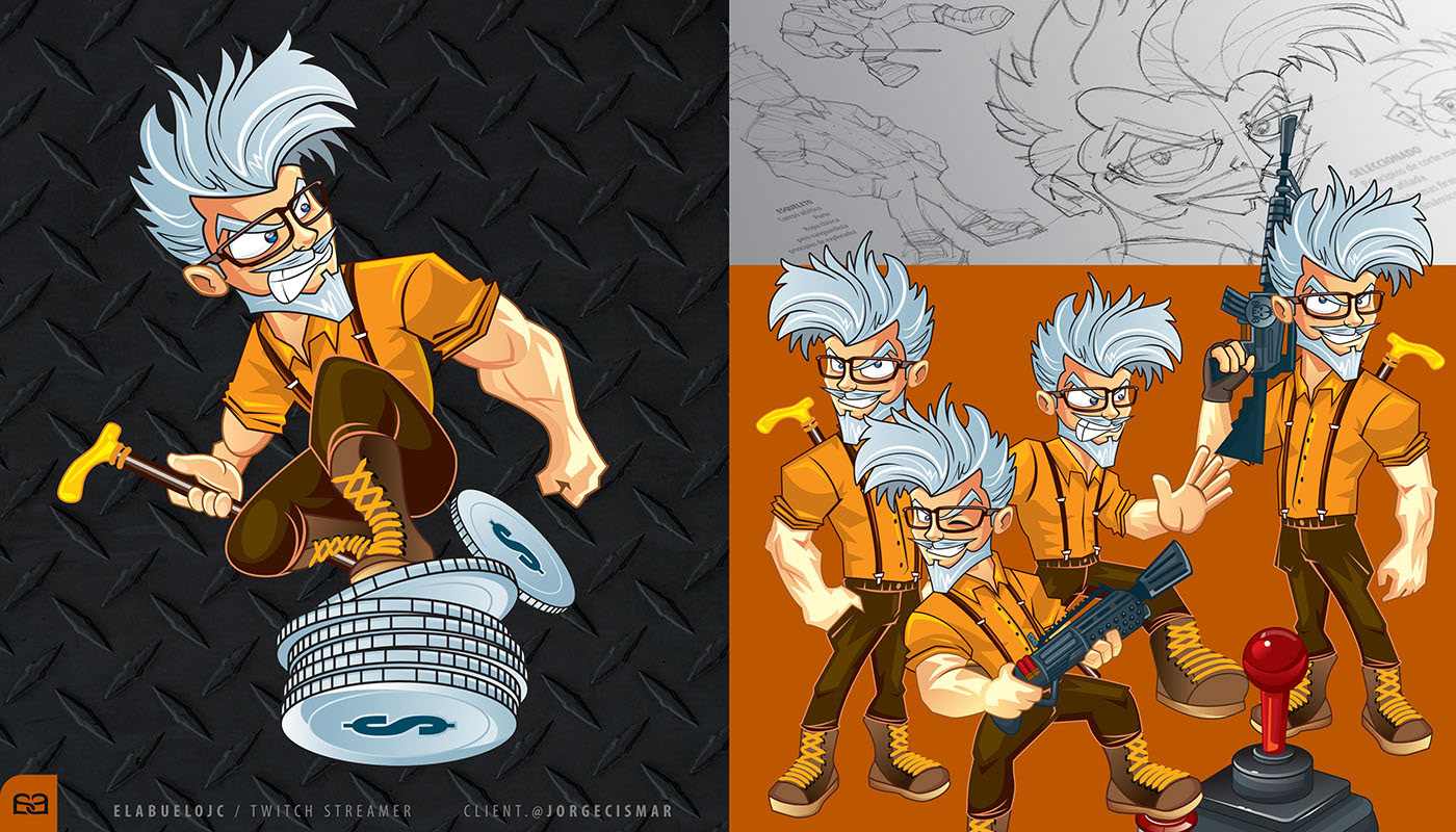
Renowned Twitch® Streamer JC, widely known as EL ABUELO®, sought a visual identity that could encapsulate his unique essence and ambitious vision for his digital platform. The objective was to create a character that bridged the gap between traditional wisdom and the high-energy, fast-paced world of virtual content creation.
Character Profile: A Revolutionary Leader EL ABUELO® was developed as a revolutionary visionary—a figure of the countryside with vast experience, reimagined for the digital age. Despite his age, the character is agile, dynamic, and possesses an infectious energy. This "Old-School Revolutionary" aesthetic creates a powerful, disruptive contrast in the streaming space, positioning the brand as both authoritative and immensely entertaining.
Engagement & Asset Ecosystem The project involved the creation of a comprehensive Emote & Expression Library. These visual assets were strategically designed to enhance viewer engagement, serving as exclusive rewards for channel subscribers. By developing a wide range of gesticulations, we provided the creator with a versatile toolkit to interact with his community, reinforcing brand loyalty and driving monetization through a cohesive and charismatic visual narrative.
MINIX LARA ®
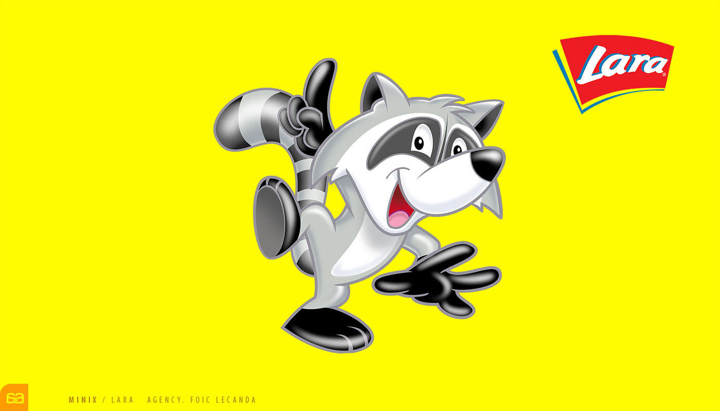
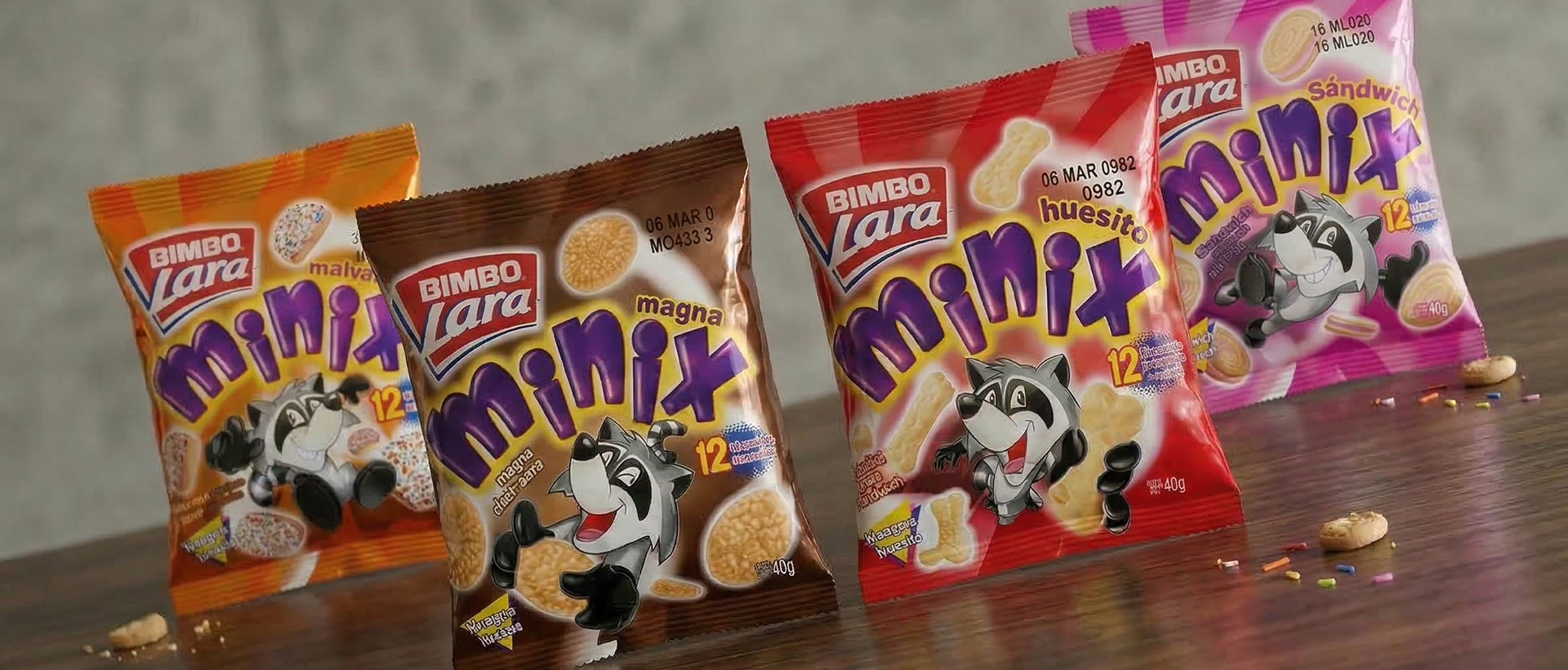
As part of the Grupo Bimbo® family, Lara® Cookies sought to penetrate the retail market with their Minix® line, specifically targeting children. The strategic objective was twofold: the product had to be perceived as an accessible, everyday snack for any budget, while simultaneously communicating quality and trust to parents.
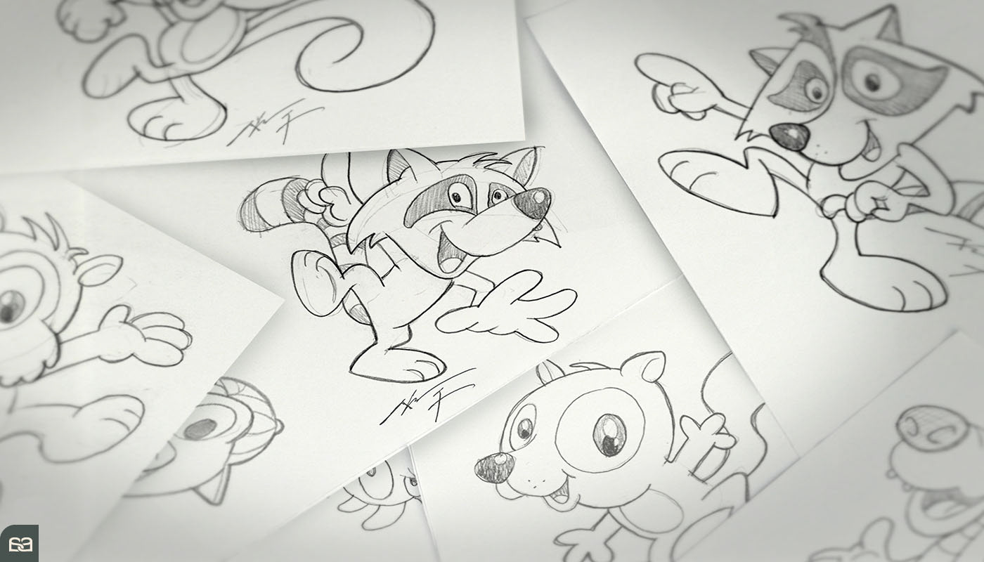
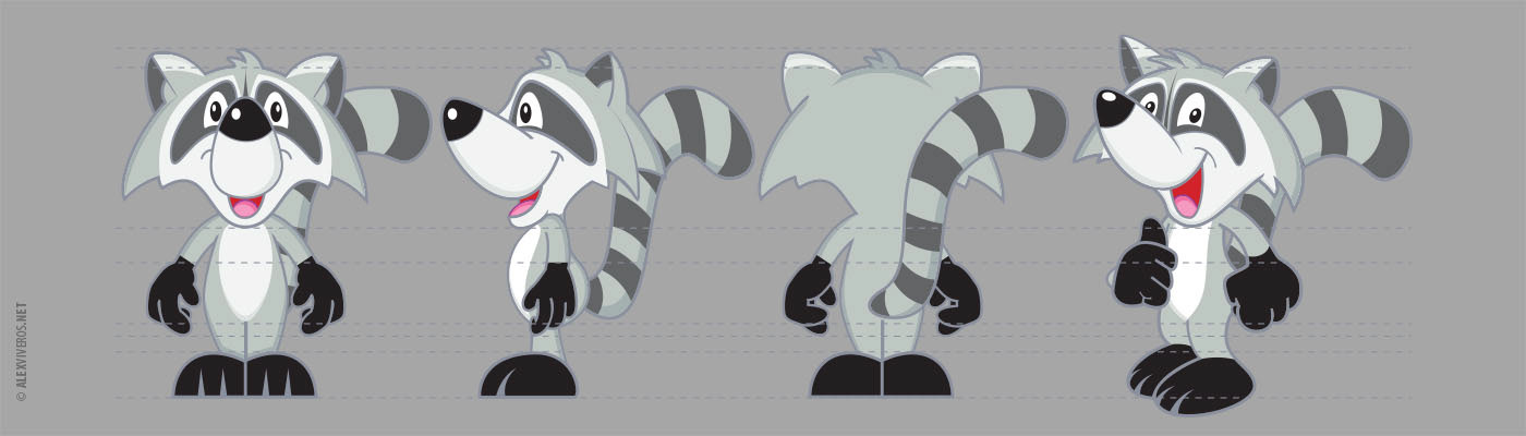
After an exhaustive profile study, Alex Viveros developed a charismatic character inspired by the natural curiosity and restless energy of the brand’s animal icon. The design focused on a "soft and friendly" (pachoncito) aesthetic, creating an immediate emotional bond with younger consumers through approachable shapes and a vibrant personality.
The success of Minix® was the result of a powerful creative synergy. Supported by a world-class packaging design from Foic Lecanda®, the character became the soul of the product. This integrated approach—character heart and strategic packaging—delivered exceptional market results, successfully positioning Minix® as a leader in its category.

EL MERO-MERO ®
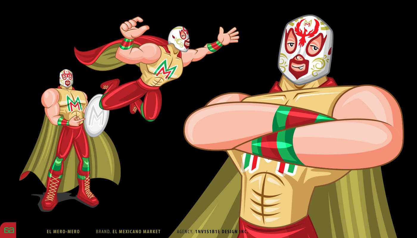
The Southern U.S. supermarket chain El Mexicano®, deeply rooted in the Latin community, has a long-standing tradition of featuring Lucha Libre spectacles at its brand activations. From these live events, the character El Mero-Mero® emerged, quickly becoming a beloved symbol for the chain. Recognizing this grassroots success, the company’s leadership commissioned Invisible Design Inc.®, who entrusted Alex Viveros with the official development and visual standardization of the character.
Strong, energetic, and a natural-born leader, El Mero-Mero® was reimagined as more than just a wrestler; he became the community's advisor. In every marketing campaign, he is portrayed as the "Fighter Against High Prices," a heroic figure who battles to protect the family budget. This persona successfully bridges the gap between cultural entertainment and retail strategy.
Strong, energetic, and a natural-born leader, El Mero-Mero® was reimagined as more than just a wrestler; he became the community's advisor. In every marketing campaign, he is portrayed as the "Fighter Against High Prices," a heroic figure who battles to protect the family budget. This persona successfully bridges the gap between cultural entertainment and retail strategy.
LOBITO FUD ®
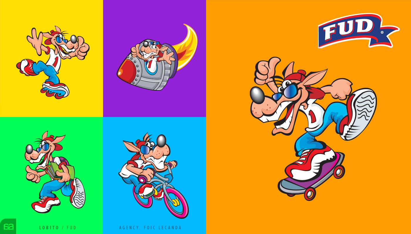
For Fud®, the undisputed leader in the cold cuts market, the Lobito® is more than just a mascot; he is the visual soul of the brand. Foic Lecanda® commissioned Alex Viveros to develop the extensive library of movements and poses required for the brand’s retail presence. This project highlights a crucial aspect of professional character design: the profound artistic responsibility of managing an established icon.
Giving "graphic life" to a character created by another artist requires a master-level understanding of its Brand DNA. It involves not only mastering the stroke, form, and color palette but also deeply inhabiting the character’s psyche, temperament, and behavior. Alex’s work ensured that every new pose—whether for point-of-sale displays or digital media—remained 100% "in character," preserving the integrity and charisma that consumers have trusted for generations.
By bridging the gap between original design and modern retail requirements, Alex provided the brand with the visual versatility necessary to stay relevant in a competitive landscape, proving that professional character development is essential for a brand’s long-term vitality.
TROMPOBOTS®
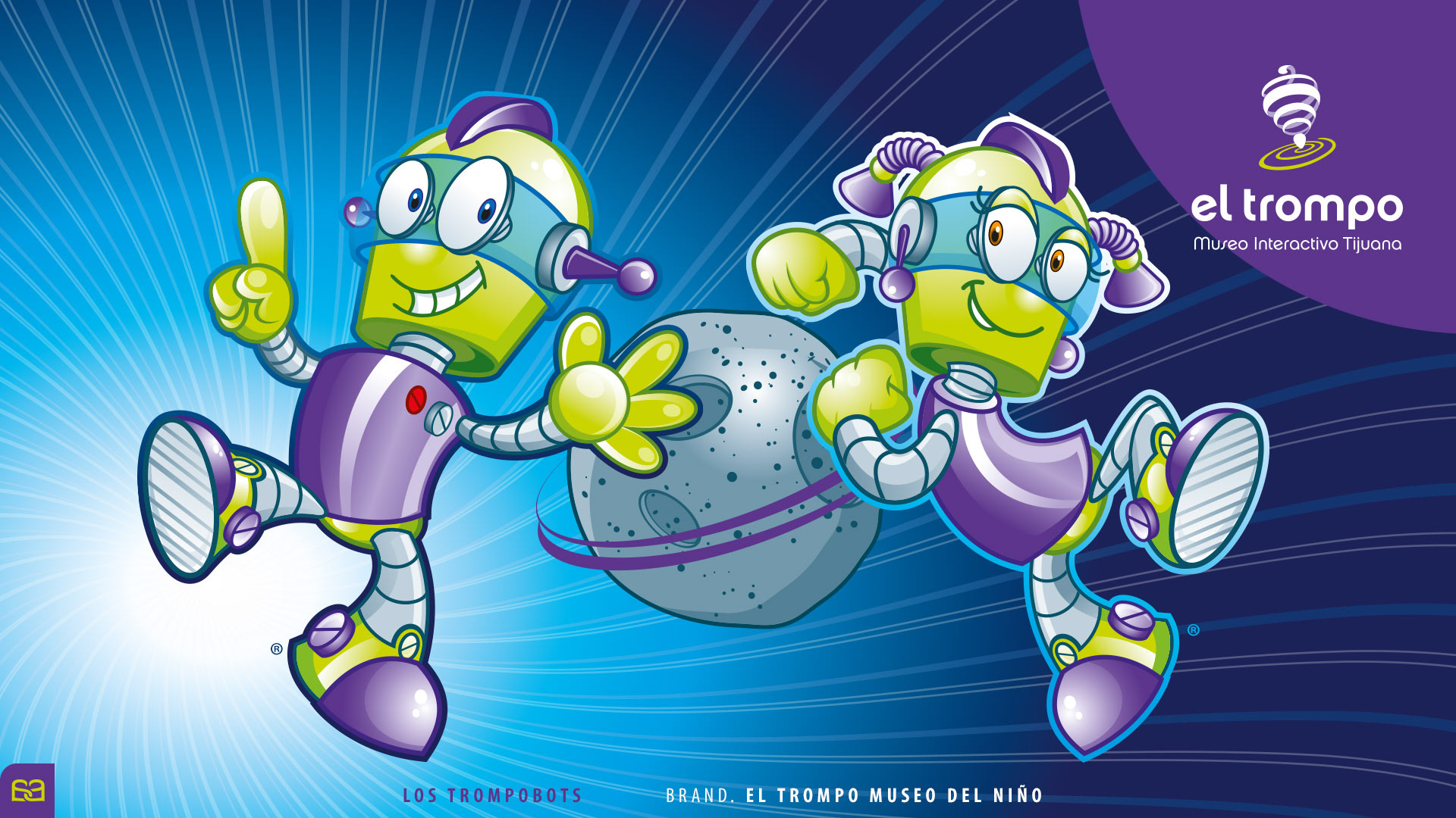
El Trompo® Museo del Niño, is the first interactive museum dedicated to promoting science and technology for children and families in the state of Baja California, Mexico. The museum’s Board of Directors invited Alex Viveros to develop the institution’s official brand characters.
After several development sessions, the direction evolved into a more human and relatable concept: a pair of curious robotic children whose personalities embody the spirit of exploration, learning, and discovery.
Designed with a clean geometric structure and a vibrant, playful aesthetic, the characters reflect the museum’s mission to inspire young audiences to engage with science and discover the world around them. Their expressive forms and energetic poses allow them to function effectively across educational materials, exhibitions, promotional campaigns, and museum merchandise.
The result was Los Trompobots, a friendly robotic duo that became the visual ambassadors of the museum, helping establish an emotional connection between the institution and its young visitors.
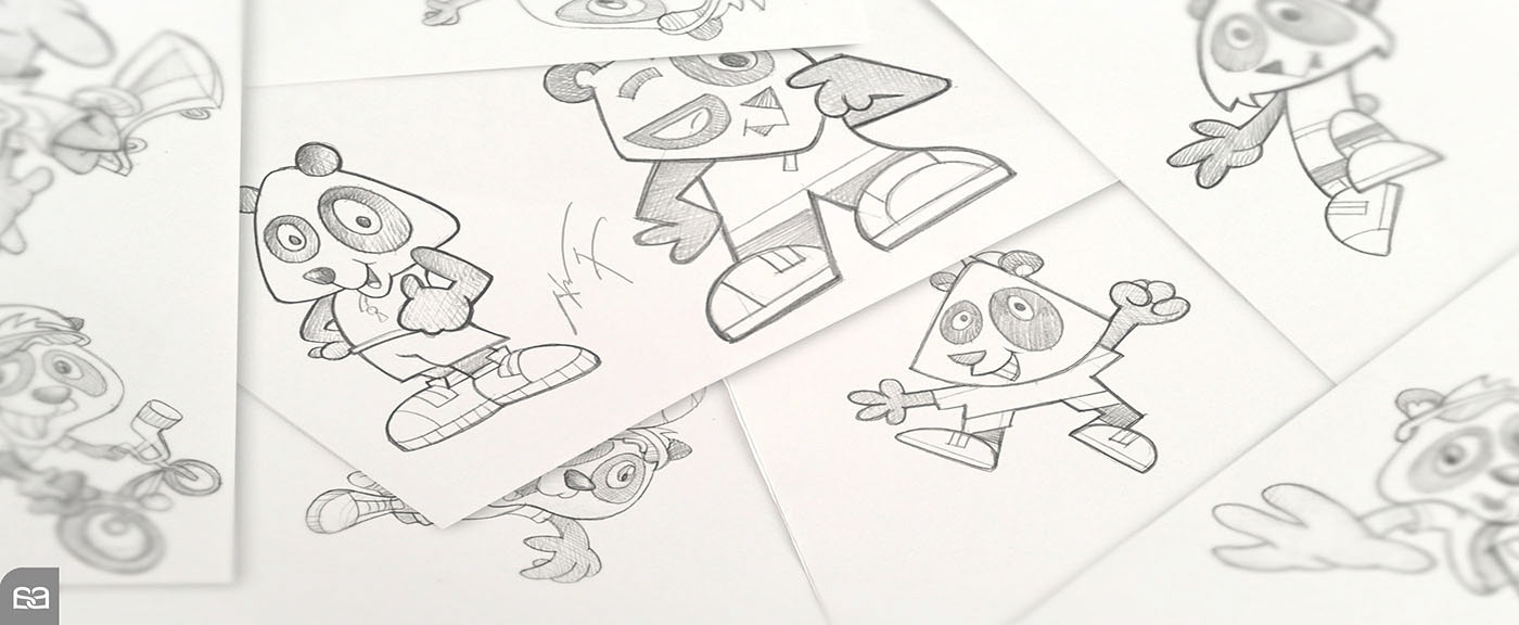
PANDITA PERK ®
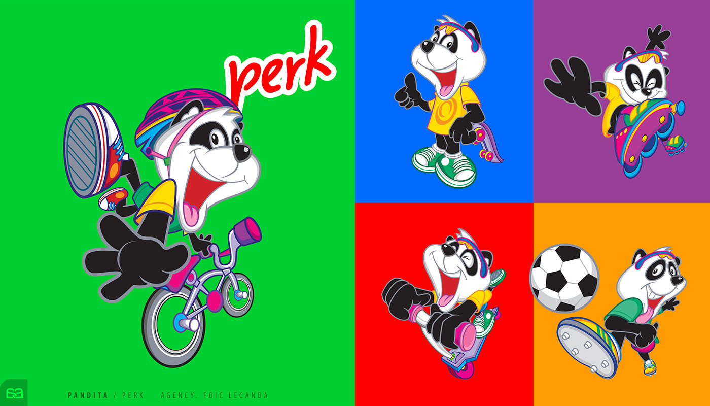
The brand sought a profound evolution of its brand ambassador. The objective was to transition from a traditional panda figure into a much more agile, dynamic, and high-energy character. The goal was to align the mascot with the active lifestyle and vitality that the product represents.
The result was a modernized, athletic Pandita Perk® that redefined the brand's visual energy. By focusing on charismatic expressions and a fluid, sport-oriented anatomy, we created a character that radiated vitality. This shift was designed to cut through the visual noise of the retail environment, offering a fresh and relatable face for the brand’s target audience.
The relaunch was a "retail bombshell." Thanks to his charisma and memorability, Pandita Perk® became a standout icon on the shelf, leading the brand to achieve record-breaking annual results. This project proves that a well-executed character refresh isn't just an aesthetic update—it’s a powerful driver for brand loyalty and commercial success.
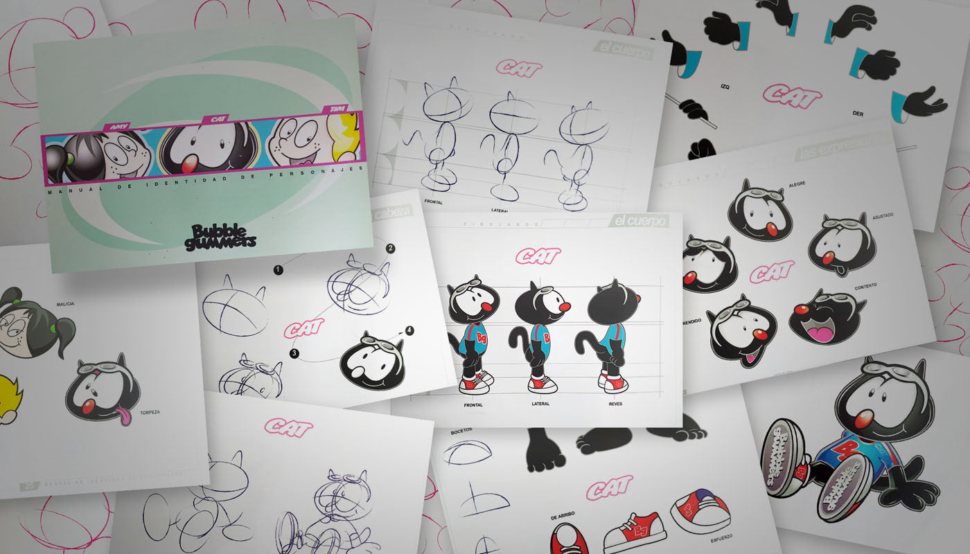
BUBBLER GUMMERS ®
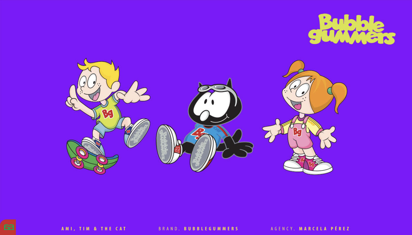
As a global leader in the children's footwear market, Bubble Gummers® (headquartered in Brazil) conducted an in-depth market study led by Marcela Perez® to diagnose the brand’s visual resonance. The findings revealed a clear need for a comprehensive mascot update. Marcela turned to Alex Viveros to interpret these insights and design a new generation of characters that could reconnect with today’s youth.
The redesign of Ami®, Tim®, and the Cat® went far beyond aesthetic changes. They were reimagined as a cohesive "gang," each representing distinct personality profiles that mirror the diverse traits of children worldwide. Whether a child is studious, extroverted, or playful, there is now a character that understands, represents, and welcomes them into the brand's world.
By providing each character with specific traits and accessories, Alex created a visual ecosystem where every child can find a mirror. This strategic approach to character design transformed the brand's image into a more inclusive and empathetic experience, ensuring that Bubble Gummers® remains a trusted companion in every step of a child's growth.
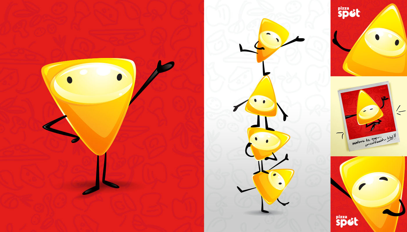
SPOTIS ®
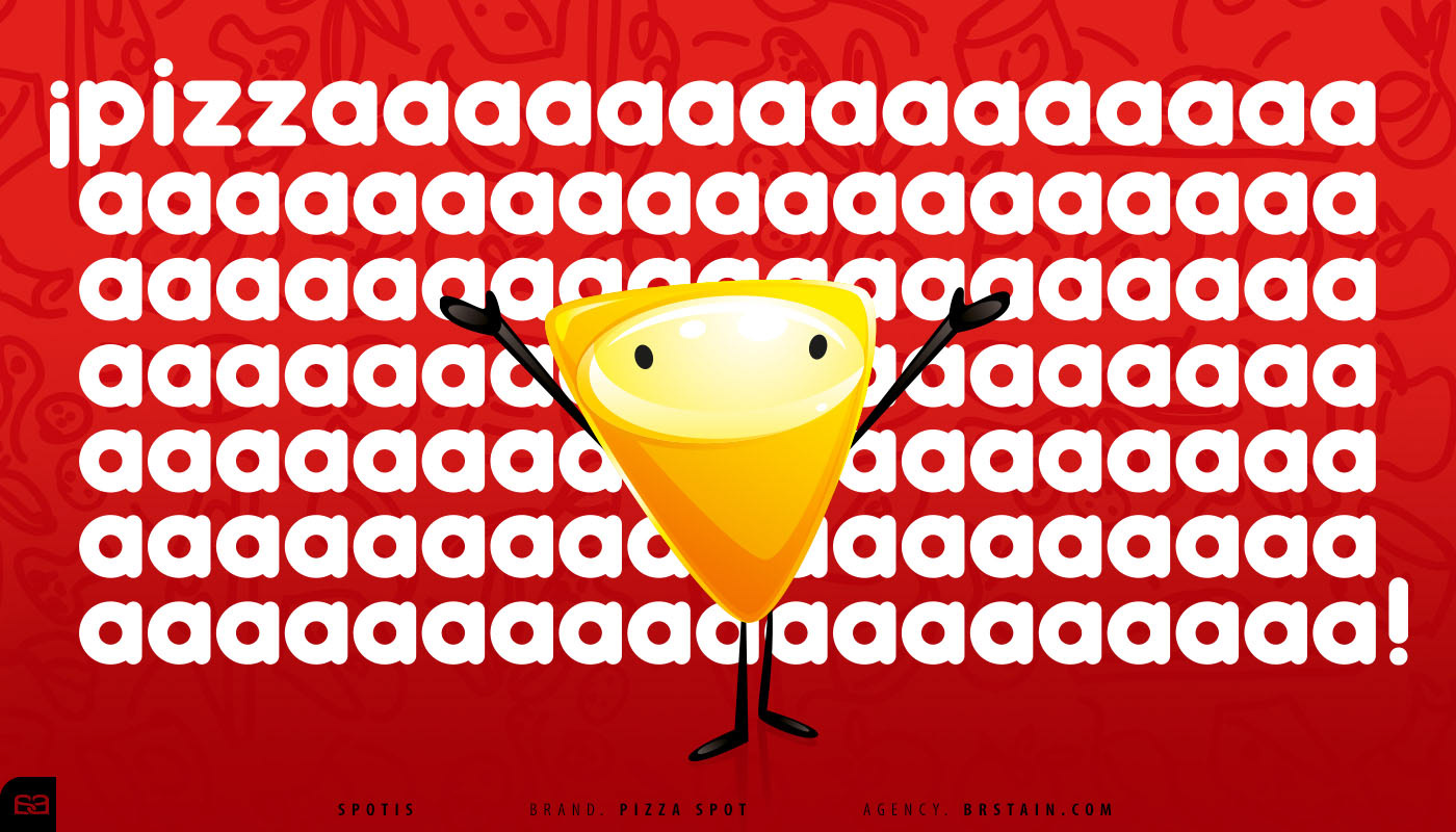
Pizza Spot®, a prominent fast-food chain in Northern Baja California, sought a fresh way to engage its audience. The agency Brstain.com® proposed a family of mascots—a group of "product elves" designed to be playful, energetic drivers of the brand’s identity.
The Spotis® are a masterclass in functional simplicity. Inspired by the iconic triangular silhouette of a pizza slice, these characters were built on elemental geometric foundations. This "basic yet bold" approach ensures they are easily recognizable, highly scalable, and instantly memorable. By utilizing a vibrant and cohesive color palette, we established strong brand remembrance within their specific target market.
The result of this strategic design was immediate and effective. The Spotis® transformed the brand's visual communication, making it more approachable and fun. This project proves that high-quality character design doesn't always require complexity; it requires a clear vision and a strong connection to the product's core essence.
TOLTECA ®
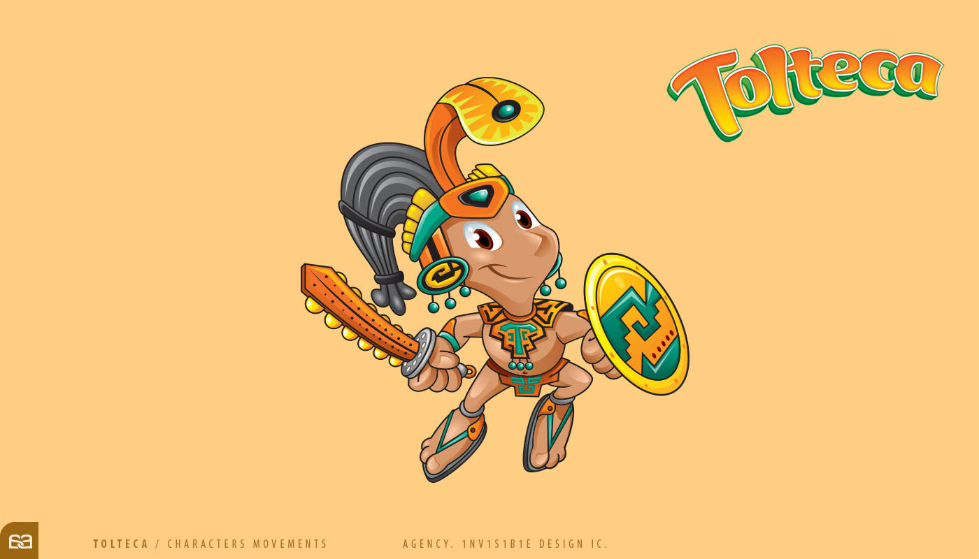
Based in Southern California, the brand of Spicy Snacks and Gummies, Tolteca Candies® sought a comprehensive refresh of its entire product line. In a high-level collaboration with Invisible Design Inc®, led by Fauss Sanchez, we made the strategic decision to rescue and revitalize a primary sketch from the brand’s archives. By deconstructing and stylizing its original features, we enriched its visual connotation, transforming a simple sketch into a powerful brand ambassador.
Today, Tolteca® is a vibrant, "living" character that breathes life into every packaging format. The design was meticulously engineered to balance ancestral iconography with modern graphic standards. This evolution has successfully positioned the brand as a leader within the "nostalgia market," creating an immediate and profound emotional bond with Hispanic consumers seeking a tangible connection to their roots.
The character serves as a cultural bridge, through precise line work and a bold color palette, we ensured that the Tolteca character provides a high level of shelf-standout and brand recall, proving that a deep understanding of a target audience's psychology is the most effective tool for successful rebranding.
ZOE ®
Commissioned by Alejandro Becerra, Director of Alto Contraste®, the development of Zoe® was a strategic project for one of the agency’s key accounts. Unlike more traditional mascot assignments, Zoe® offered a unique creative playground to explore diverse graphic styles and visual languages, pushing the boundaries of the brand’s identity.
he creative direction pivoted toward a Cyber-Hero persona. Zoe® was conceived as a tech-driven protagonist equipped to solve complex, multifaceted challenges through innovation. This conceptual framework allowed for a design that balances human empathy with futuristic precision, resulting in a character that feels both advanced and approachable.
The process of developing Zoe was an enriching journey of experimentation. By testing different line weights, color palettes, and structural silhouettes, we arrived at a final character that is not only visually striking but also highly adaptable.
QUECHITOS BARCEL ®
For Barcel®, one of the leading names in the snack industry, the mission was to create an ambassador for its cheese-flavored product line. The result was Quechos®, a character strategically designed with the personality of a playful, energetic pre-teen. By rooting his identity in the world of neighborhood sports and casual social interaction, we created an immediate emotional bridge with the brand's core demographic.
Quechos® was defined by a fresh, modern aesthetic. From his "street-style" athletic attire to his dynamic expressions, every detail was engineered to resonate with contemporary youth culture.
The launch of Quechos® was a definitive success in retail strategy. His charismatic presence and vibrant design allowed the product to quickly become a benchmark within its category on the shelf.
RICOLINO GUMMY SQUAD ®
When Ricolino International® expanded its portfolio into the gummy candy category, it faced the creative challenge of establishing a completely new visual universe. The objective was to develop a "squad" of characters that could represent the brand's fun and bold personality on a global scale.
After an in-depth study of contemporary graphic trends, we chose a minimalist 2D stylization characterized by bold color blocks and clean silhouettes. Inspired by the iconic "Cartoon Network" aesthetic of the early 2000s, this approach prioritized visual clarity and high-contrast design. The process began with the Bear, the squad’s leader; once his structural rhythm was established, the rest of the characters emerged naturally, creating a cohesive and vibrant visual family.
The resulting characters are not only modern and "pop," but also highly versatile for digital animation and global packaging standards. The Gummy Squad successfully positioned Ricolino's new line as a fresh, disruptive competitor in the international market, proving that a strong, stylized identity is the key to category leadership.
BABOON ®
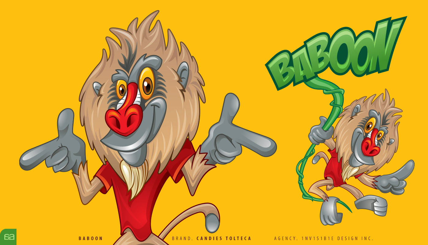
As part of the Tolteca Candies® family, the brand expanded its reach into a new category: gummy candies. Through an invitation from Invisible Design Inc®, I was tasked with developing the identity for Baboon®, a character designed to be the charismatic face of this bold new line.
Baboon® was conceived as an arrogant, confident, yet incredibly fun and athletic mandrill. He is a relentless seeker, constantly scouring the depths of the jungle to find the most intense flavors for his audience. This personality—equal parts swagger and skill—was designed to resonate with a young, adventurous demographic that values both quality and attitude.
The artistic execution utilized loose, energetic strokes and a high-contrast, vibrant color palette. This deliberate choice ensured that Baboon’s presence on the shelf was impossible to ignore. By balancing a "street-smart" aesthetic with professional character design standards, we successfully positioned Baboon® as a disruptive icon in the competitive candy market, driving both trial and brand loyalty.